Hi,
What would be they way of creating something like this in mainUI page:

You are looking for the f7-segmented. Here’s an example:
Hi!
It’s not exactly like your example, but I’m working on a widget for MPD Server using MPD Binding.
I haven’t finished it yet, but it’s already working for my use case.
I tried to include several options to customize the widget, such as background color or wallpaper, font color, button color, etc.
It’s possible to select playlists created in MPD Server and then select the track to be played.
When the track is selected, the title has an animation.
The volume, forward, and backward buttons are also working.
There’s a rule to complement the actions, and this rule requires some virtual Items in addition to those created by MPD Binding.
The virtual Items are for loading playlists, loading tracks, and MPD outputs.
version: 1
widgets:
mpd_player:
tags:
- mpd
- media
props:
parameters:
- context: item
description: Item to control Player commands (Play/Pause/Next/Previous)
label: Item to control Player
name: playerItem
required: true
type: TEXT
groupName: options
- context: item
description: Item with available Sinks (inside options -> stateDescription)
label: Item with available Sinks
name: availableSinks
required: true
type: TEXT
groupName: options
- context: item
description: Item to write sinks selected
label: Item to write sinks selected
name: sinksSelected
required: true
type: TEXT
groupName: options
- context: item
description: Item to control volume
label: Item to control volume
name: volumeItem
required: false
type: TEXT
groupName: options
- context: item
description: Item to show music title
label: Item to show music title
name: titleItem
required: false
type: TEXT
groupName: options
- context: item
default: ""
description: Optional Item for footer
label: Optional Item for footer
name: footerItem
required: false
type: TEXT
groupName: options
advanced: true
- default: No info
description: Footer default message
label: Footer default message
name: footerMSG
required: false
type: TEXT
groupName: appearance
advanced: true
- default: Stopped
description: Message to show when stopped
label: Message to show when stopped
name: defaulTitletMSG
required: false
type: TEXT
groupName: appearance
advanced: true
- default: Reload Playlist
description: Reload Playlist Message
label: Reload Playlist Message
name: reloadPlaylistMSG
required: false
type: TEXT
groupName: appearance
advanced: true
- default: 1. Select Playlist
description: Select Playlist Message
label: Select Playlist Message
name: selectPlaylistMSG
required: false
type: TEXT
groupName: appearance
advanced: true
- default: 2. Select Track
description: Select Track Message
label: Select Track Message
name: selectTrackMSG
required: false
type: TEXT
groupName: appearance
advanced: true
- default: Select Audio Sinks
description: Select Audio Sinks
label: Select Sinks Message
name: selectSinksMSG
required: false
type: TEXT
groupName: appearance
advanced: true
- context: item
description: Item to show artist
label: Item to show artist
name: artistItem
required: false
type: TEXT
groupName: options
- context: item
description: Virtual Item for configured Playlists (State Description)
label: Virtual Item for configured Playlists
name: playlistSelectorItem
required: false
type: TEXT
groupName: options
- context: item
description: Virtual Item to select tracks (Ex. 0, 1, 2...)
label: Virtual Item to select tracks (Index)
name: trackSelectorItem
required: false
type: TEXT
groupName: options
- context: item
description: Virtual Item used to reload/syncronize playlists (Send REFRESH or ON)
label: Virtual Item used to reload/syncronize playlists (Refresh)
name: refreshPlaylistsItem
required: false
type: TEXT
groupName: options
- default: black
description: Widget Media buttons color
label: Media buttons color
name: mediaColor
required: false
type: TEXT
groupName: appearance
advanced: true
- default: black
description: Widget Text color
label: Widget Text color
name: textColor
required: false
type: TEXT
groupName: appearance
advanced: true
- default: "#007aff/red"
description: Volume Bar Colors
label: Volume Bar Colors
name: volumeBarColors
required: false
type: TEXT
groupName: appearance
advanced: true
- default: "linear-gradient(135deg, #ffffff 0%, #e1e1e1 15%, #b5b5b5 30%, #fcfcfc 45%, #8c8c8c 55%, #efefef 70%, #9e9e9e 85%, #e1e1e1 100% )"
description: Widget Background color
label: Background Color
name: bgColor
required: false
type: TEXT
groupName: appearance
advanced: true
parameterGroups:
- name: options
label: Options
- name: appearance
label: Appearance
component: f7-card
config:
outline: true
title: =@props.titleItem || @props.playlistSelectorItem || props.defaulTitletMSG
footer: =@props.artistItem || @props.footerItem || @props.playlistSelectorItem || props.footerMSG
style:
background: =props.bgColor
border: 6px
border-radius: 25px
border-style: =(@props.mainItem == props.stateAlias.split('/')[0]) ? 'inset':'outset'
color: =props.textColor
--f7-block-text-color: =props.textColor
--f7-card-footer-text-color: =props.textColor
stylesheet: |
.card-header {
display: block !important;
overflow: hidden !important;
white-space: nowrap !important;
position: relative !important;
width: 100% !important;
box-sizing: border-box !important;
/* Movemos a animação para cá, mas sem usar transformações de tamanho */
animation: marquee 15s linear infinite !important;
}
@keyframes marquee {
0% { text-indent: 75%; }
100% { text-indent: -25%; }
}
slots:
default:
- component: f7-block
config:
style:
display: flex
flex-direction: column
align-items: center
text-align: center
margin: 0
padding: 8px
slots:
default:
- component: f7-list
config:
noHairlines: true
noHairlinesBetween: true
style:
width: 100%
margin-top: 0
margin-bottom: 8px
slots:
default:
- component: oh-list-item
config:
visible: "=props.refreshPlaylistsItem ? true : false"
title: =props.reloadPlaylistMSG
icon: f7:arrow_2_circlepath
action: command
actionItem: =props.refreshPlaylistsItem
actionCommand: REFRESH
style:
--f7-list-chevron-icon-color: =props.textColor
--f7-list-item-after-text-color: =props.textColor
- component: oh-list-item
config:
visible: "=props.playlistSelectorItem ? true : false"
title: =props.selectPlaylistMSG
after: =items[props.playlistSelectorItem].state
icon: f7:music_albums
action: options
actionItem: =props.playlistSelectorItem
style:
--f7-list-chevron-icon-color: =props.textColor
--f7-list-item-after-text-color: =props.textColor
- component: oh-list-item
config:
visible: "=props.trackSelectorItem ? true : false"
title: =props.selectTrackMSG
after: =items[props.trackSelectorItem].state
icon: f7:list_number
action: options
actionItem: =props.trackSelectorItem
style:
--f7-list-chevron-icon-color: =props.textColor
--f7-list-item-after-text-color: =props.textColor
- component: oh-list
config:
accordionList: true
slots:
default:
- component: oh-list-item
config:
visible: "=props.availableSinks ? true : false"
title: =@props.sinksSelected
icon: f7:hifispeaker
accordionItem: true
opened: =vars.menuOpen === true
action: variable
actionVariable: menuOpen
actionVariableValue: "=vars.menuOpen === true ? false : true"
style:
--f7-list-chevron-icon-color: =props.textColor
--f7-list-item-after-text-color: =props.textColor
slots:
accordion:
- component: oh-list
slots:
default:
- component: oh-repeater
config:
for: option
sourceType: itemStateOptions
itemOptions: =props.availableSinks
fragment: true
slots:
default:
- component: oh-list-item
config:
title: =loop.option.label
badge: =loop.option.value
checkbox: true
checked: "=(vars['check_' + loop.option.value] === undefined) ? (items[props.availableSinks].state.includes(loop.option.value)) : (vars['check_' + loop.option.value] === true)"
action: variable
actionVariable: ='check_' + loop.option.value
actionVariableValue: "=(vars['check_' + loop.option.value] === undefined) ? !items[props.availableSinks].state.includes(loop.option.value) : !vars['check_' + loop.option.value]"
- component: oh-button
config:
visible: =loop.option_idx === (loop.option_source.length - 1)
iconF7: checkmark
iconSize: 1.5rem
iconColor: =props.textColor
fill: false
large: true
outline: true
style:
marginTop: 20px
fontWeight: bold
action: command
actionItem: =props.sinksSelected
actionCommand: =loop.option_source.filter(o => vars['check_' + o.value] === true).map(o => o.value).join(',')
popupClose: true
clearVariable: menuOpen
- component: f7-segmented
config:
raised: true
color: =props.mediaColor
style:
width: 100%
max-width: 250px
margin-bottom: 16px
slots:
default:
- component: oh-button
config:
iconF7: backward_fill
action: command
actionItem: =props.playerItem
actionCommand: PREVIOUS
- component: oh-button
config:
iconF7: "=(@props.playerItem === 'PLAY') ? 'pause_fill' : 'play_fill'"
action: command
actionItem: =props.playerItem
actionCommand: "=(@props.playerItem === 'PLAY') ? 'PAUSE' : 'PLAY'"
- component: oh-button
config:
iconF7: forward_fill
action: command
actionItem: =props.playerItem
actionCommand: NEXT
- component: f7-row
config:
visible: "=props.volumeItem ? true : false"
style:
width: 100%
align-items: center
slots:
default:
- component: f7-icon
config:
f7: speaker_2_fill
size: 18
style:
margin-right: 8px
- component: oh-slider
config:
item: =props.volumeItem
style:
flex-grow: 1
--f7-range-knob-color: =props.mediaColor
--f7-range-bar-active-bg-color: =props.volumeBarColors.split('/')[0]
--f7-range-bar-bg-color: =props.volumeBarColors.split('/')[1]
hi, I tested this f7-segmented, its great and I may use it for AC or something else,
but this is a popup of options, i would like all options to be laid out on the page, not in a popup.
I can create 5 individual oh-buttons as
oh-button item: MyItem command: 1
oh-button item: MyItem command: 2
oh-button item: MyItem command: 3
oh-button item: MyItem command: 4
oh-button item: MyItem command: 5
but i find it hard to believe that this new powerful yaml css f7 monster cannot reproduce what was essentialy 1 line of code in old basicui sitemap with item name and its mappings.
The example that I linked to uses the popup action of the buttons, but that is separate from the f7-segmented layout of the buttons. That layout is exactly what you have shown up above. For example:
        - component: f7-segmented
          config:
            round: true
            raised: true
          slots:
            default:
              - component: oh-button
                config:
                  text: button 1
              - component: oh-button
                config:
                  text: button 2
              - component: oh-button
                config:
                  text: button 3
gets you

It’s not one line, but that because MainUI gives you orders of magnitude more control:
        - component: f7-segmented
          config:
            round: true
            raised: true
          slots:
            default:
              - component: oh-repeater
                config:
                  for: buttonOpt
                  sourceType: itemCommandOptions
                  itemOptions: Shutter_MasterBedroomBlinds_Position
                  fragment: true
                slots:
                  default:
                    - component: oh-button
                      config:
                        text: =loop.buttonOpt.label

great, thx! i ended up using those lined up buttons as you suggested, the only thing missing was the description on the left before the first button, so i just used fake/disabled button for that purpose (icon and name)
while I have you here, another question 
is there any logical/virtual container that i can use to separate blocks of elements for the purpose of visibility conditions and just plain old housekeeping
i use oh-block to separate multimedia from something else etc, but this oh-block creates too big spacing, it has some margins.
I would like to have the visual behaviour like there is no oh-block, but to have it logically…
Components can include html tags in addition to the various oh and f7 components. So, just use component: div:
There may be a few edge cases where the div gets some styling from an f7 directive that selects div children of some other f7 component, but 99% of the time a div should have no applied styles.
thx, already tried div, but unfortunately, it makes the same spacing as oh-block…
There are not too many places where that should happen. If you post the widget I can take a look and see if there’s something unusual going on.
hi,
here is my main layout page, i tried replacing each oh-block with div, same margins remain..also tried defining margin as 0, no luck.
version: 1
pages:
overview:
tags: []
props:
parameters: []
parameterGroups: []
component: oh-layout-page
config:
label: Muneera Doma
slots:
canvas: []
default:
- component: oh-block
config:
style:
margin: 0
padding: 0
slots:
default:
- component: oh-list-card
config:
cols:
default: 1
slots:
default:
- component: oh-grid-col
config:
visible: =items.Presence.state == "ON"
style:
margin-top: -30px
slots:
default:
- component: widget:scene_buttons
- component: oh-list-item
config:
visible: =items.Presence.state == "ON"
title: =items.KodiSummary.state
stylesheet: |
.item-title {
white-space: normal !important;
overflow: visible !important;
text-overflow: unset !important; }
icon: if:mdi:play-network
action: popup
actionPage: page:media
header: Now Playing
actionModal: page:media
expandable: false
- component: f7-segmented
config:
visible: =items.Presence.state == "ON"
round: true
raised: true
slots:
default:
- component: oh-button
config:
iconF7: music_note
text: Volume
disabled: true
style:
opacity: 1
color: var(--f7-text-color)
background: var(--f7-page-bg-color)
- component: oh-button
config:
action: command
iconF7: "=items.Mute.state == 'ON' ? 'speaker_slash_fill' : 'speaker_slash'"
actionItem: Mute
actionCommand: toggle
- component: oh-button
config:
action: command
iconF7: "=items.IRCC_Command.state == 'VolumeDown' ? 'speaker_1_fill' : 'speaker_1'"
actionItem: IRCC_Command
actionCommand: VolumeDown
- component: oh-button
config:
action: command
iconF7: "=items.IRCC_Command.state == 'VolumeUp' ? 'speaker_3_fill' : 'speaker_3'"
actionItem: IRCC_Command
actionCommand: VolumeUp
- component: oh-grid-cells
config:
cols:
default: 1
slots:
default:
- component: oh-label-cell
config:
action: group
actionGroupPopupItem: gBalconiesLights
expandable: false
footer: Temperature / Humidity
icon: if:mdi:day-temperature
item: BalconySummary
stateAsHeader: true
subtitle: = 'Abs. Humidity ' + items.BalconyHumidityAbsolute.displayState
title: = 'Balcony Sunrise ' + items.Sunrise_Time.displayState + ' Sunset ' + items.Sunset_Time.displayState
trendItem: BalconyTemperature
- component: oh-grid-cells
config:
cols:
default: 2
slots:
default:
- component: oh-label-cell
config:
style:
background: "=items.gLivingRoomLights.state == 'ON' ? 'yellow' : 'var(--f7-page-bg-color)'"
action: group
actionGroupPopupItem: gLivingRoomLights
expandable: false
footer: Temperature / Humidity
icon: if:mdi:home-temperature-outline
item: LivingSummary
stateAsHeader: true
subtitle: = 'Abs. Humidity ' + items.LivingHumidityAbsolute.displayState
title: Living Room
trendItem: LivingTemperature
trendSampling: 6
- component: oh-label-cell
config:
style:
background: "=items.gMasterBedroomLights.state == 'ON' ? 'yellow' : 'var(--f7-page-bg-color)'"
action: group
actionGroupPopupItem: gMasterBedroomLights
expandable: false
footer: Temperature / Humidity
icon: if:mdi:home-temperature-outline
item: BedroomSummary
stateAsHeader: true
subtitle: Inside
title: Master Bedroom
trendItem: BedroomTemperature
trendSampling: 6
- component: oh-label-cell
config:
style:
background: "=items.gKidsRoomLights.state === 'ON' ? 'yellow' : 'var(--f7-page-bg-color)'"
action: group
actionGroupPopupItem: gKidsRoomLights
expandable: false
footer: Temperature / Humidity
icon: if:mdi:home-temperature-outline
item: KidsSummary
stateAsHeader: true
subtitle: Inside
title: Kids Room
trendItem: KidsTemperature
trendSampling: 6
- component: oh-label-cell
config:
style:
background: "=items.gKitchenLights.state === 'ON' ? 'yellow' : 'var(--f7-page-bg-color)'"
action: group
actionAnalyzerItems:
- FridgeTemperature
- FridgeHumidity
actionGroupPopupItem: gKitchenLights
expandable: false
footer: Temperature / Humidity
icon: if:ph:thermometer-cold
item: FridgeSummary
subtitle: Fridge
title: Kitchen
trendItem: FridgeTemperature
- component: oh-block
config:
style:
margin: 0
padding: 0
title: Water & Electricity
slots:
default:
- component: oh-grid-cells
config:
cols:
default: 2
slots:
default:
- component: oh-label-cell
config:
action: analyzer
actionAnalyzerItems: WaterFlow
expandable: false
icon: material:water_drop
item: Water_Month
subtitle: = 'Usage Today ' + items.Water_Today.displayState
title: = 'Flow ' + items.WaterFlow.displayState
footer: = 'Usage This Month ' + items.Water_Month_Price.displayState
trendItem: WaterFlow
- component: oh-label-cell
config:
action: analyzer
actionAnalyzerItems: Watts
expandable: false
icon: if:flat-color-icons:electricity
item: kWh_Month
subtitle: = 'Usage Today ' + items.kWh_Today.displayState
title: = 'Load ' + items.Watts.displayState
footer: = 'Usage This Month ' + items.kWh_Month_Price.displayState
trendItem: Watts
- component: oh-block
config:
title: AC Usage
visible: =items.Summer.state === "ON"
slots:
default:
- component: oh-grid-cells
config:
cols:
default: 3
slots:
default:
- component: oh-label-cell
config:
icon: if:mdi:air-conditioner
item: AC_Month
subtitle: Total
title: This Month
trendItem: AC_Month
trendSampling: 6
- component: oh-label-cell
config:
icon: if:mdi:air-conditioner
item: ACLiving1_Today_Runtime_Min
subtitle: Living Room
title: Today
trendItem: ACLiving1_Today_Runtime_Min
- component: oh-label-cell
config:
icon: if:mdi:air-conditioner
item: ACRooms1_Today_Runtime_Min
subtitle: Bedrooms
title: Today
trendItem: ACRooms1_Today_Runtime_Min
- component: div
config: {}
slots:
default:
- component: oh-grid-row
config: {}
slots:
default:
- component: oh-grid-col
config:
width: "33"
slots:
default:
- component: oh-gauge-card
config:
footer: Used Today
item: All_Lights_Today_Runtime_Min
max: 720
min: 0
title: "Lights "
type: semicircle
- component: oh-grid-col
config:
width: "33"
slots:
default:
- component: oh-gauge-card
config:
footer: Used Today
item: lgtv_Today_Runtime_Min
max: 600
min: 0
title: Television
type: semicircle
- component: oh-grid-col
config:
width: "33"
slots:
default:
- component: oh-gauge-card
config:
footer: Used Today
item: projektor_Today_Runtime_Min
max: 600
min: 0
title: Projektor
type: semicircle
- component: oh-block
config:
title: Xiaomi Mija Robot & UPS Power & IT Equipment
slots:
default:
- component: oh-grid-row
config: {}
slots:
default:
- component: oh-grid-col
config:
width: "25"
slots:
default:
- component: oh-button
config:
text: Start
action: command
actionItem: mija_vacuum_action
actionCommand: start
- component: oh-grid-col
config:
width: "25"
slots:
default:
- component: oh-button
config:
text: Stop
action: command
actionItem: mija_vacuum_action
actionCommand: stop
- component: oh-grid-col
config:
width: "25"
slots:
default:
- component: oh-button
config:
text: Dock
action: command
actionItem: mija_vacuum_action
actionCommand: dock
- component: oh-grid-col
config:
width: "25"
slots:
default:
- component: oh-button
config:
text: Find Me
action: command
actionItem: mija_vacuum_action
actionCommand: findme
- component: oh-grid-row
config: {}
slots:
default:
- component: oh-grid-col
config:
width: "50"
slots:
default:
- component: oh-label-card
config:
item: mija_battery_level
title: = 'Mija Status ' + items.mija_vacuum_status.displayState
icon: battery
action: toggle
actionItem: AutoMiaDisarm
actionCommand: ON
actionCommandAlt: OFF
footer: = 'Automatic Disarm ' + items.AutoMiaDisarm.state
- component: oh-grid-col
config:
width: "50"
slots:
default:
- component: oh-label-card
config:
item: UPSBatteryRuntime
title: = 'UPS Status ' + items.UPSStatus.displayState
icon: battery
footer: = 'IT Equipment ' + items.gInfrastructure.state + ' C'
action: popup
actionPage: page:infrastructure
actionModal: page:infrastructure
masonry: []
also,
when presence is not on, i want to hide the first block, but since I cant use blocks as they add margins, i tried to hide each segment/cell separately with the same condition, but I end up with stuff hidden (OK) and some empty line (not OK)
like so: (white line between Overview and Balcony, what is that?)
That’s the much easier question. Your visible expression is on the specific content of the list card. When you hid that content you are not hiding the card itself. That white block is just an empty card.
Ok, I don’t know which space it is you are still trying to remove, but this is oh-blocks being used on a page. In that case, the block has only top and bottom margins, and padding on the sides. Setting margin and padding to 0 on the block removes these and makes the oh-block identical to a div as far as margin and padding are concerned. If there is still space that you don’t want at that point then the space is not coming from the oh-blocks. Perhaps it is the space created by the cards you are using that is the problem.
This section about tracking down extra widget space might help you narrow it down:
ok i managed to get rid of the spaces.
another few questions.
the layout looks great on phone or small laptop screen, but on a high res monitor, it is revealed that oh-label-cell refuses to stretch itself through the whole row, as opposed to other types of items/widgets which stretch fine.
is there a way around this, or oh-label-cell has some hardcoded max and it refuses to go above it? as you see, they all have the same size regardless if its 2 per row or 1 per row.
another question, oh-gauge-card background configured as ‘yellow’ looks very different then oh-label-card background configured in same ‘yellow’, so the dashboard does not look very consistent.
is there a way to use the transparent/washed out version from oh-label-cell in the oh-gauge-card ? without trying to guess the transparency %, or spying with chrome developer tools what css is doing?
and lastly, why the bottom oh-list-item has the “after:” value just after the last text, and the one above has it all the way to the right on the end of the row?
EDIT: fixed the last issue with
style: width: 100%
Yes, oh cells all have a css defined maximum width of 120px. You can remove this maximum with a max-width: none style setting.
But, a quick note about cells. All the oh cells are just cards with a bunch of pre-styling and coding added to them. They are convenient because they are specifically designed to be low-code. On the other hand this makes them a poor choice if you don’t like their default settings because it is almost always more work to fight through all the changes you want to make to a cell than it is to just remake that particular widget as a card. This is especially true in OH5 versions where the basic oh-card and all its derivatives give you access to different specific style objects for the card and the headers and footers.
The gauge card and the label card look the same on my screen. Did you mean label cell in this case? The cells have a color property which references default F7 colors which are not the same as named html colors. Make sure you are defining the color using a background style and it will always be html color codes.
If you used the cell color property, this is what you get:
ok, thanks for the info.
yes i mean oh-label-cell when defined yellow (conditioned by some item being ON, otherwise keep default background) has some pale yellow, like its transparent, and oh-gauge-card has bright strong yellow.
i tried the code from your link “#ffcc00” is yellow, when i configure oh-gauge-card with that, its stil much stronger, darker, not the pale/washed out/ semi transparent variant as it is in oh-label-cell
another question, how can i create simple switches that look like old BasicUI, and same as MainUI automatically generates based on semantics.
i cannot reproduce that. i tried oh-buttons, oh-list-item, oh-toggle…i cannot figure out which one looks like this:
It is transparent:
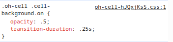
This is just one example of hundreds like I was saying above where tracking down every little cell style is not worth the time. It can be done (and I’ve a few examples where I didn’t follow my own advice), but you have to be prepared to track down all these niggling little extra styles and functions.
The switch widget is the toggle, but you have to keep track of the difference between list items and bare widgets. If you tried to put an oh-toggle directly in a list it’s going to render wrong. Anything that is the child of a list should be [oh/f7]-something-item and thing that is not the child of a list should be just be [oh/f7]-something. So if you want whats in the MainUI autogenerated lists for switches, you use oh-toggle-item.
Here’s a quick summary:
- component: oh-toggle
  config:
    item: ServerDummySwitch
    icon: f7:ant <-- Not correct for bare component, doesn't do anything
    title: Non-item component without list <-- Not correct for bare component, doesn't do anything
- component: oh-toggle-item
  config:
    item: ServerDummySwitch
    icon: f7:ant
    title: Item component without list
- component: oh-list
  config:
    mediaList: true
  slots:
    default:
      - component: oh-toggle
        config:
          item: ServerDummySwitch
          icon: f7:ant <-- Not correct for bare component, doesn't do anything
          title: Non-item component with list <-- Not correct for bare component, doesn't do anything
      - component: oh-toggle-item
        config:
          item: ServerDummySwitch
          icon: f7:ant
          title: Item component with list
ok,i managed to get the look i was after with (item names are dummy examples)
version: 1
pages:
  automation:
    tags: []
    props:
      parameters: []
      parameterGroups: []
    component: oh-layout-page
    config:
      label: Automation Control
    slots:
      default:
        - component: oh-block
          config:
            title: Automation Control
          slots:
            default:
              - component: oh-list-card
                config: {}
                slots:
                  default:
                    - component: oh-toggle-item
                      config:
                        item: DiningRoomLight
                        title: Dining Room
                        icon: f7:lightbulb
                        iconColor: "=items.DiningRoomLight.state == 'ON' ? '#ffbf40' : '#cfd8dc'"
                        color: deeporange

                    - component: oh-toggle-item
                      config:
                        item: Entrance
                        title: Entrance
                        icon: f7:lightbulb
                        iconColor: "=items.Entrance.state == 'ON' ? '#ffbf40' : '#cfd8dc'"
                        color: deeporange

                    - component: oh-toggle-item
                      config:
                        item: FloorLamp
                        title: Floor Lamp
                        icon: f7:lightbulb
                        iconColor: "=items.FloorLamp.state == 'ON' ? '#ffbf40' : '#cfd8dc'"
                        color: deeporange
any idea why this doesnt work
                    - component: oh-card
                      config:
                         title: CCTV
                      slots:
                         default:
                          - component: oh-image
                            config:
                               url: http://localhost:8080/static/webcam.jpg
                               refresh: 10000
                               lazy: false
trying to replace this
			}
			Frame label=CCTV {
				Image url="http://localhost:8080/static/webcam.jpg" refresh=10000
			}


