I’m taking a cut at expanding the Getting Started tutorial for Pages. I’m going to insert them here for public comment before submitting them as a PR. I don’t think the existing three pages are sufficient for getting started so I’m largely rewriting them but will leave them inline at the end until I’m certain that all their contents are covered elsewhere.
As usually, this is a Wiki (for now) so please correct anything wrong and add any content you think is missing and add a reply describing what you changed. I’ll convert it back to a regular post and close it once it has been migrated to github.
This page has been submitted to the official docs. You can find the PR at Getting started UI Pages by rkoshak · Pull Request #1503 · openhab/openhab-docs · GitHub and a preview of the page at Pages - Overview Page | v3 Documentation Preview.
The Overview Page
MainUI will automatically generate an Overview page (id:overview). This page will have four tabs on which itself is called also called “Overview”:
Overview Tab
This is originally a blank page which is the very first thing that your users will see when logging in to MainUI. It is a great place to put controls and widgets to display the most commonly used parts of your home automation. Populating this tab is covered in the next part of this tutorial.
Location Tab
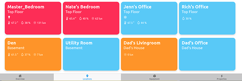
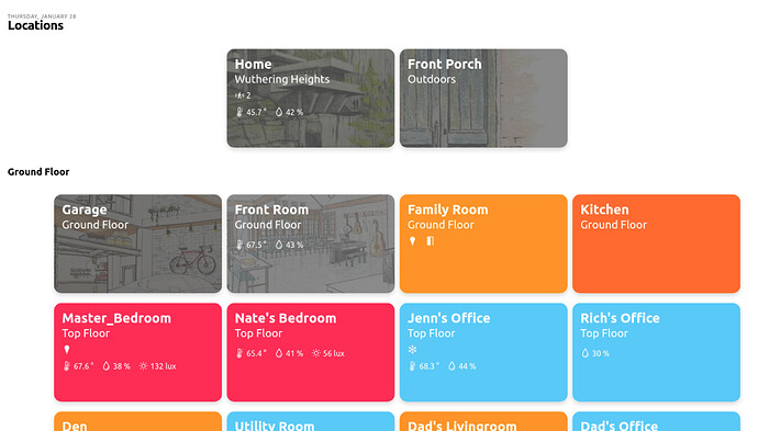
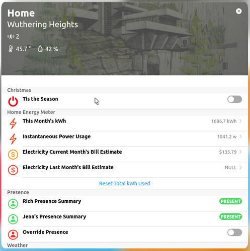
The model is starting to pay off. All of the locations that have Points or Equipment will be represented automatically with a card. For some types of Points, a badge with summary information will be shown on the card. Clicking on the card will show all the Equipment and Points in that location.
![]()

![]()
A location is subdivided automatically into two tabs: Equipments and Properties
As you can see, location cards will have badges summarizing some of the properties in that location. Items provided by “semantic properties” will appear in the properties tab and are
– Lights ON
– Open Windows
– Open Doors
– Open Garage Doors
– Open Blinds
– Presence Detected
– Locks
– Climate Control Powered On
– Screens Powered On
– Projectors Powered On
– Speakers/AV Receivers Powered On
– Average Temperature (+ Setpoint)
– Average Humidity
– Average Luminance
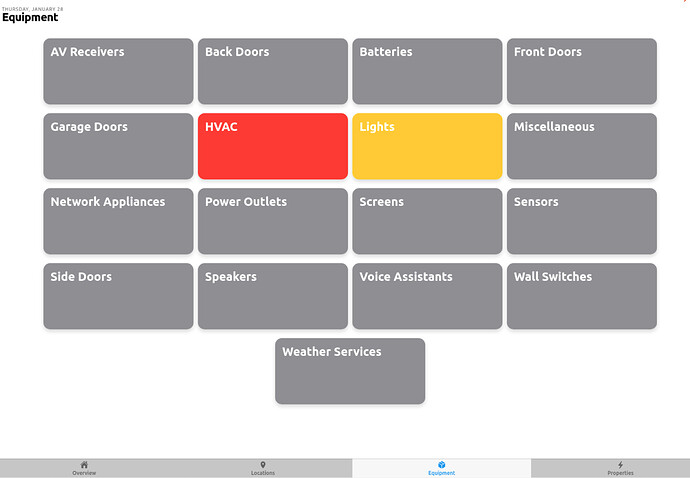
Equipment Tab
Each equipment type is represented by a card showing each instance of that equipment type and all the points on that equipment.
Properties Tab
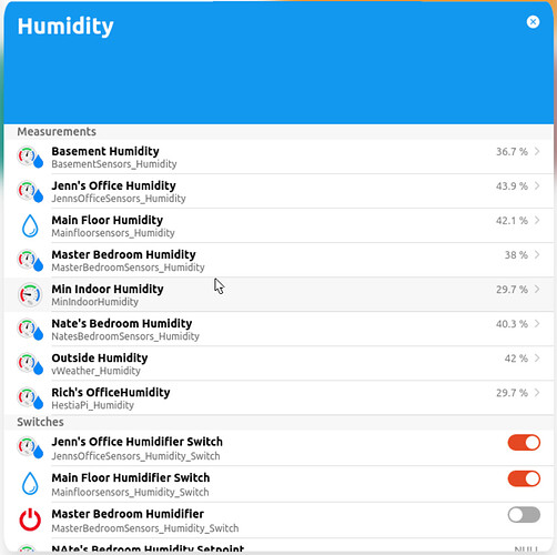
Each type of Semantic Property tag is represented by a card showing each instance of that Property in a list.
When clicking on such a card all points with that semantic property (in this case humidity) are shown and can be viewed or controlled:
In addition to showing the states and allowing the control of your Items in these three ways, there is additional information. For example, clicking on any entry in a card that has a > at the end will open something up. If the Item represents an Equipment that has sub-Equipment, the page will open up so you can access that sub-Equipment. If it’s a numerical value and Persistence was set up as described in the previous section you will get a chart:
On the Properties page, at the bottom of the card there is an “Analyze All” button that will generate a chart with all the properties on the card.
These charts can be configured by opening the “Controls” at the bottom and the chart can be saved as a Page for later review.
Customization / Page Configuration
MainUI does a pretty good job of guessing a decent default method to present the information to you. But what’s the fun in just accepting the default? Luckily there are a lot of opportunities for customization.
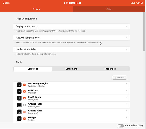
Here is a couple of screenshots of customization in progress.
Page Layout
The order of the cards can be defined and spacers can be inserted to group like cards together (for example put all the Ground Floor locations together.
In the upper right hand corner there is a pencil icon: ![]() . Clicking on that will open the customization page.
. Clicking on that will open the customization page.
-
Display model cards to: Controls who can see the cards, if “Administrators” is checked only an administrator user can see the cards tabs.
-
Allow chat input box to: If HABot is installed, this lets you control what type of users can see the chat input box.
-
Hidden Model Tabs: Allows you to hide the Locations, Equipment, and/or Properties tabs to all users in case you don’t want to use them…

Below these settings you can select one of the three automatically generated tabs. This will list all of the possible cards that can be displayed on that tab. Nicely openhab is smart enough not to show all cards though - only those that have Equipment or Points will actually appear.
Next to each card is a black and white menu button that takes you to the configuration for that card (see below) and a checkbox which when unchecked will exclude that card from the tab.
Reorder
To change the order of the cards click “Reorder” ![]() and drag and drop the card you want to move via the handle to the very right of the individual card.
and drag and drop the card you want to move via the handle to the very right of the individual card. ![]()
Separators
To visually group cards on the Page you can insert a separator (in the screenshot above you can see the separator “Ground Floor (separator)”. To insert a separator, click on the menu icon of that card you want below the separator and select “Add Separator Before”.

Give it a name and on the page you will now see a section heading with the entered name and all the Items below the separator grouped together.
Tip 1: Make sure to save before clicking Back.
You will have to reload the page to pick up the changes.
Tip 2: Open two separate tabs in your browser where you edit and view your page. Alternative, hit CTRL+R to show the changes.
Card Customization
There are a number of customization options for a card by default. More advanced customizations can be added by editing the card’s YAML directly as well.
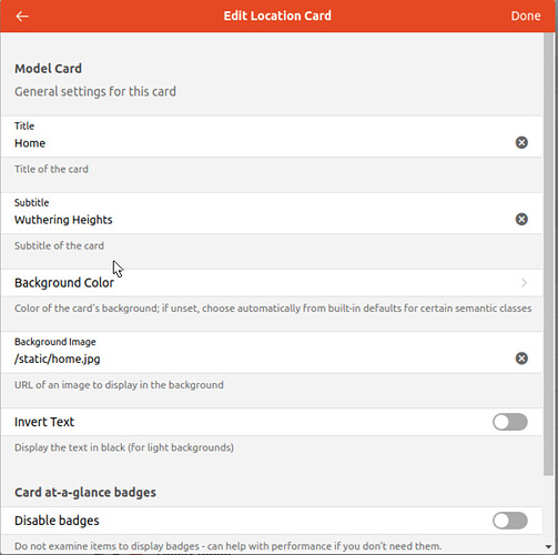
To customize a card, click the menu icon next to the card and select “Configure Card”.
Basic Settings
Instead of using the Item’s Label and parent group as the Title and Subtitle, they can be overridden here. Expressions (see below) can be used if you want to change either based on the state of some Item’s state.
The background color can also be overridden. By default a color is chosen based on the semantic tag.
Background Image
This feature needs a bit more explanation as it may require a bit more work.
If you find a picture that allows cross linking to all you need to do is put in the URL of that picture in this field and MainUI will load it and make it used as the background for the card. However, text and icons will be displayed on top of the image so one might need to modify the original image to work. Or one may have their own images they want to use instead of something downloaded from the internet.
For example, in the case above I’m using architectural drawings as the background images. However, those images tend to be very light with very high contrast which makes both white and black text unreadable in many cases. (@ysc, @RGroll What, if any, is the setting I can put into the YAML to change the text color?). So I’ve opened the images and dropped the contrast to the point where the text and icons are legible. If simply moving to black text will work, toggle “Invert Text”.
Once you have your custom images, place them in $OH_CONF/html. Once they are there, you can use the relative path /static/image.name as the URL to the image.
Note: even though it is theoretically possible and tempting to just link to an absolute URL on the internet as it doesn’t require to save the image file to openhab’s server it is highly discouraged for security, link dependency, image sizing and other reasons.
Badges
Badges are only available on Location cards.
By default, a location that has a Point Item as a member or as a member of an equipment that is a member of the location that corresponds with the list of badge types above will be shown. Many badges like lights and alarms are only shown with there is one or more that are ON.
If one want to not show any badges at all toggle “Disable badges”.
If one wants to only suppress certain badges, select those that you want to show under “Enable badges”.
Advanced Configuration
For an individual card or to edit the Page itself one can switch to or show the YAML code. Many actions like reordering the cards and inserting separators will be faster to do through the code.
Any advanced customization of the cards themselves through editing of the code directly is beyond the scope of this tutorial as it required depth knowledge (besides even explaining what YAML is).
Next → Building Pages in OH 3 - Item Customization on Auto Generated Pages
Previous ← Building Pages in the OH 3 UI - Introduction
Next → Pages - Item Widgets
Previous ← Pages - Introduction

