alda1
(Alex Needle)
1
I did a modification of the SMA 3D widget to be able handle my data:
It’s working fine, but for detail informations I impelented a button. When is clicked, special page is called:
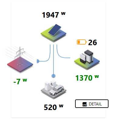
                - component: f7-block
                  config:
                    style:
                      align-items: center
                      display: flex
                      flex-direction: column
                      height: 110px
                      justify-content: center
                      margin-top: 250px
                      width: 0px
                  slots:
                    default:
                      - component: oh-button
                        config:
                          iconF7: graph_square_fill
                          color: grey
                          text: DETAIL
                          outline: true
                          action: navigate
                          actionPage: page:page_6951b7703d
                          style:
                            width: 110px
                            margin-right: 110px
But it’s not a nice solution and I want ask, if it’s possible do this jump when I will click on the widget.
Matze0211
(Matthias)
2
You should be able to set an action on nearly any component.
Therefore just modify you’re widget and copy the action related code
alda1
(Alex Needle)
3
where to place action when widget is touched ?
Matze0211
(Matthias)
4
Post your widget code and we can help you.
But it should be the most top component, where the action is added to the config
alda1
(Alex Needle)
5
here is
thank you
uid: SMA_widget_MOD_by_ALDA
tags: []
props:
parameters:
- context: item
label: Grid L1
name: Grid_L1
required: true
type: TEXT
- context: item
label: Complete consumption L1
name: complete_L1
required: true
type: TEXT
- context: item
label: PV Production
name: pv_leistung
required: true
type: TEXT
- context: item
label: Battery Power
name: batterieleistung
required: true
type: TEXT
- context: item
label: Batterie SOC
name: batterylevel
required: true
type: TEXT
parameterGroups: []
timestamp: Sep 14, 2022, 8:05:51 PM
component: f7-card
config:
class:
- display-flex
- flex-direction-column
- align-items-center
style:
height: 383px
slots:
content:
- component: f7-block
config:
style:
--f7-theme-color: var(--f7-text-color)
display: flex
justify-content: space-between
padding: 0
slots:
default:
- component: f7-col
config:
style:
align-items: center
display: flex
flex-direction: row
slots:
default:
- component: f7-block
config:
style:
align-items: center
display: flex
flex-direction: column
height: 110px
justify-content: center
margin-top: 0
width: 110px
slots:
default:
- component: oh-icon
config:
height: 110px
icon: sma_grid_2
- component: Label
config:
style:
color: '=(Number.parseFloat(items[props.Grid_L1].state.split(" ")[0]) >= 0) ? "red" : "green"'
font-size: 25px
font-weight: bold
margin-top: -10px
text-align: center
width: 100px
text: = items[props.Grid_L1].state + ' ᵂ'
- component: f7-col
config:
style:
align-items: center
display: flex
flex-direction: column
flex-grow: 1
slots:
default:
- component: f7-block
config:
style:
align-items: center
display: flex
flex-direction: column
height: 110px
justify-content: center
margin-top: 0
width: 110px
slots:
default:
- component: Label
config:
style:
font-size: 25px
font-weight: bold
text-align: center
width: 100px
text: =Math.round(items[props.pv_leistung].state) + ' ᵂ'
- component: oh-icon
config:
height: 110px
icon: sma_pv_2
style:
margin-top: -20px
- component: f7-block
config:
style:
display: flex
justify-content: center
margin: 0
padding: 0
width: 100%
slots:
default:
- component: f7-row
config:
preserveAspectRatio: xMidYMid slice
style:
height: auto
width: auto
tag: svg
viewBox: 0 0 100 100
xmlns: http://www.w3.org/2000/svg
slots:
default:
- component: f7-row
config:
d: M60 -5 v10 c0 30 10 35 30 35 h20
fill: none
id: path1
stroke: rgba(100, 150, 200, 0.8)
stroke-width: 2
tag: path
vector-effect: non-scaling-stroke
visible: '=(Number.parseFloat(items[props.batterieleistung].state.split(" ")[0]) > 0) ? true : false'
- component: f7-row
config:
fill: rgba(100, 150, 200, 0.8)
r: 6
style:
stroke-width: 4
tag: circle
vector-effect: non-scaling-stroke
visible: '=(Number.parseFloat(items[props.batterieleistung].state.split(" ")[0]) > 0) ? true : false'
slots:
default:
- component: f7-row
config:
calcMode: linear
dur: 4s
repeatCount: indefinite
tag: animateMotion
slots:
default:
- component: f7-row
config:
tag: mpath
xlink:href: "#path1"
- component: f7-row
config:
d: M40 -5 v20 c0 40 -10 35 -30 35 h-10
fill: none
id: path2
stroke: rgba(100, 150, 200, 0.8)
stroke-width: 2
tag: path
vector-effect: non-scaling-stroke
visible: '=(Number.parseFloat(items[props.Grid_L1].state.split(" ")[0]) < 0) ? true : false'
- component: f7-row
config:
fill: rgba(100, 150, 200, 0.8)
r: 6
strokeWidth: 10
tag: circle
vectorEffect: non-scaling-stroke
visible: '=(Number.parseFloat(items[props.Grid_L1].state.split(" ")[0]) < 0) ? true : false'
slots:
default:
- component: f7-row
config:
calcMode: linear
dur: 4s
repeatCount: indefinite
tag: animateMotion
slots:
default:
- component: f7-row
config:
tag: mpath
xlink:href: "#path2"
- component: f7-row
config:
d: M50, 0 v100
fill: none
id: path3
stroke: rgba(100, 150, 200, 0.8)
stroke-width: 2
tag: path
vector-effect: non-scaling-stroke
visible: '=(Number.parseFloat(items[props.pv_leistung].state.split(" ")[0])) > 0) ? true : false'
- component: f7-row
config:
fill: rgba(100, 150, 200, 0.8)
r: 6
strokeWidth: 10
tag: circle
vectorEffect: non-scaling-stroke
visible: '=(Number.parseFloat(items[props.pv_leistung].state.split(" ")[0])) > 0) ? true : false'
slots:
default:
- component: f7-row
config:
calcMode: linear
dur: 4s
repeatCount: indefinite
tag: animateMotion
slots:
default:
- component: f7-row
config:
tag: mpath
xlink:href: "#path3"
- component: f7-row
config:
d: M-5 50 l10 0 c40 0 35 10 35 50 l 0 20
fill: none
id: path4
stroke: rgba(100, 150, 200, 0.8)
stroke-width: 2
tag: path
vector-effect: non-scaling-stroke
visible: '=(Number.parseFloat(items[props.Grid_L1].state.split(" ")[0]) > 0) ? true : false'
- component: f7-row
config:
fill: rgba(100, 150, 200, 0.8)
r: 6
strokeWidth: 10
tag: circle
vectorEffect: non-scaling-stroke
visible: '=(Number.parseFloat(items[props.Grid_L1].state.split(" ")[0]) > 0) ? true : false'
slots:
default:
- component: f7-row
config:
calcMode: linear
dur: 4s
repeatCount: indefinite
tag: animateMotion
slots:
default:
- component: f7-row
config:
tag: mpath
xlink:href: "#path4"
- component: f7-row
config:
d: M 105 50 l -10 0 c -40 0 -35 10 -35 50 l 0 20
fill: none
id: path5
stroke: rgba(100, 150, 200, 0.8)
stroke-width: 2
tag: path
vector-effect: non-scaling-stroke
visible: '=(Number.parseFloat(items[props.batterieleistung].state.split(" ")[0]) < 0) ? true : false'
- component: f7-row
config:
fill: rgba(100, 150, 200, 0.8)
r: 6
strokeWidth: 10
tag: circle
vectorEffect: non-scaling-stroke
visible: '=(Number.parseFloat(items[props.batterieleistung].state.split(" ")[0]) < 0) ? true : false'
slots:
default:
- component: f7-row
config:
calcMode: linear
dur: 4s
repeatCount: indefinite
tag: animateMotion
slots:
default:
- component: f7-row
config:
tag: mpath
xlink:href: "#path5"
- component: f7-block
config:
style:
align-items: center
display: flex
flex-direction: column
height: 110px
justify-content: center
margin-top: -10px
width: 110px
slots:
default:
- component: oh-icon
config:
color: orange
height: 110px
icon: sma_consumption_2
- component: Label
config:
style:
font-size: 25px
font-weight: bold
margin-top: -10px
text-align: center
width: 100px
text: =items[props.complete_L1].state + ' ᵂ'
- component: f7-col
config:
style:
align-items: center
display: flex
flex-direction: row
slots:
default:
- component: f7-block
config:
style:
align-items: center
display: flex
flex-direction: column
height: 110px
justify-content: center
margin-top: -40px
width: 110px
slots:
default:
- component: oh-link
config:
iconColor: red
iconF7: battery_0
iconSize: 33px
style:
font-size: 25px
font-weight: bold
white-space: nowrap
text: =items[props.batterylevel].state
visible: '=(Number.parseFloat(items[props.batterylevel].state.split(" ")[0]) < 10) ? true : false'
- component: oh-link
config:
iconColor: orange
iconF7: battery_25
iconSize: 33px
style:
font-size: 25px
font-weight: bold
white-space: nowrap
text: =items[props.batterylevel].state
visible: '=(Number.parseFloat(items[props.batterylevel].state.split(" ")[0]) >= 10 && Number.parseFloat(items[props.batterylevel].state.split(" ")[0]) < 75) ? true : false'
- component: oh-link
config:
iconColor: green
iconF7: battery_100
iconSize: 33px
style:
font-size: 25px
font-weight: bold
white-space: nowrap
text: =items[props.batterylevel].state
visible: '=(Number.parseFloat(items[props.batterylevel].state.split(" ")[0]) >= 75) ? true : false'
- component: oh-icon
config:
height: 110px
icon: sma_battery_2
style:
margin-top: -20px
- component: Label
config:
style:
color: '=(Number.parseFloat(items[props.batterieleistung].state.split(" ")[0]) <= 0) ? "red" : "green"'
font-size: 25px
font-weight: bold
margin-top: -10px
text-align: center
white-space: nowrap
width: 100px
text: =Math.abs(Number.parseFloat(items[props.batterieleistung].state.split(" ")[0])) + ' ᵂ'
visible: '=(Number.parseFloat(items[props.batterieleistung].state.split(" ")[0]) !== 0) ? true : false'
- component: f7-block
config:
style:
align-items: center
display: flex
flex-direction: column
height: 110px
justify-content: center
margin-top: 250px
width: 0px
slots:
default:
- component: oh-button
config:
iconF7: graph_square_fill
color: grey
text: DETAIL
outline: true
action: navigate
actionPage: page:page_6951b7703d
style:
width: 110px
margin-right: 110px
Matze0211
(Matthias)
6
Your top component is the component: f7-card element.
You should be able to add the action and actionPage config from the button to this element
alda1
(Alex Needle)
7
like this ?
component: f7-card
config:
  action: navigate
  actionPage: page:page_6951b7703d
  class:
    - display-flex
    - flex-direction-column
    - align-items-center
  style:
    height: 383px
slots:
  content:
    - component: f7-block
      config:
        style:
          --f7-theme-color: var(--f7-text-color)
          display: flex
          justify-content: space-between
          padding: 0
      slots:
Matze0211
(Matthias)
8
Yes, this should theoretically work.
Theoretically, because I’m traveling and cannot test it by myself.
You can just copy the widget code and save it with a different name /uid (first row), then it’s more easy to test and you will not break something.
Matze0211
(Matthias)
10
Most likely other components are on top of the layer, therefore the f7-card is in the background and technically you click on a different element.
As an easy workaround e.g. you could add the action to all the images, than you can at least click on an icon…
alda1
(Alex Needle)
11
Very good idea. YES, I added action under each oh-icon config and it’s working quite fine.
Thanks
