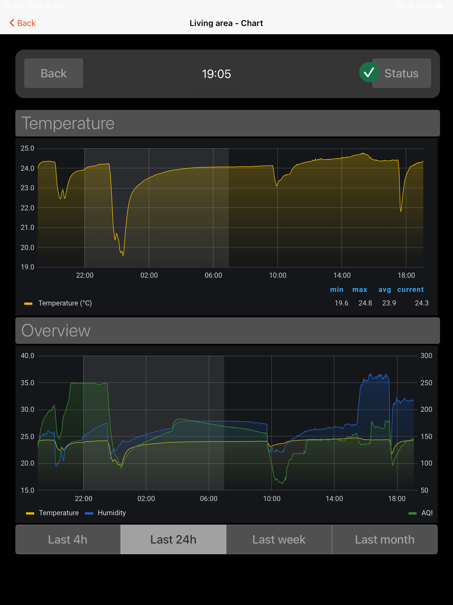
With great support by @BobMiles, @RGroll and @ysc I managed to create a widget to embed grafana charts with configurable time ranges.
If interested, you can find the whole discussion here.


Source URL:
Make sure you insert {period} inside the URL where you would want to have the time range pasted.
Example:
http://192.168.0.13:3000/d-solo/4OdYJNbMk/energie-pv-haus?orgId=1&refresh=1m&from=now-{period}&to=now&panelId=2
Resources
Full widget YAML (updated 2021-04-05: segmented “strong” removed):
uid: Grafana chart with timeranges
tags: []
props:
  parameters:
    - description: Title of the chart
      label: Title
      name: title
      required: false
      type: TEXT
    - description: Footer of the chart
      label: Footer
      name: footer
      required: false
      type: TEXT
    - description: URL to show in the frame
      label: Source URL
      name: URL
      required: true
      type: TEXT
    - description: Comma-separated list of options. Use value=label format (e.g. 1d=1 day) to provide a label different than the option. Minimum 1 entry required. The first entry is the default timerange.
      label: Time range options
      name: timerange
      required: true
      type: TEXT
    - description: Height of the Frame (empty = default)
      label: Height
      name: height
      required: false
      type: TEXT
  parameterGroups: []
timestamp: Mar 21, 2021, 5:17:50 PM
component: f7-card-content
config:
  style:
    --f7-card-margin-horizontal: 0px
    --f7-card-margin-vertical: 3px
    --f7-card-content-padding-horizontal: 10px
    --f7-card-content-padding-vertical: 10px
slots:
  default:
    - component: oh-webframe-card
      config:
        title: =props.title
        borders: false
        noBorder: false
        outline: true
        height: =props.height
        src: =props.URL.replace('{period}', vars.selectedPeriod || [props.timerange.split(',')[0].split('=')[0]])
        footer: =props.footer
        class:
          - display-block
    - component: f7-segmented
      config:
        round: false
        outline: false
        style:
          --f7-button-bg-color: rgba(255, 255, 255, 0.05)
      slots:
        default:
          - component: oh-repeater
            config:
              sourceType: range
              for: size
              fragment: true
            slots:
              default:
                - component: oh-repeater
                  config:
                    fragment: true
                    for: period
                    in: =[props.timerange.split(",")[loop.size].split("=")[1]]
                  slots:
                    default:
                      - component: oh-button
                        config:
                          text: =loop.period
                          fill: "=(([props.timerange.split(',')[loop.size].split('=')[0]] == vars.selectedPeriod) || (props.timerange.split(',')[0].split('=')[1] === loop.period) && !vars.selectedPeriod) ? true : false"
                          round: false
                          outline: true
                          style:
                            --f7-button-font-size: 14px
                            --f7-button-font-weight: 300
                            --f7-button-text-transform: none
                            --f7-button-border-width: 1px
                            --f7-button-text-color: white
                            --f7-button-border-color: rgba(255,255,255,.15)
                            --f7-button-padding-vertical: 0px
                            --f7-button-padding-horizontal: 0px
                            --f7-button-fill-hover-bg-color: rgba(var(--f7-theme-color-rgb), 1)
                          action: variable
                          actionVariable: selectedPeriod
                          actionVariableValue: =props.timerange.split(",")[loop.size].split("=")[0]
New version with more flexible implementation of time ranges:
Changelog:
v02: added default timeranges in props
uid: Grafana chart with timeranges v02
tags: []
props:
  parameters:
    - description: Title of the chart
      label: Title
      name: title
      required: false
      type: TEXT
    - description: URL to show in the frame
      label: Source URL
      name: URL
      required: true
      type: TEXT
    - default: from=now-6h&to=now;6h,from=now-12h&to=now;12h,from=now-1d&to=now;24h,from=now/d&to=now/d;Day,from=now-3d&to=now;Last 3 Days,from=now-7d&to=now;Last 7 Days,from=now-14d&to=now;Last 14 Days
      description: Comma-separated List of options. Example "from=now-6h&to=now;-6h,from=now-1d/d&to=now-1d/d;yesterday" for past "6h" and "yesterday". First entry is default.
      label: Time range options
      name: timerange
      required: true
      type: TEXT
    - description: Height of the Frame (empty = default)
      label: Height
      name: height
      required: false
      type: TEXT
  parameterGroups: []
timestamp: Apr 23, 2021, 4:40:01 PM
component: f7-card
config:
  title: =props.title
  outline: true
  style:
    --f7-card-margin-horizontal: 10px
    --f7-card-margin-vertical: 3px
    --f7-card-padding-horizontal: 10px
    --f7-card-padding-vertical: 100px
    margin-top: 10px
    margin-bottom: 10px
    noShadow: false
    border-radius: var(--f7-card-expandable-border-radius)
    box-shadow: 5px 5px 10px 1px rgba(0,0,0,0.3)
slots:
  default:
    - component: oh-webframe-card
      config:
        borders: false
        noBorder: false
        noShadow: true
        height: =props.height
        src: =props.URL.replace('{period}', vars.selectedPeriod || [props.timerange.split(',')[0].split(';')[0]])
        class:
          - display-block
    - component: f7-segmented
      config:
        round: false
        outline: false
        class:
          - padding-bottom-half
        style:
          margin-left: 10px
          margin-right: 10px
          --f7-button-font-size: 14px
          --f7-button-text-color: "=themeOptions.dark === 'light' ? 'black' : 'white'"
          --f7-button-text-transform: none
          --f7-button-border-radius: 4px
          --f7-button-outline-border-width: 1px
          --f7-button-font-weight: 300
          --f7-button-padding-vertical: 0px
          --f7-button-padding-horizontal: 0px
      slots:
        default:
          - component: oh-repeater
            config:
              sourceType: range
              for: size
              fragment: true
            slots:
              default:
                - component: oh-repeater
                  config:
                    fragment: true
                    for: period
                    in: =[props.timerange.split(",")[loop.size].split(";")[1]]
                  slots:
                    default:
                      - component: oh-button
                        config:
                          text: =loop.period
                          fill: "=(([props.timerange.split(',')[loop.size].split(';')[0]] == vars.selectedPeriod) || (props.timerange.split(',')[0].split(';')[1] === loop.period) && !vars.selectedPeriod) ? true : false"
                          round: false
                          outline: true
                          style:
                            --f7-button-border-color: var(--f7-card-outline-border-color)
                          action: variable
                          actionVariable: selectedPeriod
                          actionVariableValue: =props.timerange.split(",")[loop.size].split(";")[0]
This one requires adjustment in the widget props as follows:
config:
  URL: http://192.168.0.13:3000/d-solo/4OdYJNbMk/energie-pv-haus?orgId=1&refresh=1m&theme=light&{period}&panelId=2
  timerange: from=now-6h&to=now;6h,from=now-12h&to=now;12h,from=now-1d&to=now;24h,from=now/d&to=now/d;Tag,from=now-1d/d&to=now-1d/d;Tag-1,from=now-2d/d&to=now-2d/d;Tag-2
Hope some of you find it useful 


 The ‘regular’ segmented looks much nicer, using that too now: