I have this on my overview:
and when I hover the mouse it shows what the icons are.
Here is the code:
component: oh-cell
config:
  action: popup
  actionModal: widget:Status-list-metadata-door-window-blinds
  actionModalConfig:
    item: gDoors
    prop1: DOOR
  footer: Windows Doors Curtains Blinds Shed
  icon: f7:menu
  title: Click to find the open items
slots:
  background:
    - component: f7-block
      config:
        class:
          - card-opened-fade-out
        style:
          bottom: 10px
          position: absolute
          right: 10px
      slots:
        default:
          - component: f7-chip
            config:
              iconColor: "=((items.Gate_opener_status.state) === 'OPEN') ? 'red' : 'green'"
              iconF7: "=((items.Gate_opener_status.state) === 'OPEN') ? 'lock_open' : 'lock'"
              iconSize: 18
              style:
                --f7-chip-bg-color: rgba(255, 255, 255, 0)
              text: "=((items.Gate_opener_status.state) === 'OPEN') ? '1' : ''"
              textColor: "=((items.Gate_opener_status.state) === 'OPEN') ? 'red' : 'green'"
              tooltip: Gate
              visible: =items.Gate_opener_status.state === 'OPEN'
          - component: f7-chip
            config:
              iconColor: "=(Number(items.gwindowscount.state) > 0) ? 'red' : 'green'"
              iconMaterial: "=(Number(items.gwindowscount.state) > 0) ? 'window' : 'lock'"
              iconSize: 18
              style:
                --f7-chip-bg-color: rgba(255, 255, 255, 0)
              text: "=(Number(items.gwindowscount.state) > 0) ? items.gwindowscount.state :
                ''"
              textColor: "=(Number(items.gwindowscount.state) > 0) ? 'red' : 'green'"
              tooltip: Windows
          - component: f7-chip
            config:
              iconColor: "=(Number(items.gdoorcount.state) > 0) ? 'red' : 'green'"
              iconMaterial: "=(Number(items.gdoorcount.state) > 0) ? 'door_front' : 'lock'"
              iconSize: 18
              style:
                --f7-chip-bg-color: rgba(255, 255, 255, 0)
              text: "=(Number(items.gdoorcount.state) > 0) ? items.gdoorcount.state : ''"
              textColor: "=(Number(items.gdoorcount.state) > 0) ? 'red' : 'green'"
              tooltip: Doors
          - component: f7-chip
            config:
              iconColor: "=(Number(items.gcurtaincount.state) > 0) ? 'red' : 'green'"
              iconMaterial: "=(Number(items.gcurtaincount.state) > 0) ? 'curtains' : 'lock'"
              iconSize: 18
              style:
                --f7-chip-bg-color: rgba(255, 255, 255, 0)
              text: "=(Number(items.gcurtaincount.state) > 0) ? items.gcurtaincount.state :
                ''"
              textColor: "=(Number(items.gcurtaincount.state) > 0) ? 'red' : 'green'"
              tooltip: Curtains
          - component: f7-chip
            config:
              iconColor: "=(Number(items.gblindscount.state) > 0) ? 'red' : 'green'"
              iconMaterial: "=(Number(items.gblindscount.state) > 0) ? 'roller_shades' :
                'lock'"
              iconSize: 18
              style:
                --f7-chip-bg-color: rgba(255, 255, 255, 0)
              text: "=(Number(items.gblindscount.state) > 0) ? items.gblindscount.state : ''"
              textColor: "=(Number(items.gblindscount.state) > 0) ? 'red' : 'green'"
              tooltip: Blinds house
          - component: f7-chip
            config:
              iconColor: "=(Number(items.gwindowsshedcount.state) > 0) ? 'red' : 'green'"
              iconMaterial: "=(Number(items.gwindowsshedcount.state) > 0) ? 'window' : 'lock'"
              iconSize: 18
              style:
                --f7-chip-bg-color: rgba(255, 255, 255, 0)
              text: "=(Number(items.gwindowsshedcount.state) > 0) ?
                items.gwindowsshedcount.state : ''"
              textColor: "=(Number(items.gwindowsshedcount.state) > 0) ? 'red' : 'green'"
              tooltip: Windows shed
          - component: f7-chip
            config:
              iconColor: "=(Number(items.gblindscountshed.state) > 0) ? 'red' : 'green'"
              iconMaterial: "=(Number(items.gblindscountshed.state) > 0) ? 'roller_shades' :
                'lock'"
              iconSize: 18
              style:
                --f7-chip-bg-color: rgba(255, 255, 255, 0)
              text: "=(Number(items.gblindscountshed.state) > 0) ?
                items.gblindscountshed.state : ''"
              textColor: "=(Number(items.gblindscountshed.state) > 0) ? 'red' : 'green'"
              tooltip: Blinds shed
          - component: f7-chip
            config:
              iconColor: "=(Number(items.gshedcounter.state) > 0) ? 'red' : 'green'"
              iconMaterial: "=(Number(items.gshedcounter.state) > 0) ? 'directions_car' :
                'lock'"
              iconSize: 18
              style:
                --f7-chip-bg-color: rgba(255, 255, 255, 0)
              text: "=(Number(items.gshedcounter.state) > 0) ? items.gshedcounter.state : ''"
              textColor: "=(Number(items.gshedcounter.state) > 0) ? 'red' : 'green'"
              tooltip: Doors shed
          - component: f7-chip
            config:
              iconColor: "=((items.SonoffTH16_door_status.state) == 'OPEN') ? 'red' : 'green'"
              iconMaterial: "=((items.SonoffTH16_door_status.state) == 'OPEN') ? 'warehouse' :
                'lock'"
              iconSize: 18
              style:
                --f7-chip-bg-color: rgba(255, 255, 255, 0)
              text: "=((items.SonoffTH16_door_status.state) == 'OPEN') ? '1' : ''"
              textColor: "=((items.SonoffTH16_door_status.state) == 'OPEN') ? 'red' : 'green'"
              tooltip: Door container
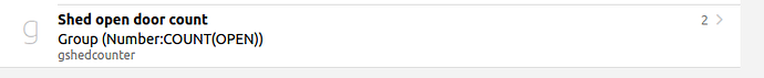
The counter items are set up like this:
I don’t know if this is what you are looking for but feel free to modify it.
The widget I use when the cell is clicked Status-list-metadata-door-window-blinds:
uid: Status-list-metadata-door-window-blinds
tags: []
props:
  parameters:
    - default: door
      description: Tag group name
      label: Tag name to search
      name: prop1
      required: true
      type: TEXT
    - default: WINDOW
      description: Tag group name
      label: Tag name to search
      name: prop2
      required: true
      type: TEXT
    - default: BLINDS
      description: Tag group name
      label: Tag name to search
      name: prop3
      required: true
      type: TEXT
  parameterGroups: []
timestamp: Mar 2, 2025, 8:54:04 AM
component: oh-list
config:
  style:
    --f7-list-item-after-font-size: 12px
    --f7-list-item-after-font-weight: bold
    --f7-list-item-after-text-color: var(--f7-text-color)
    min-width: 250px
slots:
  default:
    - component: oh-repeater
      config:
        display: contents
        for: index
        itemTags: =props.prop1
        sourceType: itemsWithTags
      slots:
        default:
          - component: oh-list-item
            config:
              badge: =loop.index.state
              badgeColor: '=(loop.index.state === "OPEN") ? "red" : "green"'
              icon: '=(loop.index.state === "OPEN") ? "f7:lock_open" : "f7:lock"'
              iconColor: '=(loop.index.state === "OPEN") ? "red" : "green"'
              iconUseState: true
              title: =loop.index.label
    - component: oh-repeater
      config:
        display: contents
        for: index
        itemTags: =props.prop2
        sourceType: itemsWithTags
      slots:
        default:
          - component: oh-list-item
            config:
              badge: =loop.index.state
              badgeColor: '=(loop.index.state === "OPEN") ? "blue" : "green"'
              icon: '=(loop.index.state === "OPEN") ? "f7:lock_open" : "f7:lock"'
              iconColor: '=(loop.index.state === "OPEN") ? "red" : "green"'
              iconUseState: true
              title: =loop.index.label
    - component: oh-repeater
      config:
        display: contents
        for: index
        itemTags: =props.prop3
        sourceType: itemsWithTags
      slots:
        default:
          - component: oh-list-item
            config:
              badge: =loop.index.state
              badgeColor: '=(loop.index.state === "OPEN")||(loop.index.state === "100") ?
                "orange" : "green"'
              icon: '=(loop.index.state === "OPEN")||(loop.index.state === "100") ?
                "f7:lock_open" : "f7:lock"'
              iconColor: '=(loop.index.state === "OPEN")||(loop.index.state === "0") ? "red" :
                "green"'
              iconUseState: true
              title: =loop.index.label
It looks like this:

 . You have to be more specific.


