Issues with Layout of my widget

Hi all,
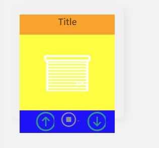
I have issues creating my first own widget, can someone help me setting the right layout here? (color are just to understand what’s happening there
My challenges:

  • I don’t understand why the height percentage value has no impact on the visualization and the last row overlaps the complete card
  • I want to have the arrows next to the stop button (left one, right aligned, right one left aligned)
  • The buttons are cutted
  • There are small red dots next to the buttons, I don’t know why
  • When I press a button on a tablet, not only the button is somehow highlighted but the complete cell

Result:
image

uid: Kachel_Garagentor
tags: []
props:
  parameters:
  ...
  parameterGroups: []
timestamp: Oct 14, 2022, 10:49:26 PM
component: f7-card
config:
  noShadow: false
  padding: false
  style:
    --f7-card-header-border-color: transparent
    border-radius: 10px
    box-shadow: 5px 5px 15px 1px rgba(0,0,0,0.05)
    padding: 0px
    background-color: rgba(240,240,240)
    width: 200px
    height: 200px
slots:
  default:
    - component: f7-card-content
      slots:
        default:
          - component: f7-progressbar
            config:
              infinite: true
              style:
                --f7-progressbar-height: 2px
                bottom: 0px
                left: 0px
                position: absolute
              visible: "=items[props.GarageDoorMoves].state === 'OPEN' ? true : false"
          - component: f7-row
            config:
              class:
                - display-flex
                - justify-content-center
                - align-items-flex-start
              style:
                height: 10%
                background-color: orange
            slots:
              default:
                - component: f7-block-header
                  slots:
                    default:
                      - component: Label
                        config:
                          style:
                            font-size: 1.2em
                            font-weight: 600
                          text: "=props.title"
          - component: f7-row
            config:
              class:
                - justify-content-center
                - align-items-flex-start
              style:
                height: 65%
                background-color: yellow
            slots:
              default:
                - component: oh-image
                  config:
                    style:
                      width: 80%
                    url: "='/static/icons/' + props.iconFolder + '/' + Math.round(items[props.garageDoorStatus].state) +'.png'"
                    visible: "true"
          - component: f7-row
            config:
              style:
                height: 25%
                background-color: blue
              class:
                - justify-content-center
            slots:
              default:
                - component: f7-col
                  config:
                  slots:
                    default:
                      - component: oh-button
                        config:
                          action: command
                          actionCommand: UP
                          actionItem: =props.RollerItem
                          iconColor: teal
                          iconF7: arrow_up_circle
                          iconSize: 40
                          style:
                            background: transparent
                            height: 40px
                            z-index: 98
                - component: f7-col
                  slots:
                    default:
                      - component: oh-button
                        config:
                          action: command
                          actionCommand: STOP
                          actionItem: =props.RollerItem
                          iconColor: gray
                          iconF7: stop_circle
                          iconSize: 30
                          style:
                            background: transparent
                            height: 30px
                            z-index: 98
                - component: f7-col
                  slots:
                    default:
                      - component: oh-button
                        config:
                          action: command
                          actionCommand: DOWN
                          actionItem: =props.RollerItem
                          iconColor: teal
                          iconF7: arrow_down_circle
                          iconSize: 40
                          style:
                            background: transparent
                            height: 40px
                            z-index: 98
                

The way css calculates the height of an element, % only works as a unit if the element’s direct parent has a defined height. In this case the direct parent of the three rows is the f7-card-content:

    - component: f7-card-content
      slots:
        default:
          ...

With no height styling it is just fitting its height to its content and this creates a loop if you try to use percent because the child asks the parent “what’s your height, I want to be 1/10th of that.” and the parent responds “I won’t know my height until I know your height.” Fixing this is easy, you just have to set the card content height explicitly, and presumably you want it to fill the card, so:

    - component: f7-card-content
      config:
        style:
          height: 100%
      slots:
        default:
          ...

In this case, the f7-col are extraneous and adding some margin and padding you don’t want. You can just get rid of them and have the buttons as direct children of the f7-row.

You can solve the first two of these issues (and probably also the third) by just using an oh-link instead of an oh-button. The oh-button comes with a lot of built-in style settings and these are interfering with what you want to do. Yon don’t even need to change any of the other properties, just change oh-button to oh-link and you should get what you’re looking for.

1 Like

Thank you for the good explanation.
But I still have an issue here:

component: f7-card
config:
  style:
    --f7-card-header-border-color: transparent
    position: relative
    border-radius: 10px
    box-shadow: 5px 5px 15px 1px rgba(0,0,0,0.05)
    background-color: rgb(233,250,200)
    width: 100%
    display: block
    padding-bottom: 100%
slots:
  default:
    - component: f7-card-content
      config:
        style:
          background-color: rgba(0,0,0,0.5)
          position: absolute
          width: 100%
          height: 100%

The card-content overlaps the parent f7-card. I think because of the shadow?
card-content is only working when I set the position to absolute. I tried to reduce the height by calc(100%-15px) but then the height is reduced to a minimum height.
Any suggestions here?

The card content comes with a default padding of 16px on each edge. Because the default box-sizing is for the content box inside the padding, when you set the width and height to 100% of the card the content gets that size and then the padding is added on after that, making the entire element l;arger than the card. There are two possible fixes then:

  1. Get rid of the padding with padding: 0
  2. Tell css to include the padding in the size calculation with box-sizing: border-box