MainUI Widget with graphical timeline of item historical states

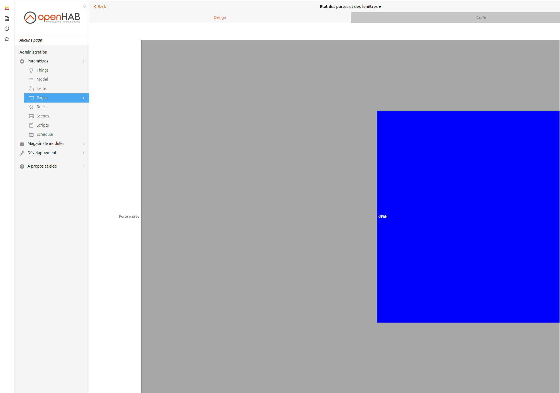
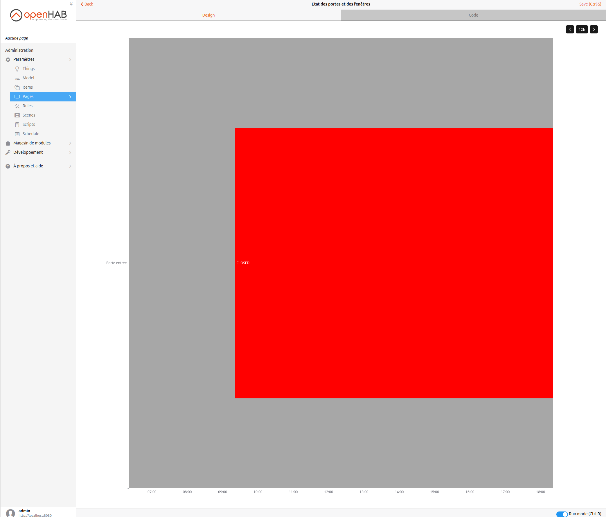
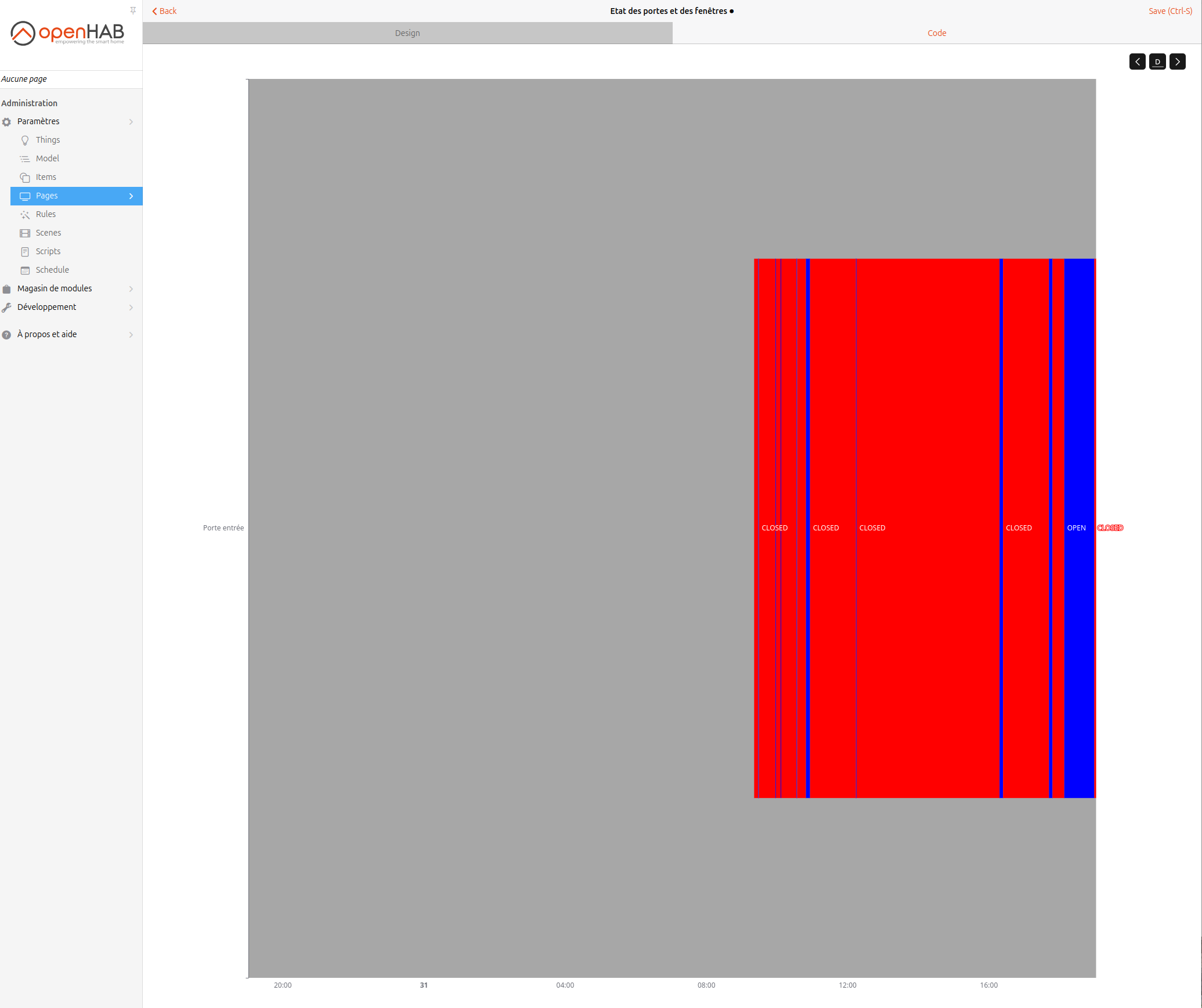
I wanted a MainUI widget that displays the historical state of an item.

I wrote a JS rule that processes each item I want to display as such into a new item holding a JSON string that can later be ingested by a MainUI repeater widget. The rule maps item states to labels and colours. This looks like this in the end:

This is the JS rule to process, it needs to be adapted to each item possible values, in this version I process a Contact item.

You need to create a String item with the same name as the item which value you want to display and the _HIST suffix. This item should not be persisted. I added all the items I wanted to process in a dedicated gTimelineWidget group.

This is my first attempt to the subject, it is not very flexible and has lots of room for improvements. You’ll need to modify the rule and the widget to display something else than 24h (processGroupMember function and labels at the end of the widget.)

If the widget constantly change states, it might tax a bit too much the CPU to compute the string item as it is fully reprocessed for each change.

rules.JSRule({
    name: "Historic state query for gTimelineWidget members",
    description: "Queries historic state of all members of a group for the last 24 hours on every change",
    triggers: [
        triggers.GroupStateChangeTrigger("gTimelineWidget"),
        triggers.GenericCronTrigger("0 */5 * * * ?") // Run every 5 minutes
    ],
    execute: (data) => {
        // If triggered by cron, process all members
        if (data.cronExpression) {
            processGroupMembers("gTimelineWidget");
        } else {
            // Otherwise process only the changed item
            var changedItemName = data.itemName;
            processGroupMember(changedItemName);
        }
    }
});

// Process all group members' historic states on file reload
processGroupMembers("gTimelineWidget");

function processGroupMembers(groupName) {
    var group = items.getItem(groupName);
    group.members.forEach(member => {
        processGroupMember(member.name);
    });
}

function processGroupMember(itemName) {
    var member = items.getItem(itemName);
    var now = new Date();
    var start =  time.Instant.ofEpochMilli(new Date(now.getTime() - (24 * 3600 * 1000)).getTime());
    var queryStart = new Date(now.getTime() - (25 * 3600 * 1000));

    var histItemName = itemName + "_HIST";

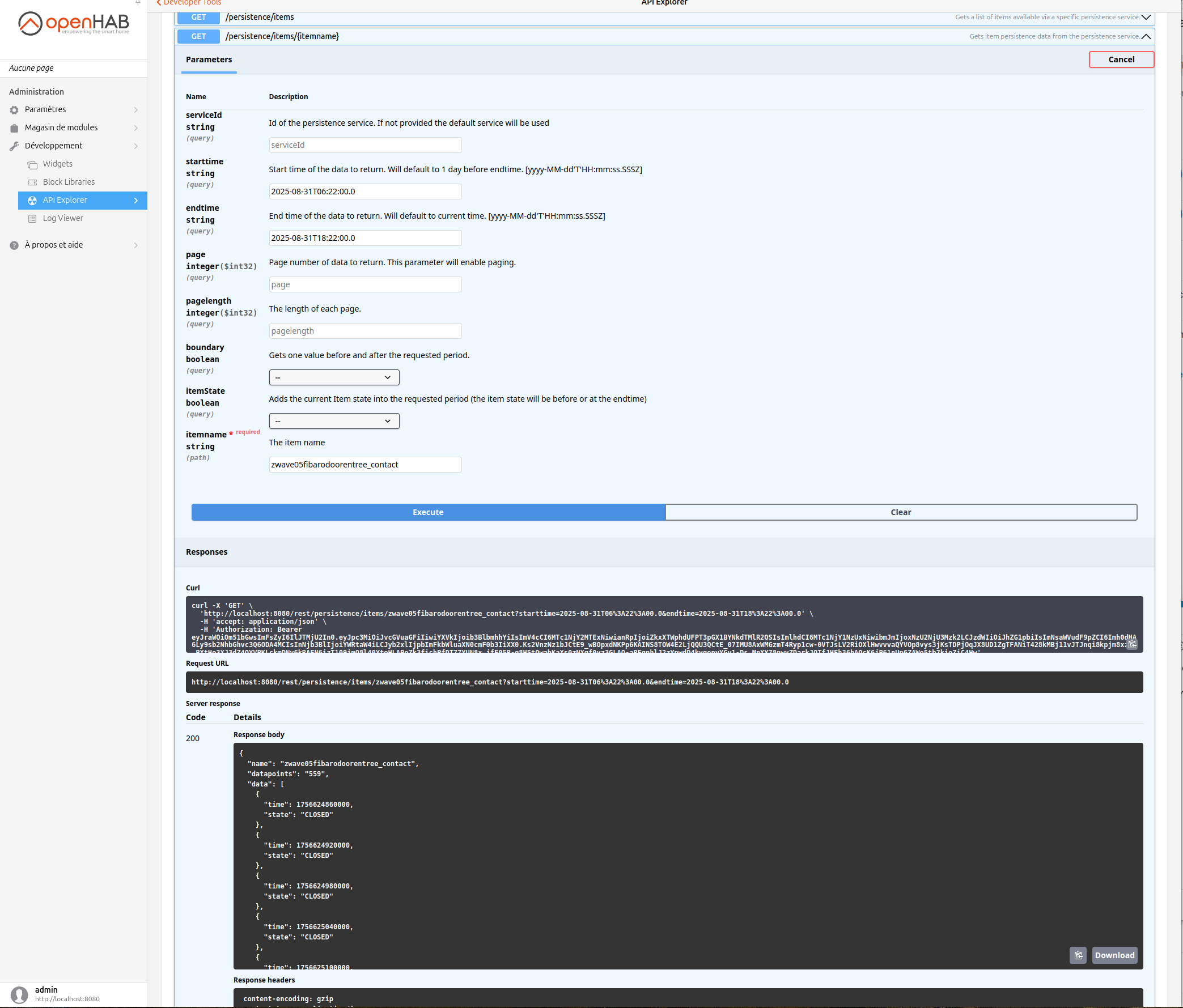
    var historicStates = member.persistence.getAllStatesSince(queryStart);
    
    var result = [];
    var previousTime = start;

    // console.log("Processing item: " + itemName);
    // console.log("Historic states count: " + historicStates.length);
    // console.log("Start time: " + start);
    // historicStates.forEach(persisted => {
    //     console.log("State: " + persisted.state + ", Timestamp: " + persisted.instant);
    // })

    // Initialize first data point either at first provided state or at start time
    var previousState = null;
    var previousTime = start;
    if (historicStates[0]?.instant.isBefore(previousTime)) {
        previousTime = historicStates[0]?.instant;
    }

    historicStates.push({
        state: member.state,
        instant: time.Instant.ofEpochMilli(now.getTime())
    })

    // The list of states may not begin before start, in that case the first state is null
    // Process each historic state
    historicStates.forEach((persisted, idx) => {
        // If the state is different from the previous state or if it is the last, process the state
        if (persisted.state != previousState || idx == historicStates.length - 1) {
            // If the state is after the start time, create a new entry
            if (persisted.instant.isAfter(start)) {
                // Clamp to start of period for duration calculation
                var duration = (previousTime.isBefore(start) ? start : previousTime).until(persisted.instant, time.ChronoUnit.SECONDS);
                
                result.push({
                    dur: Math.round(duration*1000 / (24*3600))/10,
                    col: mapValueToColor(previousState),
                    txt: mapValueToText(previousState),
                    start: previousTime,
                    end: persisted.instant,
                })
            }

            previousState = persisted.state;
            previousTime = persisted.instant;
        }
    })

    var payload = {
        states: result,
        lastTxt: result[result.length - 1]?.txt,
        lastCol: result[result.length - 1]?.col,
        end: now
    }

    var json = JSON.stringify(payload);
    console.log("Result: " + json);

    // Send the result to the corresponding item
    items.getItem(histItemName).sendCommand(json);
}

function mapValueToColor(value) {
    // Implement your value-to-color mapping logic here
    if (value == "CLOSED") {
        return "rgb(56, 204, 101)";
    } else if (value == "OPEN") {
        return "red";
    } else {
        return "gray";
    }
}

function mapValueToText(value) {
    if (value == "CLOSED") {
        return "Vide";
    } else if (value == "OPEN") {
        return "Occupé";
    } else {
        return "N/A";
    }
}

The code of the custom widget is the following. It is a div so I don’t think it can be added directly to a layout, I embedded it in a custom card widget.

uid: vas_timeline_div
tags: []
props:
  parameters:
    - context: item
      description: Item holding history over the last period
      label: History item
      name: itmHist
      required: true
      type: TEXT
  parameterGroups: []
timestamp: Apr 9, 2025, 4:45:42 PM
component: oh-context
config:
  variables:
    key: =Math.random().toString(36).substring(2, 10);
    data: =JSON.parse(items[props.itmHist].state)
slots:
  default:
    - component: div
      config:
        stylesheet: |
          .timeline {
            display: flex;
            border-radius: 4px;
            overflow: hidden;
            background-color: transparent;
            margin: 0px;
            padding: 0px;
            width: 100%;
            flex-grow: 1;
          } .period-div {
            display: block;
            position: relative;
            font-size: 10px;
            padding: 0px;
            min-width: 0px;
          } .timeline-scale-container {
            width: 100%;
            display: flex;
            -webkit-box-pack: justify;
            justify-content: space-between;
          } .timeline-scale-label {
            flex: 1 1 0%;
            color: #808893;
            font-size: 10px
          }
        config: {}
      slots:
        default:
          - component: oh-repeater
            config:
              containerClasses: timeline
              for: repeat
              fragment: false
              in: =JSON.parse(items[props.itmHist].state).states
            slots:
              default:
                - component: f7-button
                  config:
                    class: period-div
                    popover-open: =".popover-patch-"+loop.repeat_idx+"-"+vars.key
                    style:
                      background-color: =loop.repeat.col + ' !important'
                      border-radius: 0
                      height: 8px
                      width: =loop.repeat.dur +'%'
                    text: =".popover-patch-"+loop.repeat_idx
                - component: f7-popover
                  config:
                    backdrop: false
                    class: =['popover', 'popover-patch-'+loop.repeat_idx+"-"+vars.key]
                    close-on-escape: true
                    style:
                      --f7-popover-bg-color: black
                      --f7-card-bg-color: black
                    text: =loop.repeat.txt
                    vertical-position: bottom
                  slots:
                    default:
                      - component: f7-card
                        config:
                          style:
                            color: white
                        slots:
                          default:
                            - component: Label
                              config:
                                text: =dayjs(loop.repeat.start).format('H:mm') + ' - ' +
                                  dayjs(loop.repeat.end).format('H:mm')
                            - component: div
                              slots:
                                default:
                                  - component: div
                                    config:
                                      style:
                                        border-radius: 50%
                                        display: inline-block
                                        width: 10px
                                        height: 10px
                                        background-color: =loop.repeat.col
                                  - component: Content
                                    config:
                                      text: =loop.repeat.txt
          - component: div
            config:
              class: timeline-scale-container
            slots:
              default:
                - component: span
                  config:
                    class: timeline-scale-label
                    content: "=items[props.itmHist].state.startsWith('{') ?
                      dayjs(JSON.parse(items[props.itmHist].state).end).subtrac\
                      t(24, 'hour').format('H:mm') : ''"
                - component: span
                  config:
                    class: timeline-scale-label
                    content: "=items[props.itmHist].state.startsWith('{') ?
                      dayjs(JSON.parse(items[props.itmHist].state).end).subtrac\
                      t(12, 'hour').format('H:mm') : ''"
                    style:
                      text-align: center
                - component: span
                  config:
                    class: timeline-scale-label
                    content: Maintenant
                    style:
                      text-align: end

5 Likes

These are good candidates for the marketplace. The rule would be a rule template, obviously, and the widget a custom UI widget. See How to write a rule template for details on creating a rule template.

The advantage is users will be able to just install them same as an add-on and instantiate and configure these rather than copy/paste/edit.

It looks like your widget is already ready to go but the rule would need to be converted.

Note, there might be some improvements to creating rule templates comming in OH 5.

I agree, but for the moment I’ve never used, nor written marketplace widgets. The first one is always the hardest. I would of course not have any issue with anyone doing it instead of me :slight_smile:

Furthermore, I rather have in mind to create a built-in widget because it could also improve things performance-wise and would make sense as a complement to oh-trend.

Your code is done. All you’d have to do is follow the template presented when you create the posting to the marketplace. Nothing special needs to be done for UI widgets code wise. And most of the template is optional.

Just fill in the needed info. You’d paste the widget code in at the bottom in the indicated space.

The challenge with someone else doing it is then they are on the hook to keep it up and support it.

Existence of a marketplace option does not prevent the developers from adding features to OH and in a lot of cases it encourages them to do so. I’ve had several rule templates deprecated because what they do was added as a feature to OH (e.g. time is Item triggers, debounce mostly deprecated, hysteresis is mostly deprecated).

1 Like

I needed this feature as well and so took the time to implement a new oh-state-series and submitted a PR to the openhab-ui. Since I just submitted it, I don’t know when it will be accepted or included - hopefully in time for 5.0.

If you are up to give it a try and provide feedback, I compiled a version for use in openHAB 4.3. To install, just bundle:stop the existing MainUI and install this in the addons directory.

org.openhab.ui-4.3.6-SNAPSHOT.jar

Either a category axis can be used for the y-axis (pictured), or you can superimpose this state timeline on oh-value-axis with another graph.

Here is the YAML code for the chart shown:

config:
  label: Test Graph - State
slots:
  dataZoom:
    - component: oh-chart-datazoom
      config:
        type: inside
  grid:
    - component: oh-chart-grid
      config:
        show: false
  series:
    - component: oh-state-series
      config:
        gridIndex: 0
        item: Recirculating_Pump_Power
        name: Pump Power
        stateColor:
          OFF: rgba(255, 0, 0, .4)
          ON: rgba(0, 255, 0, .4)
        xAxisIndex: 0
        yAxisIndex: 0
        yValue: 1
    - component: oh-state-series
      config:
        gridIndex: 0
        item: HouseScene
        name: House Scene
        xAxisIndex: 0
        yAxisIndex: 0
        yValue: 0
    - component: oh-state-series
      config:
        gridIndex: 0
        item: Air_Temp
        name: Air Temp (Raw)
        xAxisIndex: 0
        yAxisIndex: 0
        yValue: 2
    - component: oh-state-series
      config:
        gridIndex: 0
        item: Air_Temp
        mapState: "=(point) => (point < 65) ? 'COLD' : (point > 77) ? 'HOT' : 'WARM'"
        name: Air Temp (State)
        stateColor:
          COLD: "#0000FF"
          HOT: "#FF0000"
          WARM: "#00FF00"
        xAxisIndex: 0
        yAxisIndex: 0
        yValue: 3
    - component: oh-state-series
      config:
        gridIndex: 0
        item: Air_Temp
        mapState: "=(point) => (point < 65) ? 'COLD' : (point > 77) ? 'HOT' : 'WARM'"
        name: Air Temp (Raw 2)
        xAxisIndex: 0
        yAxisIndex: 0
        yValue: 4
    - component: oh-state-series
      config:
        gridIndex: 0
        item: rachio_active_number
        name: Rachio Zone
        xAxisIndex: 0
        yAxisIndex: 0
        yValue: 5
  tooltip:
    - component: oh-chart-tooltip
      config:
        orient: horizontal
        show: true
  xAxis:
    - component: oh-time-axis
      config:
        gridIndex: 0
  yAxis:
    - component: oh-category-axis
      config:
        categoryType: values
        data:
          - |-
            Rachio Active
            Zone
          - |-
            Air Temp
            State (Full)
          - |-
            Air
            Temp
            State
          - |-
            Air
            Temperature
          - |-
            Recirulating
            Pump
            Power
          - |-
            House
            Scene
        gridIndex: 0
        show: true
        splitArea:
          areaStyle:
            color:
              - rgba(80,80,80,0.5)
              - rgba(0,0,0,0.3)
          show: true

The configurable parameters follow the oh-time-series - with a few additional items:

yValue (optional) - where the timeline center should be on the y axis. Note, if using categories, it will simply be the index of the category. Defaults to 0
yHeight (optional) - the unit (in relation to the y-axis coordiate system) of the height of the timeline. Defaults to .6.
mapState (optional) - a function to classify item states to a set of “string” states
stateColor (optional) - a map of specified colors to use in the graph for each state.

Would appreciate any feedback.

8 Likes

Hi James,

how do I make this widget work for fixed intervals, such as monthly charts? Currently, it seems the chart only plots correctly if I am using dynamic charts (which makes sense), however I want to map daily energy costs to presence


Unfortunately, i did not test with a fixed period - so you found a bug in the implementation. In the next few days i’ll look to debug and provide a fix. Thanks.

1 Like

OK cool!

Guess the challenge for fixed intervals is aggregation. Because if there are daily interval’s, how do you define the state of a day for a binary item that was 12 hours on and 12 hours off?

Ideally, the chart stays dynamic but just follows the fixed chart type. Don’t know if that’s possible though.

Just a naive question: what persistent service should I use with the oh-state-component ? Notably for a switch or a contact item ?

Any persistence service should work as long as it provides historical data (not just the most recent - i.e. mapDB).

If I remember, rrd4j cannot be used to store historical data for switch/contact items and mapDB does not record historical data. Which persistent service should I use based on your experience with oh-state-series ?

It can and does. It stores them as 0 for OFF/CLOSED and 1 for ON/OPEN.

I use influxDB in my system and it stores the values as strings.

If the values are stored as 0 and 1, you can use the mapState config setting to map them to their string equivalents. Just note, the expression needs to have surrounding quotes so that it can be executed as a javascript statement.

Thanks @jsjames and @rlkoshak for these crystal clear explanations.

I used the following mapState config for my contact item:

    mapState: "=(point) => (point == 0 ? 'CLOSED' : 'OPEN')"

I have still a problem with the CLOSED to OPEN transition. I have the following display:

Transition from CLOSED to OPEN is displayed correctly but not for OPEN to CLOSED transition. The door appears OPEN although it is CLOSED. I just left the door open for 1mn.

I have the following config:

- component: oh-state-series
  config:
    gridIndex: 0
    item: ZWaveNode005FGDW002FibaroDoorWindowSensor2_SensorDoor
    mapState: "=(point) => (point == 0 ? 'CLOSED' : 'OPEN')"
    name: Porte entrée
    stateColor:
      OPEN: rgba(255, 128, 0, .4)
      CLOSED: rgba(128, 255, 0, .4)
    xAxisIndex: 0
    yAxisIndex: 0
    yValue: 10
    service: rrd4j

The persistence strategy for this item is:

- items:
    - ZWaveNode005FGDW002FibaroDoorWindowSensor2_SensorDoor
  strategies:
    - everyChange

Analyzing the item give this graph:

Any idea why it has such behavior ?

I did some investigations in the rrd file associated with the ZWaveNode005FGDW002FibaroDoorWindowSensor2_SensorDoor item using
rrd4j-3.3.1-inspector. I got the following info:

I have NaN values when the door is closed (sometimes 0). I do not know why.

This looks fishy and it’s certainly nothing you have control over. I’d file an issue on the openhab-addons repo. rrd4j should be able to handle both OPEN and CLOSED properly on a Contact Item.

Thanks for that. I have the same behavior for a switch item.

Meanwhile, I made a fresh installation of OpenHAB 5.0.1 on another machine and add a new thing & item to connect to my zwave contact device (I use zwave-js-ui so that it is easy to share a device between OpenHAB instances). With this new instance of OpenHAB, the rrd file seems ok with 0 and 1 since the creation of the item (NaN before the creation).

Thus, may be the rrd file on my production machine (rpi4 with openhabian) was corrupted in the past (I have successively upgraded from OpenHAB 3.x till OpenHAB 5.0.1 over the past years).

Anyway, with the fresh installation, I have still a problem when displaying the oh-state-series:

The status of the door is marked as OPEN at 9:20:23 although the rrd file shows a 0 at that time stamp.

So it seems that it is not only a persistence problem but a problem when using rrd4j with the os-state-series implementation.

Is there a way to log the value when the JS script defined in the mapState is executed ?

I do not want to bother you too much with this problem which is not very critical for me. It is a good opportunity to add a new persistence service such as InfluxDB in my production system.

Can you try this formula:

“=(point) => (!point) ? ‘OPEN’ : ‘CLOSED’”

I’m wondering if the comparison with 0 is too restrictive.

If that doesn’t work, can you send me the output from the persistence rest api for the item from the api explorer under the developer menu (setup the same time frame/etc).

I did the change but this time CLOSED is displayed instead of OPEN:

The time frame was for the last 12 hours.

I used the rest api for the item as suggested (I hope I provided the right configuration
).

I can provide you the output but I think the problem is nearly solved ! I do not have to test 0 for CLOSED or 1 for OPEN. The persistence service has already transformed 0 and 1 respectively to CLOSED and OPEN for the oh-state-series


With the following config:

  series:
    - component: oh-state-series
      config:
        gridIndex: 0
        item: zwave05fibarodoorentree_contact
        name: Porte entrée
        stateColor:
          OPEN: "#0000FF"
          CLOSED: "#FF0000"
        xAxisIndex: 0
        yAxisIndex: 0
        yValue: 0
        service: rrd4j

I have now this graph:

I will have to check the correctness of what is displayed. Thanks a lot for your help.