OH3 Chart Page with Time and Category Axis

  • Platform information:
    • Hardware: RP3
    • OS: Linux 4.19.66-v7+ arm
    • Java Runtime Environment: Temurin-11.0.15+10
    • openHAB version: 3.3.0
  • Issue of the topic: Configure a chart page to show a device status on a time x-axis and category y-axis.

Hi all,

I am really a big fan of the Apache ECharts provided with OH3. Every day I find some new possibilities and I am fully aware that the integration is not finished and will be better over time.
Currently I am struggeling with a layout that I would think should work but somehow does not.
I have a device status item which receives status values (integer 0-7) which can be mapped to some text status name (done in the binding).
So unluckily there is not a real good implemention of a timeline chart available so I thougth maybe I can simulate this with the charts available.
I tested my idea in ECharts Sandbox:

option = {
  title: {
    text: 'Betriebszustand'
  },
  tooltip: {
    alwaysShowContent: true,
    formatter: '{b0}: {c0}'
  },
  legend: {},
  grid: {
    left: '3%',
    right: '4%',
    bottom: '3%',
    containLabel: true
  },
  xAxis: {
    type: 'time'
  },
  yAxis: {
    type: 'category',
    data: ['Heizen','Warmwasser','Schwimmbad / Photovoltaik','EVU-Sperre','Abtauen','Keine Anforderung','Heizen ext. Energiequelle','KĂĽhlbetrieb']
  },
  series: [
    {
      name: 'Betriebszustand',
      type: 'line',
      data: [["2022-10-05 10:00", 0], ["2022-10-05 11:00", 1], ["2022-10-05 12:00",5], ["2022-10-05 13:00", 2]]
    }
  ]
};

That actually works pretty fine with the following result:

So I tried to translate the JS configuration to the YAML like this:

config:
  period: D
  label: T_LWD70ARX_Betriebszustand
  sidebar: false
slots:
  grid:
    - component: oh-chart-grid
      config:
        includeLabels: true
  xAxis:
    - component: oh-time-axis
      config:
        gridIndex: 0
  yAxis:
    - component: oh-category-axis
      config:
        gridIndex: 0
        data:
          - Heizen
          - Warmwasser
          - Schwimmbad / Photovoltaik
          - EVU-Sperre
          - Abtauen
          - Keine Anforderung
          - Heizen ext. Energiequelle
          - KĂĽhlbetrieb
  series:
    - component: oh-time-series
      config:
        name: Betriebszustand
        gridIndex: 0
        xAxisIndex: 0
        yAxisIndex: 0
        type: line
        areaStyle: {}
        item: LWD70ARX_Betriebszustand
  tooltip:
    - component: oh-chart-tooltip
      config:
        confine: true
        smartFormatter: false
        formatter: "{b}: {c}"
  legend:
    - component: oh-chart-legend
      config:
        bottom: 3
        type: scroll
  dataZoom:
    - component: oh-chart-datazoom
      config:
        type: inside
  toolbox:
    - component: oh-chart-toolbox
      config:
        show: true
        presetFeatures:
          - dataView

So my assumption was the the line in the YAML “item: LWD70ARX_Betriebszustand” will return an array of time / value pairs which maps to my data definition in the ECharts Sandbox.
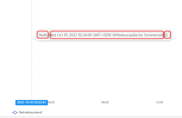
But what ever I try the chart in OH stays empty. The Tooltip shows that the Category can not be matched “NaN” but the timestamp and value are there: (sorry only one screenshot for new users, I will pin it to the thread)

Maybe someone has an idea how to get this running or maybe an explanation why this will not work with the current implementation of ECharts in OH.

Really looking forward to your feedback!

Br
Sebash

P.S. not sure if it is the right forum category…

Tooltip Screenshot:

The widget code is, I think, OK. My guess is that the problem is with the assumptions about the item state. Is the item a number item or a string item? What persistence service are you using?

Yep I agree there might be an issue with the item state. Here is the output from a REST call:

{
    "link": "http://rp/rest/items/LWD70ARX_Betriebszustand",
    "state": "5",
    "stateDescription": {
        "pattern": "%.0f",
        "readOnly": true,
        "options": [
            {
                "value": "0",
                "label": "Heizen"
            },
            {
                "value": "1",
                "label": "Warmwasser"
            },
            {
                "value": "2",
                "label": "Schwimmbad / Photovoltaik"
            },
            {
                "value": "3",
                "label": "EVU-Sperre"
            },
            {
                "value": "4",
                "label": "Abtauen"
            },
            {
                "value": "5",
                "label": "Keine Anforderung"
            },
            {
                "value": "6",
                "label": "Heizen ext. Energiequelle"
            },
            {
                "value": "7",
                "label": "KĂĽhlbetrieb"
            }
        ]
    },
    "commandDescription": {
        "commandOptions": [
            {
                "command": "0",
                "label": "Heizen"
            },
            {
                "command": "1",
                "label": "Warmwasser"
            },
            {
                "command": "2",
                "label": "Schwimmbad / Photovoltaik"
            },
            {
                "command": "3",
                "label": "EVU-Sperre"
            },
            {
                "command": "4",
                "label": "Abtauen"
            },
            {
                "command": "5",
                "label": "Keine Anforderung"
            },
            {
                "command": "6",
                "label": "Heizen ext. Energiequelle"
            },
            {
                "command": "7",
                "label": "KĂĽhlbetrieb"
            }
        ]
    },
    "editable": true,
    "type": "Number",
    "name": "LWD70ARX_Betriebszustand",
    "label": "Betriebszustand",
    "category": "",
    "tags": [
        "Point"
    ],
    "groupNames": [
        "LWD70ARX"
    ]
}

The tooltip (screenshot above) shows the EChart “value” which seems to be “long date time format, number” but somehow the category could not be identified with the number given.

The persistence service is rrd4j.

OK, as a number item, the state should be properly persisted by rrd4j, so there’s data there to chart. The problem is that OH makes a distinction between the state of the item and what it is displaying if the item has a state description. The item never has a state of “Heizen” or “Warmwasser” etc., it only ever has a state of 0 or 1 etc, but OH knows that when the item’s state is 0 you want to see “Heizen” instead.

So when you send that item’s persisted data to the eChart, it is numerical, not categorical. The data is not plotting and tooltip cannot show the category because the categorical axis never has a value that equals any of the data it is receiving.

I think I can follow your thesis and correct me if I am wrong. But there are two arguments that do not fit.

  1. I agree that the item state is numeric and therefore might not be recognized by the categories of the y-axis. But why is the tooltip the same as above if I change the y-axis configuration to this?
yAxis:
    - component: oh-category-axis
      config:
        gridIndex: 0
        data:
          - 0
          - 1
          - 2
          - 3
          - 4
          - 5
          - 6
          - 7
  1. Still I think the item state is numeric but actually this should be recognized by EChart because of the following documentation concerning the category axis type:
 xAxis: {
      type: 'category',
      data: ['Monday', 'Tuesday', 'Wednesday', 'Thursday']
  },
  yAxis: {
      type: 'category',
      data: ['a', 'b', 'm', 'n', 'p', 'q']
  },
  series: [{
      data: [
          // xAxis      yAxis
          [  0,           0,    2  ], // This point is located at xAxis: 'Monday', yAxis: 'a'.
          [  'Thursday',  2,    1  ], // This point is located at xAxis: 'Thursday', yAxis: 'm'.
          [  2,          'p',   2  ], // This point is located at xAxis: 'Wednesday', yAxis: 'p'.
          [  3,           3,    5  ]
      ]
  }]

It explains that the data array of the category axis could either be adressed by name e.g. Heizen or as array index e.g. a[0] = Heizen. So in both ways it should find the category. (Note: you could try this in the EChart Sandbox posted in the initial post, it works…)

I some how get the feeling that this is an unintended use case when configuring the chart in OH this way and maybe something is not correct when it is interpreted at runtime. But I am not sure how to check this…

1 Like

Interesting. Your reasoning seems solid to me. I wonder if the numerical data is getting stringified in the call to eCharts because of the categorical axis. What happens if you set your category array to:

yAxis:
    - component: oh-category-axis
      config:
        gridIndex: 0
        data:
          - "0"
          - "1"
          - "2"
          - "3"
          - "4"
          - "5"
          - "6"
          - "7"

Good idea, I tried it but still no graph and no tooltip category information :crazy_face: I also tried the float values 0.0 and “0.0” but not working as well.

Ok, looking at the code for this, it seems that the oh-category-axis has only been designed as a x-axis type for bins of temporal units. Your chart isn’t working because the oh-category-axis completely ignores the data config and sets its own based solely on which temporal unit has been designated.

It looks like your going to have to achieve your desired results by using a value axis instead (which is fine as we’ve established you’re getting value data), and add the category indications to the axis tick marks (which I’m sure eCharts can do, but I’ve never tried).

Hah I see what you mean, yep with the current implementation of the oh-category-axis it will not work :upside_down_face:
I will give your idea a try but earliest on the afternoon :metal:

I think I found another way using the axisLabel but I do not think I can translate this to OH :scream:

I configured the following in the ECharts Sandbox

yAxis: {
    type: 'value',
    axisLabel: {
      formatter: function (value, index) {
          switch (value) {
            case 0:
              return "Heizen";
            case 1:
              return "Warmwasser";
            case 2:
              return "Schwimmbad / Photovoltaik";
            case 3:
              return "EVU-Sperre";
            case 4:
              return "Abtauen";
            case 5:
              return "Keine Anforderung";
            case 6:
              return "Heizen ext. Energiequelle";
            case 7:
              return "KĂĽhlbetrieb";
            default:
              return "n/a";
          }
      }
    }
  }

It works there and shows the names on the axis ticks but not sure if the script will be working in the options parameters in OH.

I don’t think the odds are in your favor. I once tried briefly to configure a chart option with a function and did not meet with any success, but it was a half-hearted attempt and I moved to a different solution pretty quickly. So, I won’t say it can’t be done, but I don’t know of any examples to follow at the moment.

In yaml you can define a multi-line value if you precede the value with a | or a >. That would be where I would start to see if this works. One of those keeps the newline characters as part of the string value the other does not, I never remember which is which. But your declaration would look like this:

formatter: >
  function (value, index) {
    switch...

There’s also a one line variant of the script which might work better in terms of passing the script to eCharts:

function (value, index) { return ((["Heizen", "Warmwasser", "Schwimmbad / Photovoltaik", "EVU-Sperre", "Abtauen", "Keine Anforderung", "Heizen ext. Energiequelle", "KĂĽhlbetrieb"])[value] || "n/a") }

If you can’t get the formatter function to work, you can probably get close to what you’d like by keeping the value axis for the actual plotting, but then overlaying a unused category axis on it. That won’t fix the tooltip issue, but it will at least get you your graph. But then, I don’t know if the tick label trick gets you your tooltip either, so maybe it’s not a big difference.

It’s not something that I would really support either - imperative code in what’s supposed to be declarative-only opens a can of worms. I know you figured out a way with the onclick events and the like but I have to say I wasn’t particularly happy to see that it could be possible :slight_smile:

Apart from that an obvious limitation comes from this:

You can supposedly define ECharts options outside any OH chart components with the options property on the oh-chart (and oh-chart-page) components themselves, except those defined below ...chartConfig in the code above (those are computed from slots/components). In hindsight I figure it would be best to give precedence to whatever top-level option appears in the user-defined options property like xAxis, yAxis etc., to give more control to those users who “know what they are doing”.

Thanks for the creative ideas :stuck_out_tongue_closed_eyes: of course I tried it but unluckily neither the one-line version nor the multi-line version worked. Actually it is just outputting the code as string on every axis tick as label.

I also thought about the second category axis simply showing the values. I think I will try and on a larger chart I can live with that. Of course that is not useful on a shrinked version on a widget in the overview. Therefore the tooltip would be much nicer.

I will show the final results with the second axis as soon I get this done.

I got your point, and I am not trying to bend the system till breakdown. I would really appreciate to allow more control over the options property even for the currently excepted items. That could help in such use cases a lot. How could I make a proposal for that?

In this case I actually just meant passing a function script to eCharts since several of the eCharts options accept that as a viable parameter. But, as @Sebash has just corroborated, even though the entire function line (or lines) does get passed, it’s interpreted as a string instead of parsed by eCharts as a function. It only comes up rarely, but, as I said, I had run into this problem previously myself.

Sorry about that :roll_eyes:. I only stumbled across that in an attempt to scale text in a widget responsively (which, for reasons known only to The Illuminati, seems to be the very hardest part of web design).