Hey @maxmaximax
I think it’s best, when I post the different widgets in a new post. and I will update my last post with the page YAML code.
First of all, UI would like to thank all community members with their posts and solutions to built my widgets and dashboard as it is now 
Room Card:
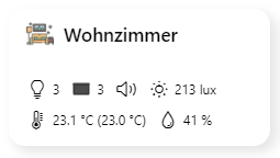
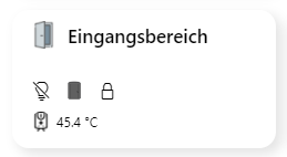
Maximum:
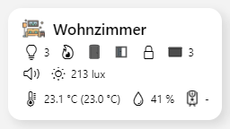
uid: Card_room_12
tags: []
props:
  parameters:
    - label: Header
      name: text_header
      required: false
      type: TEXT
    - description: icon name without ".png", located in static/icons/ folder
      label: Icon
      name: iconimage
      required: false
      type: TEXT
    - description: HEX or rgba
      label: Backgroundcolor
      name: bgcolor
      required: false
      type: TEXT
    - description: Page which will be opened as popup
      label: Page ID
      name: page
      required: false
    - context: item
      description: select group for status lights
      label: Item
      name: status
      required: false
      type: TEXT
    - context: item
      description: select item for heating
      label: Item
      name: heating
      required: false
      type: TEXT
    - context: item
      description: select item for temperature
      label: Item
      name: temp
      required: false
      type: TEXT
    - context: item
      description: select item for set temperature
      label: Item
      name: settemp
      required: false
      type: TEXT
    - context: item
      description: select item for humidity
      label: Item
      name: humidity
      required: false
      type: TEXT
    - context: item
      description: select item for illuminance
      label: Item
      name: illuminance
      required: false
      type: TEXT
    - context: item
      description: select item for door state(s)
      label: Item
      name: door_state
      required: false
      type: TEXT
    - context: item
      description: select item for door lock(s)
      label: Item
      name: door_lock
      required: false
      type: TEXT
    - context: item
      description: select item for blinds group (SUM)
      label: Item
      name: blinds_closed
      required: false
      type: TEXT
    - context: item
      description: select item for speaker(s)
      label: Item
      name: speakers
      required: false
      type: TEXT
    - context: item
      description: select item for windows(s)
      label: Item
      name: windows
      required: false
      type: TEXT
    - context: item
      description: select item for numbers of windows
      label: Item
      name: windows_numbers
      required: false
      type: TEXT
    - context: item
      description: select item for boiler temp
      label: Item
      name: boiler_temp
      required: false
      type: TEXT
timestamp: Apr 14, 2021, 7:33:24 PM
component: f7-card
config:
  style:
    noShadow: false
    class:
      - padding: 0px
    border-radius: var(--f7-card-expandable-border-radius)
    box-shadow: 5px 5px 10px 1px rgba(0,0,0,0.1)
    background-color: "=props.bgcolor ? props.bgcolor : ''"
    height: 125px
    margin-left: 5px
    margin-right: 5px
slots:
  content:
    - component: f7-block
      config:
        style:
          position: absolute
          top: -5px
          left: 50px
      slots:
        default:
          - component: Label
            config:
              text: "=props.text_header ? props.text_header : 'Set Props'"
              style:
                font-size: 17px
                font-weight: 600
                margin-left: 0px
                margin-top: 0px
    - component: f7-block
      config:
        style:
          position: absolute
          bottom: -37px
          left: 16px
      slots:
        default:
          - component: f7-chip
            config:
              style:
                --f7-chip-bg-color: rgba(255, 255, 255, 0)
              visible: "=props.status ? true : false"
              text: "=(Number(items[props.status].state) > 0) ? items[props.status].state : ''"
              iconColor: "=themeOptions.dark === 'dark' ? 'white' : 'black'"
              iconF7: "=(Number(items[props.status].state) > 0) ? 'lightbulb' : 'lightbulb_slash'"
              iconSize: 18
          - component: f7-chip
            config:
              style:
                --f7-chip-bg-color: rgba(255, 255, 255, 0)
              visible: =items[props.heating].state === 'ON'
              text: "=items[props.heating].state === 'ON' ? '' : ''"
              iconColor: "=themeOptions.dark === 'dark' ? 'white' : 'black'"
              iconF7: flame
              iconSize: 18
          - component: f7-chip
            config:
              style:
                --f7-chip-bg-color: rgba(255, 255, 255, 0)
              visible: "=props.door_state ? true : false"
              text: "=items[props.door_state].state === 'ON' ? '' : ''"
            slots:
              media:
                - component: oh-icon
                  config:
                    icon: "=items[props.door_state].state === 'ON' ? 'door-open' : 'door-closed'"
                    style:
                      filter: "='brightness(' + (themeOptions.dark === 'dark' ? '1' : '0.4') + ')'"
                      height: 18px
          - component: f7-chip
            config:
              style:
                --f7-chip-bg-color: rgba(255, 255, 255, 0)
              visible: "=items[props.windows].state === 'OPEN' ? true : false"
              text: "=items[props.windows_numbers].state > 0 ? items[props.windows_numbers].state : ''"
            slots:
              media:
                - component: oh-icon
                  config:
                    icon: window-open
                    style:
                      filter: "='brightness(' + (themeOptions.dark === 'dark' ? '1' : '0.4') + ')'"
                      height: 18px
          - component: f7-chip
            config:
              style:
                --f7-chip-bg-color: rgba(255, 255, 255, 0)
              visible: "=props.door_lock ? true : false"
              text: "=items[props.door_lock].state === 'ON' ? '' : ''"
              iconColor: "=themeOptions.dark === 'dark' ? 'white' : 'black'"
              iconF7: "=items[props.door_lock].state === 'ON' ? 'lock_open' : 'lock'"
              iconSize: 18
          - component: f7-chip
            config:
              style:
                --f7-chip-bg-color: rgba(255, 255, 255, 0)
              visible: "=(Number(Math.floor(items[props.blinds_closed].state)) > 0) ? true : false"
              text: "=(Number(items[props.blinds_closed].state) === 0) ? '' : Math.floor(items[props.blinds_closed].state)"
            slots:
              media:
                - component: oh-icon
                  config:
                    icon: "=(Number(items[props.blinds_closed].state) === 0) ? 'cinemascreen-30' : 'cinemascreen-100'"
                    style:
                      filter: "='brightness(' + (themeOptions.dark === 'dark' ? '100' : '0.3') + ')'"
                      height: 18px
          - component: f7-chip
            config:
              style:
                --f7-chip-bg-color: rgba(255, 255, 255, 0)
              visible: "=items[props.speakers].state === 'PLAY' ? true : false"
              iconColor: "=themeOptions.dark === 'dark' ? 'white' : 'black'"
              iconF7: "=items[props.speakers].state === 'PLAY' ? 'speaker_2' : 'speaker'"
              iconSize: 18
          - component: f7-chip
            config:
              style:
                --f7-chip-bg-color: rgba(255, 255, 255, 0)
              visible: "=props.illuminance ? true : false"
              text: =items[props.illuminance].displayState
              iconColor: "=themeOptions.dark === 'dark' ? 'white' : 'black'"
              iconF7: sun_min
              iconSize: 18
    - component: f7-block
      config:
        style:
          position: absolute
          bottom: -65px
          left: 16px
      slots:
        default:
          - component: f7-chip
            config:
              style:
                --f7-chip-bg-color: rgba(255, 255, 255, 0)
              visible: "=props.temp ? true : false"
              text: "=(items[props.temp].displayState  ? items[props.temp].displayState : items[props.temp].state) +  (props.settemp ? ' (' + items[props.settemp].state + ')' : '')"
              iconColor: "=themeOptions.dark === 'dark' ? 'white' : 'black'"
              iconF7: thermometer
              iconSize: 18
          - component: f7-chip
            config:
              style:
                --f7-chip-bg-color: rgba(255, 255, 255, 0)
              visible: "=props.humidity ? true : false"
              text: =items[props.humidity].displayState
              iconColor: "=themeOptions.dark === 'dark' ? 'white' : 'black'"
              iconF7: drop
              iconSize: 18
          - component: f7-chip
            config:
              style:
                --f7-chip-bg-color: rgba(255, 255, 255, 0)
              visible: "=props.boiler_temp ? true : false"
              text: =items[props.boiler_temp].state
            slots:
              media:
                - component: oh-icon
                  config:
                    icon: waterheater2
                    style:
                      filter: "='invert(' + (themeOptions.dark === 'dark' ? '1' : '0') + ')'"
                      height: 18px
    - component: oh-image
      config:
        url: ='/static/icons/' + props.iconimage + '.png'
        style:
          position: absolute
          left: 16px
          top: 10px
          height: 25px
          opacity: 0.7
        visible: "=props.iconimage ? true : false"
    - component: oh-link
      config:
        action: popup
        actionModal: ='page:' + props.page
        style:
          position: absolute
          left: 0px
          top: 0px
          height: 110px
          width: 100%
waterheater2 icon is from here: waterheater2 (flaticon.com)
the rest are f7 or oh icons.
Pool card
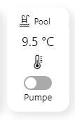
uid: Cell_Pool_1
tags: []
props:
  parameters:
    - description: Small title on top of the card
      label: Title
      name: title
      required: false
      type: TEXT
    - label: Background Color
      name: bgcolor
      required: false
      type: TEXT
      description: HEX or rgba
    - context: item
      description: Item Pooltemp
      label: Item
      name: item_temp
      required: false
      type: TEXT
    - context: item
      description: Item Poolpump
      label: Item
      name: item_pump
      required: false
      type: TEXT
  parameterGroups: []
timestamp: Mar 29, 2021, 2:56:32 PM
component: f7-card
config:
  style:
    noShadow: false
    class:
      - padding: 0px
    border-radius: var(--f7-card-expandable-border-radius)
    box-shadow: 5px 5px 10px 1px rgba(0,0,0,0.1)
    background-color: "=props.bgcolor ? props.bgcolor : ''"
    height: 150px
    margin-left: 5px
    margin-right: 5px
slots:
  content:
    - component: f7-block
      config:
        style:
          position: absolute
          top: -5px
          left: 16px
          flex-direction: row
          display: flex
      slots:
        default:
          - component: oh-icon
            config:
              icon: swimming_pool
              style:
                height: 18px
                margin-right: 5px
                filter: "='invert(' + (themeOptions.dark === 'dark' ? '1' : '0') + ')'"
          - component: Label
            config:
              text: "=props.title ? props.title : ''"
              style:
                font-size: 12px
                margin-top: 0px
    - component: f7-block
      config:
        style:
          position: absolute
          bottom: -15px
          left: 16px
          flex-direction: row
          width: 100%
        class:
          - text-align-center
      slots:
        default:
          - component: Label
            config:
              text: =items[props.item_temp].state
              style:
                font-size: 18px
                font-weight: 400
                margin-left: 0px
                margin-top: 0px
    - component: f7-block
      config:
        style:
          position: absolute
          bottom: -42px
          left: 16px
          width: 100%
        class:
          - text-align-center
      slots:
        default:
          - component: f7-icon
            config:
              size: 22
              f7: thermometer
    - component: f7-block
      config:
        style:
          position: absolute
          bottom: -90px
          left: 16px
          width: 100%
        class:
          - text-align-center
      slots:
        default:
          - component: oh-toggle
            config:
              item: =props.item_pump
          - component: Label
            config:
              text: Pumpe
              style:
                font-size: 13px
swimming_pool for example: swimming_pool (flaticon.com)
To do: I forgot to insert an oh-link over the hole card with action: analyzer
Current weather
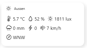
uid: Cell_Weather_Actual_1
tags: []
props:
  parameters:
    - description: Small title on top of the card
      label: Title
      name: title
      required: false
      type: TEXT
    - description: HEX or rgba
      label: Background Color
      name: bgcolor
      required: false
      type: TEXT
    - description: page ID of chart to be opened
      label: page
      name: page
      required: false
    - context: item
      description: Item of Outsidetemp
      label: Outsidetemperature
      name: item_temp
      required: false
      type: TEXT
    - context: item
      description: Item of Outsidehumidity
      label: Humidity
      name: item_hum
      required: false
      type: TEXT
    - context: item
      description: Item of Rain Today
      label: Rain
      name: item_rain
      required: false
      type: TEXT
    - context: item
      description: Item of Strikes
      label: Strike Count
      name: item_strike
      required: false
      type: TEXT
    - context: item
      description: Item of Illuminance
      label: Illuminance
      name: item_ill
      required: false
      type: TEXT
    - context: item
      description: Item of Wind Avg
      label: Wind
      name: item_wind
      required: false
      type: TEXT
    - context: item
      description: Item of Wind Direction
      label: Wind Dir
      name: item_wind_dir
      required: false
      type: TEXT
  parameterGroups: []
timestamp: Apr 14, 2021, 7:55:05 PM
component: f7-card
config:
  style:
    noShadow: false
    class:
      - padding: 0px
    border-radius: var(--f7-card-expandable-border-radius)
    box-shadow: 5px 5px 10px 1px rgba(0,0,0,0.1)
    background-color: "=props.bgcolor ? props.bgcolor : ''"
    height: 150px
    margin-left: 5px
    margin-right: 5px
slots:
  content:
    - component: f7-block
      config:
        style:
          position: absolute
          top: -5px
          left: 16px
          flex-direction: row
          display: flex
      slots:
        default:
          - component: f7-icon
            config:
              f7: sun_max
              size: 18
              style:
                margin-right: 10px
          - component: Label
            config:
              text: "=props.title ? props.title : ''"
              style:
                font-size: 12px
                margin-top: 0px
    - component: f7-block
      config:
        style:
          position: absolute
          top: 60px
          left: 16px
          width: 100%
      slots:
        default:
          - component: f7-chip
            config:
              iconF7: thermometer
              text: =items[props.item_temp].state
              style:
                margin-bottom: 10px
                font-size: 16px
                --f7-chip-bg-color: rgba(255, 255, 255, 0)
              iconColor: "=themeOptions.dark === 'dark' ? 'white' : 'black'"
              iconSize: 20
          - component: f7-chip
            config:
              iconF7: drop
              text: =items[props.item_hum].displayState
              style:
                margin-bottom: 10px
                font-size: 16px
                --f7-chip-bg-color: rgba(255, 255, 255, 0)
              iconColor: "=themeOptions.dark === 'dark' ? 'white' : 'black'"
              iconSize: 20
          - component: f7-chip
            config:
              iconF7: sun_min
              text: =items[props.item_ill].displayState
              style:
                margin-bottom: 10px
                font-size: 16px
                --f7-chip-bg-color: rgba(255, 255, 255, 0)
              iconColor: "=themeOptions.dark === 'dark' ? 'white' : 'black'"
              iconSize: 20
          - component: f7-chip
            config:
              iconF7: cloud_drizzle
              text: =items[props.item_rain].displayState
              style:
                margin-bottom: 10px
                font-size: 16px
                --f7-chip-bg-color: rgba(255, 255, 255, 0)
              iconColor: "=themeOptions.dark === 'dark' ? 'white' : 'black'"
              iconSize: 20
          - component: f7-chip
            config:
              iconF7: bolt
              text: =items[props.item_strike].state
              style:
                margin-bottom: 10px
                font-size: 16px
                --f7-chip-bg-color: rgba(255, 255, 255, 0)
              iconColor: "=themeOptions.dark === 'dark' ? 'white' : 'black'"
              iconSize: 20
          - component: f7-chip
            config:
              iconF7: wind
              text: =items[props.item_wind].displayState
              style:
                margin-bottom: 10px
                font-size: 16px
                --f7-chip-bg-color: rgba(255, 255, 255, 0)
              iconColor: "=themeOptions.dark === 'dark' ? 'white' : 'black'"
              iconSize: 20
          - component: f7-chip
            config:
              iconF7: compass
              text: =items[props.item_wind_dir].state
              style:
                margin-bottom: 10px
                font-size: 16px
                --f7-chip-bg-color: rgba(255, 255, 255, 0)
              iconColor: "=themeOptions.dark === 'dark' ? 'white' : 'black'"
              iconSize: 20
    - component: oh-link
      config:
        action: navigate
        actionPage: ='page:' + props.page
        style:
          position: absolute
          left: 0px
          top: 0px
          height: 150px
          width: 100%
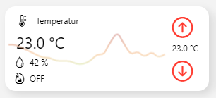
Thermostat
With set temperature and heating control:
Without set temperature (only temp and hum):
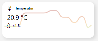
uid: Cell_Temp_Card_1
tags: []
props:
  parameters:
    - description: Small title on top of the card
      label: Title
      name: title
      required: false
      type: TEXT
    - description: Icon on top of the card (only f7 icons (without f7:))
      label: Icon
      name: icon
      required: false
      type: TEXT
    - description: in rgba() or HEX or empty
      label: Background Color
      name: bgcolor
      required: false
      type: TEXT
    - context: item
      label: Current Temperature
      name: temp_item
      required: false
      type: TEXT
    - context: item
      label: Set Temperature
      name: set_temp_item
      required: false
      type: TEXT
    - context: item
      label: Current Humidity
      name: humidity_item
      required: false
      type: TEXT
    - context: item
      description: on/off item
      label: Heating control item
      name: heating_item
      required: false
      type: TEXT
  parameterGroups: []
timestamp: Apr 13, 2021, 8:39:54 PM
component: f7-card
config:
  style:
    noShadow: false
    padding: 0px
    border-radius: var(--f7-card-expandable-border-radius)
    box-shadow: 5px 5px 10px 1px rgba(0,0,0,0.1)
    background-color: "=props.bgcolor ? props.bgcolor : ''"
    height: 120px
    margin-left: 5px
    margin-right: 5px
slots:
  content:
    - component: f7-block
      config:
        style:
          position: absolute
          top: -5px
          left: 16px
          flex-direction: row
          display: flex
      slots:
        default:
          - component: f7-icon
            config:
              f7: =props.icon
              size: 18
              style:
                margin-right: 10px
              visible: "=props.icon ? true : false"
          - component: Label
            config:
              text: "=props.title ? props.title : ''"
              style:
                font-size: 12px
                margin-top: 0px
    - component: f7-block
      config:
        style:
          position: absolute
          bottom: -20px
          left: 16px
          flex-direction: row
      slots:
        default:
          - component: Label
            config:
              text: "=items[props.temp_item].displayState ? items[props.temp_item].displayState : items[props.temp_item].state"
              style:
                font-size: 22px
                font-weight: 400
                margin-left: 0px
                margin-top: 0px
    - component: f7-block
      config:
        style:
          position: absolute
          bottom: -40px
          left: 12px
          flex-direction: row
          display: flex
      slots:
        default:
          - component: f7-icon
            config:
              f7: drop
              size: 18
              visible: "=props.humidity_item ? true : false"
          - component: Label
            config:
              visible: "=props.humidity_item ? true : false"
              text: =items[props.humidity_item].displayState
              style:
                font-size: 12px
                margin-left: 5px
                margin-top: 0px
    - component: f7-block
      config:
        style:
          position: absolute
          bottom: -63px
          left: 12px
          flex-direction: row
          display: flex
      slots:
        default:
          - component: f7-icon
            config:
              visible: "=props.heating_item ? true : false"
              f7: flame
              size: 18
          - component: Label
            config:
              visible: "=props.heating_item ? true : false"
              text: =items[props.heating_item].state
              style:
                font-size: 12px
                margin-left: 5px
                margin-top: 0px
    - component: oh-button
      config:
        visible: "=props.set_temp_item ? true : false"
        iconColor: red
        iconF7: arrow_up_circle
        iconSize: 35
        action: command
        actionItem: =props.set_temp_item
        actionCommand: =Number(items[props.set_temp_item].state.split(' ')[0]) + 0.5
        style:
          position: absolute
          top: 12px
          right: 10px
          height: 35px
          background: transparent
    - component: oh-button
      config:
        visible: "=props.set_temp_item ? true : false"
        iconColor: red
        iconF7: arrow_down_circle
        iconSize: 35
        action: command
        actionItem: =props.set_temp_item
        actionCommand: =Number(items[props.set_temp_item].state.split(' ')[0]) - 0.5
        style:
          position: absolute
          top: 74px
          right: 10px
          height: 35px
          background: transparent
    - component: Label
      config:
        visible: "=props.set_temp_item ? true : false"
        text: =items[props.set_temp_item].state
        style:
          font-size: 12px
          position: absolute
          right: 15px
          top: 50px
    - component: f7-block
      config:
        style:
          position: absolute
          top: 15px
          left: 15px
          width: "=props.set_temp_item ? 'calc(100% - 55px)' : '100%' "
          height: 120px
      slots:
        default:
          - component: oh-trend
            config:
              trendItem: =props.temp_item
              trendGradient:
                - "#aa2b1d"
                - "#cc561e"
                - "#ef8d32"
                - "#beca5c"
              style:
                --f7-theme-color-bg-color: transparent
                background: var(--f7-theme-color-bg-color)
                filter: opacity(30%)
                position: absolute
                width: 100%
                height: 100%
                top: 0px
                left: 0px
                z-index: 1
    - component: oh-link
      config:
        actionAnalyzerChartType: day
        action: analyzer
        actionAnalyzerItems: "=props.set_temp_item ? [props.temp_item, props.humidity_item, props.set_temp_item, props.heating_item] : (props.humidity_item ? [props.temp_item, props.humidity_item] : [props.temp_item])"
        actionAnalyzerCoordSystem: time
        style:
          position: absolute
          left: 0px
          top: 0px
          height: 120px
          width: "=props.set_temp_item ? 'calc(100% - 55px)' : '100%' "
Speaker (SONOS)
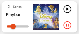
uid: Cell_Speaker_Card_1
tags: []
props:
  parameters:
    - description: Small title on top of the card
      label: Title
      name: title
      required: false
      type: TEXT
    - description: Header big sized
      label: Header
      name: header
      required: false
      type: TEXT
    - label: Background Color
      name: bgcolor
      required: false
      type: TEXT
      description: HEX or rgba
    - context: item
      description: Item to control
      label: Item
      name: item
      required: false
      type: TEXT
    - context: item
      description: Item for volume
      label: Item
      name: item_volume
      required: false
      type: TEXT
    - context: item
      description: Item for Coverbild
      label: Item
      name: item_cover
      required: false
      type: TEXT
  parameterGroups: []
timestamp: Mar 29, 2021, 5:56:15 PM
component: f7-card
config:
  style:
    noShadow: false
    padding: 0px
    border-radius: var(--f7-card-expandable-border-radius)
    box-shadow: 5px 5px 10px 1px rgba(0,0,0,0.1)
    background-color: "=props.bgcolor ? props.bgcolor : ''"
    height: 120px
    margin-left: 5px
    margin-right: 5px
slots:
  content:
    - component: f7-block
      config:
        style:
          position: absolute
          top: -5px
          left: 16px
          flex-direction: row
          display: flex
      slots:
        default:
          - component: f7-icon
            config:
              f7: "=items[props.item].state === 'PLAY' ? 'speaker_3' : 'speaker'"
              size: 18
              style:
                margin-right: 10px
          - component: Label
            config:
              text: "=props.title ? props.title : ''"
              style:
                font-size: 12px
                margin-top: 0px
    - component: f7-block
      config:
        style:
          position: absolute
          bottom: -15px
          left: 16px
          flex-direction: row
      slots:
        default:
          - component: Label
            config:
              text: "=props.header ? props.header : 'Set Props'"
              style:
                font-size: 17px
                font-weight: 600
                margin-left: 0px
                margin-top: 0px
    - null
    - component: oh-button
      config:
        iconColor: "=items[props.item].state === 'PAUSE' ? themeOptions.dark === 'dark' ? 'white' : 'black' : 'red' "
        iconF7: play_circle
        iconSize: 35
        action: command
        actionItem: =props.item
        actionCommand: PLAY
        style:
          position: absolute
          top: 12px
          right: 10px
          height: 35px
          background: transparent
    - component: oh-button
      config:
        iconColor: "=items[props.item].state === 'PLAY' ? themeOptions.dark === 'dark' ? 'white' : 'black' : 'red'"
        iconF7: pause_circle
        iconSize: 35
        action: command
        actionItem: =props.item
        actionCommand: PAUSE
        style:
          position: absolute
          top: 74px
          right: 10px
          height: 35px
          background: transparent
    - component: oh-slider
      config:
        item: =props.item_volume
        min: 0
        max: 100
        style:
          position: absolute
          bottom: -75px
          left: 20px
          width: calc(100% - 205px)
          --f7-range-bar-size: 8px
          --f7-range-bar-border-radius: 8px
          --f7-range-knob-size: 20px
          --f7-range-knob-box-shadow: 0 2px 4px rgba(0, 0, 0, 0.3)
    - component: oh-image
      config:
        style:
          position: absolute
          bottom: -78px
          right: 70px
          height: 100px
        item: =props.item_cover
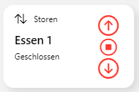
Blinds
uid: Cell_Shutter_Card_1
tags: []
props:
  parameters:
    - description: Small title on top of the card
      label: Title
      name: title
      required: false
      type: TEXT
    - description: Header big sized
      label: Header
      name: header
      required: false
      type: TEXT
    - description: Icon on top of the card (only f7 icons (without f7:)). e.g.: arrow_up_arrow_down
      label: Icon
      name: icon
      required: false
      type: TEXT
    - label: Background Color
      name: bgcolor
      required: false
      type: TEXT
      description: HEX or rgba
    - context: item
      description: Shutter item to control
      label: Item
      name: item
      required: false
      type: TEXT
  parameterGroups: []
timestamp: Mar 9, 2021, 10:31:34 PM
component: f7-card
config:
  style:
    noShadow: false
    padding: 0px
    border-radius: var(--f7-card-expandable-border-radius)
    box-shadow: 5px 5px 10px 1px rgba(0,0,0,0.1)
    background-color: "=props.bgcolor ? props.bgcolor : ''"
    height: 120px
    margin-left: 5px
    margin-right: 5px
slots:
  content:
    - component: f7-block
      config:
        style:
          position: absolute
          top: -5px
          left: 16px
          flex-direction: row
          display: flex
      slots:
        default:
          - component: f7-icon
            config:
              f7: =props.icon
              size: 18
              style:
                margin-right: 10px
              visible: "=props.icon ? true : false"
          - component: Label
            config:
              text: "=props.title ? props.title : ''"
              style:
                font-size: 12px
                margin-top: 0px
    - component: f7-block
      config:
        style:
          position: absolute
          bottom: -15px
          left: 16px
          flex-direction: row
      slots:
        default:
          - component: Label
            config:
              text: "=props.header ? props.header : 'Set Props'"
              style:
                font-size: 17px
                font-weight: 600
                margin-left: 0px
                margin-top: 0px
    - component: f7-block
      config:
        style:
          position: absolute
          bottom: -35px
          left: 16px
          flex-direction: row
      slots:
        default:
          - component: Label
            config:
              text: "=Number(items[props.item].state) === 0 ? 'Geöffnet' : 'Geschlossen'"
              style:
                font-size: 12px
                margin-left: 0px
                margin-top: 0px
    - component: oh-button
      config:
        iconColor: red
        iconF7: arrow_up_circle
        iconSize: 35
        action: command
        actionItem: =props.item
        actionCommand: UP
        style:
          position: absolute
          top: 12px
          right: 10px
          height: 35px
          background: transparent
    - component: oh-button
      config:
        iconColor: red
        iconF7: stop_circle
        iconSize: 29
        action: command
        actionItem: =props.item
        actionCommand: STOP
        style:
          position: absolute
          top: 46px
          right: 13px
          height: 29px
          background: transparent
    - component: oh-button
      config:
        iconColor: red
        iconF7: arrow_down_circle
        iconSize: 35
        action: command
        actionItem: =props.item
        actionCommand: DOWN
        style:
          position: absolute
          top: 74px
          right: 10px
          height: 35px
          background: transparent
Todo: Control icon colors according state of shutter item (at the moment they are all red).
Light

uid: Cell_Light_Card_1
tags: []
props:
  parameters:
    - description: Small title on top of the card
      label: Title
      name: title
      required: false
      type: TEXT
    - description: Header big sized
      label: Header
      name: header
      required: false
      type: TEXT
    - description: Icon on top of the card (only f7 icons (without f7:))
      label: Icon
      name: icon
      required: false
      type: TEXT
    - label: Background Color
      name: bgcolor
      required: false
      type: TEXT
      description: rgba or HEX
    - context: item
      description: Item to control on/off
      label: Item
      name: item_schalter
      required: false
      type: TEXT
    - context: item
      description: Item to control brightness
      label: Item
      name: item_brightness
      required: false
      type: TEXT
  parameterGroups: []
timestamp: Mar 10, 2021, 8:00:57 PM
component: f7-card
config:
  style:
    noShadow: false
    padding: 0px
    border-radius: var(--f7-card-expandable-border-radius)
    box-shadow: 5px 5px 10px 1px rgba(0,0,0,0.1)
    background-color: "=props.bgcolor ? props.bgcolor : ''"
    height: 120px
    margin-left: 5px
    margin-right: 5px
slots:
  content:
    - component: f7-block
      config:
        style:
          position: absolute
          top: -5px
          left: 16px
          flex-direction: row
          display: flex
      slots:
        default:
          - component: f7-icon
            config:
              f7: =props.icon
              size: 18
              style:
                margin-right: 10px
              visible: "=props.icon ? true : false"
          - component: Label
            config:
              text: "=props.title ? props.title : ''"
              style:
                font-size: 12px
                margin-top: 0px
    - component: f7-block
      config:
        style:
          position: absolute
          bottom: -15px
          left: 16px
          flex-direction: row
      slots:
        default:
          - component: Label
            config:
              text: "=props.header ? props.header : 'Set Props'"
              style:
                font-size: 17px
                font-weight: 600
                margin-left: 0px
                margin-top: 0px
    - component: oh-slider
      config:
        item: =props.item_brightness
        min: 0
        max: 100
        style:
          position: absolute
          bottom: -75px
          left: 20px
          width: calc(100% - 40px)
          --f7-range-bar-size: 8px
          --f7-range-bar-border-radius: 8px
          --f7-range-knob-size: 20px
          --f7-range-knob-box-shadow: 0 2px 4px rgba(0, 0, 0, 0.3)
    - component: oh-toggle
      config:
        item: =props.item_schalter
        style:
          position: absolute
          top: 15px
          right: 20px
Feel free to modify and improve these widgets! would be nice, if you can share your improvements with me!?