I used the oh-image-card in my UI for long time, now I wanted to add an action to open popup when image is clicked.
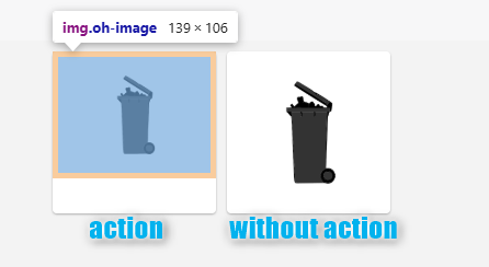
But when I defined action for image card the image got shifted and scaled. Nothing else regarding styling changed, just added action: popup. Here is how it looks like without and with action:
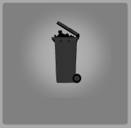
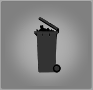
Is this a bug in MainUI widget or do I have something wrong with my card config? I see this problem in fixed grid layout, but it seems it works properly in another place when I use it in oh-masonry.
Code for card:
component: oh-image-card
config:
  url: =items.OdpadSvozIkona.state
  actionModal: widget:ozo_svozy_list
  action: popup
This is HTML rendered without action:
<div class="vue-grid-item oh-grid-item card no-margin" x="4" y="4" w="2" h="2" i="2" style="top: 358px; left: 369px; width: 177px; height: 172px; position: absolute;">
  <div class="oh-grid-item-content card oh-card" style="overflow: hidden;">
    <div class="card-content card-content-padding oh-image-card no-padding">
	  <img url="/static/images/Popelnice_Sm.png" actionmodal="widget:ozo_svozy_list" class="oh-image" src="/static/images/Popelnice_Sm.png">
	</div>
  </div>
</div>
and this when action is defined:
<div class="vue-grid-item oh-grid-item card no-margin" x="4" y="4" w="2" h="2" i="2" style="top: 358px; left: 369px; width: 177px; height: 172px; position: absolute;">
  <div class="oh-grid-item-content card oh-card" style="overflow: hidden;">
    <div class="card-content card-content-padding oh-image-card">
	  <div class="image-link list">
	    <ul>
		  <li class="oh-image-clickable no-chevron">
		    <a href="#" class="item-link">
			  <div class="item-content">
			    <img url="/static/images/Popelnice_Sm.png" actionmodal="widget:ozo_svozy_list" action="popup" class="oh-image" src="/static/images/Popelnice_Sm.png">
			    <div class="item-inner"></div>
			  </div>
			</a>
		  </li>
		</ul>
	  </div>
	</div>
  </div>
</div>
Do you see it as a bug? Should I file an issue on github for webui project?
 Yeah, this should be fixed in 4.3.1.