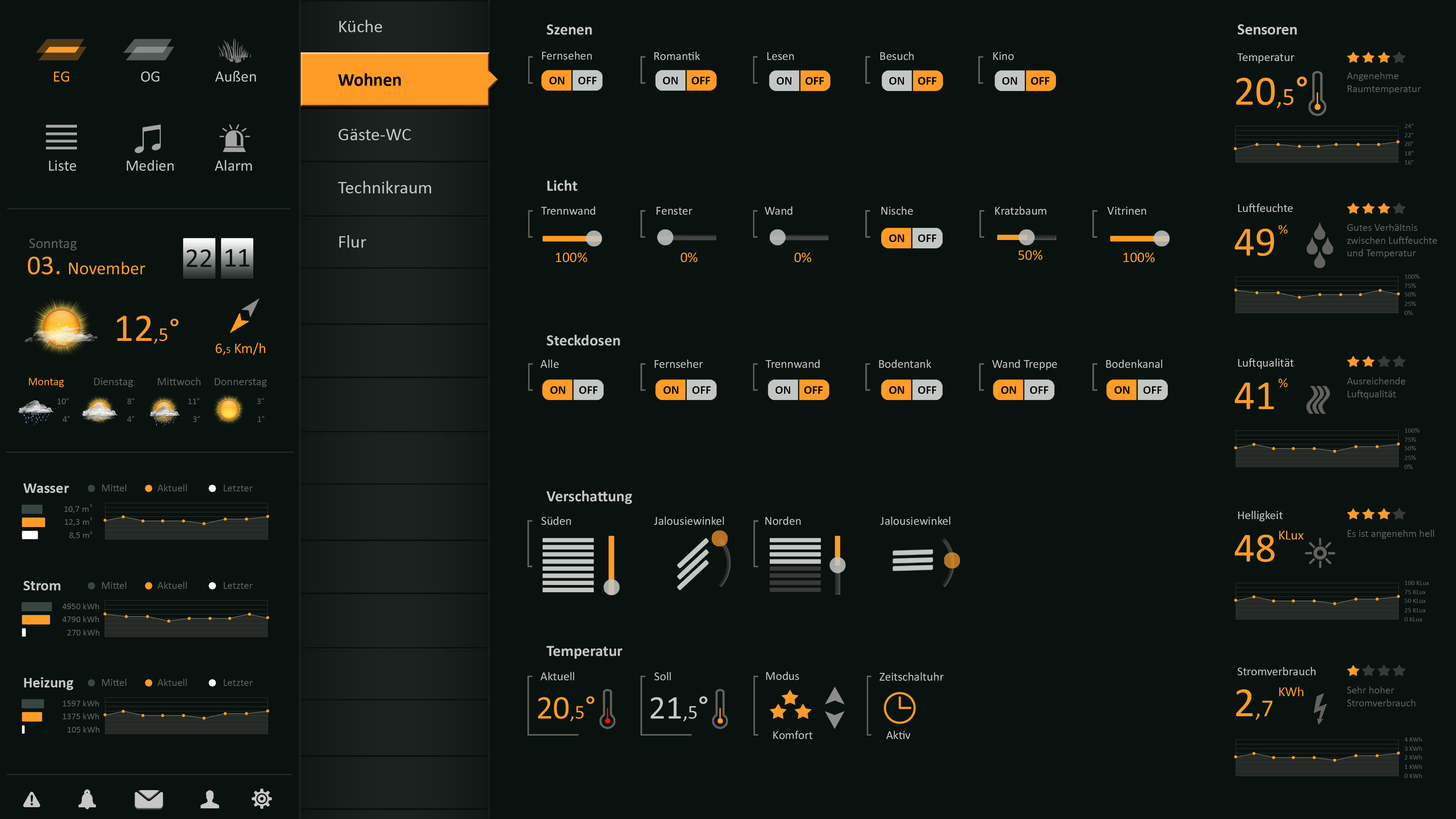
Looks great! Wanna share code on that temp widget ? 
indent preformatted text by 4 spaces
<div class="leftborder-temp"></div>
<div class="leftborder-label">{{ngModel.name}}</div>
<div class="text-left" style="display: block; margin-top: -6px; font-size: 15px;">
  Read1 Errors: <span class="value">{{itemState(config.read)}}<br></span>
  Read2 Errors: <span class="value">{{itemState(config.reall)}}</span>
</div>

<div class="switch btn-group switch-leftborder" style=" margin-top: 6px;">
  <span class="value" style="display: block; margin-top: -6px; font-size: 25px;">
{{itemState(config.status)}}</span>

</div>Here my temp widget
   <div class="leftborder-temp"></div>
<div class="leftborder-label">{{ngModel.name}} ({{itemState(config.temp)}}°C)</div>
<div class="text-left" style="display: block; margin-top: -6px; font-size: 25px;">
  <span class="value">{{itemState(config.item)}}°C</span>
</div>

<div class="switch btn-group switch-leftborder" style="display: block; margin-top: 6px;">
  <button class="btn"
          ng-class="{'btn-primary': itemState(config.up)=='ON', 'btn-default': itemState(config.up)!='ON'
}"
          ng-click="sendCmd(config.up, 'ON')">
     +
  </button>
 <div class="switch btn-group switch-leftborder">
  <button class="btn"
          ng-class="{'btn-primary': itemState(config.down)=='ON', 'btn-default':
 itemState(config.down)!='ON' }"
           ng-click="sendCmd(config.down, 'OFF')">
    -
   </button>
</div>Hi there,
I like orange tree very much.
Is there any possibility to realize a button-widget like the “ON/OFF”-Type, but with three like at the blinds-Element? I would like to steer the blinds, but without slider, just compact.
Thanks,
Simon
When I tried to customize my panel I have seen this beautiful layout.
I have seen that you took the effort to program it, thank you very much for this, I like it very much. For the blinds widget there is only the Jalousiewinkel, which I miss. I started to try to enhance the existing widget with a knob but realized that I’m far away of getting this to work (since I only started to learn HTML/CSS/bootstrap/angularJS the last fews weeks). Although I understand the coding much better by now, I’m far away to be able to program it so that something useful comes out.
- Question: Is the Jalousiewinkel part easily programmable?
- If yes, I tried to start something by integrating a knob. At the moment I could at least integrate it but it is not correctly arranged, I don’t manage to get it next to the blinds, not even thinking of getting the slats with moving angles integrated and arranged
blinds-left.txt (2.9 KB)
It would be great to get some hints, I would be highly motivated to dig into more details and coding knowledge, as long as i have some assurance that it leads somewhere
Many thanks Yannick for your great contributions…
okay i got it. 
Hey everyone,
i finally started customizing my HabPanel and i’m absolutely in love with this skin.
Now i’m looking for a selection widget that also has this style.
Is there someone who has done this yet?
Hey again,
since it looks like no one was in need for a themed selector widget, i now have made my own.
It is made for the use with the Spotify Binding so at the moment i can’t guarantee the selector works with anything else then Spotify.
Screenshot

This is what i would like to share with you, even if i’m at the very beginning of learning HTML and CSS:
CSS
I’ve added the following to the end of orange-tree-overrides.css:
/* Styles for the selection widget */

.dropdown {
    position: relative;
    display: inline-block;
}

.dropdown-content {
    /*background-color: var(--text-color);*/
    /*box-shadow: 0px 8px 16px 0px rgba(0,0,0,0.2);*/
    columns: 4;
    display: none;
    margin-top: 8px;
    width: 700px !important;
    position: absolute;
    z-index: 1;
}

.dropdown-content a {
    background-color: #c5c5c5;
    border-color: black;
    border-radius: 10px;
    color: black;
    display: block;
    font-size: 0.9em;
    margin-bottom: 8px;
    padding: 12px 16px;
    text-align: left;
}

.dropdown-content a:hover {
    background-color: var(--chart-fill);
    color: #c5c5c5;
    font-weight: bold;
}

.dropdown:hover .dropdown-content {
    display: block;
}

.dropdown:hover .dropbtn {
    background-color: black;
}
Widget
After that, safe your css file and reload HABPanel.
Import the following file and you can start using the themed selectors:
Selection.widget.json (1.1 KB)
Let me know if you have any suggestions.
Enjoy.
