Problem with layout input type:time for widget in Main UI

Hi All,

Openhab version: 4.3.5

Platform: Rpi4

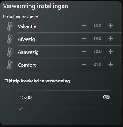
I’m creating a widget where I can choose the time to set a certain temperature on a certain time. It’s working fine but the layout is a bit strange. Can someone help me correct the layout? I want the Send / Clear en clock icon on the same row. At this time the send button is always below this input-item and the clock and clear button are overlapping eachother.

uid: verwarming_settings_card
tags: []
props:
  parameters:
    - default: "#474c4d"
      description: Gradient eerste kleur linksboven
      label: Achtergrond kleur 1
      name: backcolor2
      required: false
      type: TEXT
    - default: "#171c1d"
      description: Gradient eerste kleur rechtsonder
      label: Achtergrond kleur 2
      name: backcolor1
      required: false
      type: TEXT
    - default: white
      description: Kies een kleurnaam
      label: Kleur van text
      name: fontcolor
      required: false
      type: TEXT
    - default: gray
      description: Kies een kleurnaam
      label: Kleur van icons
      name: iconcolor
      required: false
      type: TEXT
    - context: item
      description: Huidige Temperatuur
      label: Item
      name: curtemp
      required: false
      type: TEXT
  parameterGroups: []
timestamp: Sep 26, 2025, 8:49:48 AM
component: f7-card
config:
  padding: false
  style:
    background: "=themeOptions.dark === 'dark' ? 'linear-gradient(to top left,' +
      props.backcolor1 + ' 0%,' + props.backcolor2 + ' 100%)' :
      'linear-gradient(to top left,' + props.backcolor1 + ' 0%,' +
      props.backcolor2 + ' 100%)'"
    border-radius: 15px
    box-shadow: "=themeOptions.dark === 'dark' ? '0px 0px 0px' :
      'var(--f7-card-expandable-box-shadow)'"
    margin-left: 0px
    margin-right: 0px
    width: 100%
slots:
  content:
    - component: f7-row
      config:
        style:
          margin: 0px
      slots:
        default:
          - component: Label
            config:
              style:
                color: white
                font-size: 20px
                margin-left: 10px
              text: Verwarming instellingen
    - component: f7-row
      slots:
        default:
          - component: f7-col
            slots:
              default:
                - component: oh-list
                  config:
                    simpleList: false
                  slots:
                    default:
                      - component: Label
                        config:
                          style:
                            color: white
                            margin-left: 10px
                            margin-top: 10px
                          text: Preset woonkamer
                      - component: oh-stepper-item
                        config:
                          color: '=themeOptions.dark == "dark" ? "gray" : "white"'
                          icon: f7:thermometer
                          iconColor: '=themeOptions.dark == "dark" ? "gray" : "white"'
                          item: Woonkamer_4
                          raised: true
                          round: true
                          step: 0.1
                          style:
                            color: white
                            font-size: 16px
                          title: Vakantie
                          visible: true
                      - component: oh-stepper-item
                        config:
                          color: '=themeOptions.dark == "dark" ? "gray" : "white"'
                          icon: f7:thermometer
                          iconColor: '=themeOptions.dark == "dark" ? "gray" : "white"'
                          item: Woonkamer_1
                          raised: true
                          round: true
                          step: 0.1
                          style:
                            color: white
                            font-size: 16px
                          title: Afwezig
                          visible: true
                      - component: oh-stepper-item
                        config:
                          color: '=themeOptions.dark == "dark" ? "gray" : "white"'
                          icon: f7:thermometer
                          iconColor: '=themeOptions.dark == "dark" ? "gray" : "white"'
                          item: Woonkamer_2
                          raised: true
                          round: true
                          step: 0.1
                          style:
                            color: white
                            font-size: 16px
                          title: Aanwezig
                          visible: true
                      - component: oh-stepper-item
                        config:
                          color: '=themeOptions.dark == "dark" ? "gray" : "white"'
                          icon: f7:thermometer
                          iconColor: '=themeOptions.dark == "dark" ? "gray" : "white"'
                          item: Woonkamer_3
                          raised: true
                          round: true
                          step: 0.1
                          style:
                            color: white
                            font-size: 16px
                          title: Comfort
                          visible: true
                      - component: Label
                        config:
                          style:
                            font-weight: bold
                            margin-left: 15px
                            margin-top: 20px
                            margin-bottom: -20px
                          text: Tijdstip inschakelen verwarming
                      - component: oh-input-item
                        config:
                          name: Set verwarming
                          item: Verwarming_time
                          type: time
                          label: Starttijd Verwarming
                          clearButton: true
                          sendButton: true
                          showTime: true
                          outline: true
                          style:
                            width: 100%
                            padding: 10px
                            margin-left: 0px


Think it can be fixed with the style options, but I can’t get anything to change if i try to add some code to the style section, for example: this doesn’t do anything:

                            --f7-label-font-weight: 400
                            --f7-label-height: 16px
                            --f7-label-font-size: 12px

Hope someone can help me.

This should not be the case. The container for the input and the send button has a flex-wrap: nowrap !important directive. So unless something is ignoring that or directly overwriting it, the button should always remain on the same line. You have nothing I can see that is overwriting it, so something must be interfering with it. Are you viewing this on Safari (iOS or desktop)?

It’s possible that your width: 100% on the oh-input-item is interfering with this, but honestly, I cannot replicate the problem on my system. The button is always where it is supposed to be.

It looks like the reason you have to add the extra styles to the input item is that you are trying to get it to not overlap with the Label above it. The reason you are getting the overlap is that a label doesn’t really fit in an list. If you use anything but one of the -item components inside a list you are simply going to get layout issues (it produces degenerate html - it puts non <li> tags as children of the <ul> tag). Put the text of those Label components in an oh-label-item or any of the more generic item components such as a basic f7-list-item. You can look at the f7 list item docs for divider or group-title properties if you want that text to look more distinct from the other items. Then you will not have to modify the other styles and you shouldn’t run into as many issues with the send button.

This isn’t an oh issue, and you can’t fix it with css. The clear button simply isn’t intended to work with the time input (don’t know why not). If you inspect the html that results from having both in view you will see that they are just pseudo-elements of the same span element. It’s the span that gets the click event, so you cannot isolate the actions of those two icons.

If you absolutely insist on having both functionalities, then you are going to have to build something custom yourself where you have a time input with the clock icon which drives a variable and then oh links or buttons that send that variable state to your item or clear it (and all thos components will need to the children of a -item component such as an f7-list-item-row).

The overlapping is not a problem, I won’t use the clear button so I removed it, but was hoping it would point to the right direction of the problem. I don’t understand what you meant with inspecting the HTML results. But that’s ok.

The problem still exist with the sendButton, it just is being placed under the input-item. I created a new widget and the problem is the same.

uid: test_card
tags: []
props:
  parameters:
  parameterGroups: []
timestamp: Oct 10, 2022, 7:13:21 PM
component: f7-card
config:
  style:
    background: black
slots:
  content:
    - component: oh-input
      config:
        name: Set verwarming
        item: Verwarming_time_weekend
        type: time
        clearButton: false
        sendButton: true
        showTime: true
        outline: true
        style:
          width: 100%
          padding: 10px
          margin-left: 0px

The style was creating the problem. I thought I created the widget at first without the style but I clearly was mistaken. I removed the CSS and now it’s almost on the same line, the sendButton is a bit lower, it’s noticable when I enable the outline, but not a big problem.

Thnx for the help!