StateGrid to show status information of an equipment

This is not about clicking and something is happening in the real word :slight_smile:
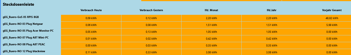
It is just about getting status information (e.g. signal strength, battery level, temperature, etc) of an equipment element presented in a space saving table view.
Just wanted to share in case someone needs a template to adapt from.

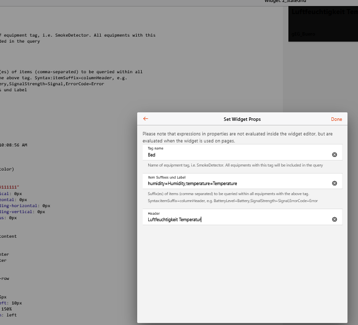
Just provide the type of equipment according to semantics e.g. SmokeDetector and name of points in a comma-seperated way.
Furthermore it puts the location at the beginning of each row (which was painful to find out)

The widget asumes that the item name follows the standard syntax: thingName_channel

You can also specify individual column headers and an overall header

Code

uid: StateGrid
tags: []
props:
  parameters:
    - description: Name of equipment tag, i.e. SmokeDetector. All equipments with this tag will be included in the query
      label: Tag name
      name: varTag
      required: false
      type: TEXT
    - description: Suffix(es) of items (comma-separated) to be queried within all equipments with the above tag. Syntax:itemSuffix=columnHeader, e.g. BatteryLevel=Battery,SignalStrength=Signal,ErrorCode=Error
      label: Item Suffixes und Label
      name: varItem
      required: false
      type: TEXT
    - label: Header
      name: varHeader
      required: false
      type: TEXT
  parameterGroups: []
timestamp: Feb 10, 2021, 9:36:19 PM
component: f7-card
config:
  style:
    color: var(--my-font-color)
    fontSize: 1.0em
    font-weight: bold
    --f7-card-bg-color: "#111111"
    --f7-card-margin-vertical: 0px
    --f7-card-margin-horizontal: 0px
    --f7-card-content-padding-horizontal: 0px
    --f7-card-content-padding-vertical: 0px
    --f7-card-border-radius: 0px
slots:
  default:
    - component: f7-card-content
      config:
        style:
          align-items: center
          text-align: center
      slots:
        default:
          - component: f7-row
            config:
              style:
                height: 35px
                padding-left: 10px
                fontSize: 150%
                text-align: left
            slots:
              default:
                - component: f7-col
                  slots:
                    default:
                      - component: Label
                        config:
                          text: '=(props.varHeader == NULL) ? "" : props.varHeader'
          - component: f7-row
            config:
              noGap: true
              style:
                height: 35px
            slots:
              default:
                - component: f7-col
                - component: oh-repeater
                  config:
                    for: rHeader
                    sourceType: array
                    in: =props.varItem.split(",")
                    fragment: true
                  slots:
                    default:
                      - component: f7-col
                        slots:
                          default:
                            - component: Label
                              config:
                                text: =loop.rHeader.split("=")[1]
          - component: oh-repeater
            config:
              for: rThing
              sourceType: itemsWithTags
              itemTags: '=(props.varTag == NULL) ? "" : props.varTag'
              fetchMetadata: semantics
              fragment: true
            slots:
              default:
                - component: f7-row
                  config:
                    style:
                      height: 35px
                      --f7-grid-row-gap: 1px
                      --f7-grid-gap: 1px
                  slots:
                    default:
                      - component: f7-col
                        slots:
                          default:
                            - component: Label
                              config:
                                text: =loop.rThing.metadata.semantics.config.hasLocation
                                style:
                                  padding-left: 10px
                                  text-align: left
                      - component: oh-repeater
                        config:
                          for: rItem
                          sourceType: array
                          in: =props.varItem.split(",")
                          fragment: true
                        slots:
                          default:
                            - component: f7-col
                              config:
                                style:
                                  background: "#222222"
                                  font-weight: normal
                              slots:
                                default:
                                  - component: Label
                                    config:
                                      text: =items[loop.rThing.name + "_" + loop.rItem.split("=")[0]].state
                                      style:
                                        height: 35px
                                      class:
                                        - justify-content-center
                                        - display-flex
                                        - flex-direction-column

You mention that we have to “provide the type of equipment according to semantics”.. But this is based on “Tags” instead, right ?

v.

Not sure what you mean. A type of an equipment (e.g.SmokeDetector) is defined by tags.

Hi @Oliver2

I recently discovered your widget. I have been adding more power monitoring devices (mostly Shelly) and this widget is fantastic for displaying and organising the devices together.
Would you be able to help point me in the right direction to make a modification?
I’d like to add a toggle as the last column to turn the device On or Off.
I’ve been able to add a single column after the repeater for the column headings for this, but am struggling to figure out how to add a single column after the grid repeater to only have an oh-toggle-item. The item for the toggle switches would all be named as thingname_Power . For example Prusa_MK3Splus_Power, Coffee_Maker_Power
I’m beginning to wrap my head around how the repeater for the grid works but haven’t been able to sort out how to do this…

Thanks, Craig.

Add a f7-col and oh-toggle control at the end of your widget like this:

                      - component: oh-repeater
                        config:
                          for: rItem
                          sourceType: array
                          in: =props.varItem.split(",")
                          fragment: true
                        slots:
                          default:
                            - component: f7-col
                              config:
                                style:
                                  background: "#222222"
                                  font-weight: normal
                              slots:
                                default:
                                  - component: Label
                                    config:
                                      text: =items[loop.rThing.name + "_" + loop.rItem.split("=")[0]].state
                                      style:
                                        height: 35px
                                      class:
                                        - justify-content-center
                                        - display-flex
                                        - flex-direction-column
                        #add this:
                      - component: f7-col
                        config:
                          style:
                            background: "#222222"
                        slots:
                          default:
                            - component: oh-toggle
                              config:
                                item: =loop.rThing.name + "_Power"

Great thank you very much! I was sooo close but not quite correct… :+1:

Craig

Hi Oliver,

I found your widget here and copied the above yaml-code into my widget library but it seems not to work for me as my item-setup is not like your standard.

.items (examle)

//                          Temperatur + Luftfeuchtigkeits-Sensor Tuya TS0201
Group                      gts0201_01                    "Thermometer TS0201 01"                              <snzb02>               (gEG_Buero,gZ2M)                     ["TemperatureSensor"]
Number:Dimensionless        ts0201_01_battery            "Thermometer TS0201 01 Batterie"                     <snzb02>               (gts0201_01,gBattLevelEG)            ["LowBattery"]                              { channel="mqtt:topic:danny:ts020101:battery", unit="%", stateDescription="pattern" [pattern="%.0f %unit%"] }       
Number:Dimensionless        ts0201_01_humidity           "Thermometer TS0201 01 Luftfeuchtigkeit"             <snzb02>               (gts0201_01,gHumidI)                 ["Humidity", "Measurement"]                 { channel="mqtt:topic:danny:ts020101:humidity", unit="%", stateDescription="pattern" [pattern="%.1f %unit%"] }     
Number:Temperature          ts0201_01_temperature        "Thermometer TS0201 01 Temperatur"                   <snzb02>               (gts0201_01,gRtIstI)                 ["Temperature","Measurement"]               { channel="mqtt:topic:danny:ts020101:temperature", stateDescription="pattern" [pattern="%.1f %unit%"] }         
Number                      ts0201_01_linkquality        "Thermometer TS0201 01 LQI "                         <snzb02>               (gts0201_01)                         ["Level"]                                   { channel="mqtt:topic:danny:ts020101:linkquality", stateDescription="" [pattern="%.0f LQI"] }     
DateTime                    ts0201_01_lastseen           "Thermometer TS0201 01 letzter Kontakt"              <snzb02>               (gts0201_01)                         ["Point"]                                   { channel="mqtt:topic:danny:ts020101:lastseen", stateDescription=" " [pattern="%1$ty-%1$tm-%1$td %1$tH:%1$tM"] }     

So I created a “test-item” from it that looks like

//                          Temperatur + Luftfeuchtigkeits-Sensor Tuya TS0201 - Test
Group                       test_ts0201_01                    "Thermometer TS0201 01"                              <snzb02>               (gEG_Buero,gZ2M)                     ["Bed"]
Number:Dimensionless        test_ts0201_01_battery            "Thermometer TS0201 01 Batterie"                     <snzb02>               (test_ts0201_01,gBattLevelEG)        ["LowBattery"]                              { channel="mqtt:topic:danny:ts020101:battery", unit="%", stateDescription="pattern" [pattern="%.0f %unit%"] }       
Number:Dimensionless        test_ts0201_01_humidity           "Thermometer TS0201 01 Luftfeuchtigkeit"             <snzb02>               (test_ts0201_01,gHumidI)             ["Humidity", "Measurement"]                 { channel="mqtt:topic:danny:ts020101:humidity", unit="%", stateDescription="pattern" [pattern="%.1f %unit%"] }     
Number:Temperature          test_ts0201_01_temperature        "Thermometer TS0201 01 Temperatur"                   <snzb02>               (test_ts0201_01,gRtIstI)             ["Temperature","Measurement"]               { channel="mqtt:topic:danny:ts020101:temperature", stateDescription="pattern" [pattern="%.1f %unit%"] }         
Number                      test_ts0201_01_linkquality        "Thermometer TS0201 01 LQI "                         <snzb02>               (test_ts0201_01)                     ["Level"]                                   { channel="mqtt:topic:danny:ts020101:linkquality", stateDescription="" [pattern="%.0f LQI"] }     
DateTime                    test_ts0201_01_lastseen           "Thermometer TS0201 01 letzter Kontakt"              <snzb02>               (test_ts0201_01)                     ["Point"]                                   { channel="mqtt:topic:danny:ts020101:lastseen", stateDescription=" " [pattern="%1$ty-%1$tm-%1$td %1$tH:%1$tM"] }     

and my “Props” were

Maybe I’m a bit silly, but nothing happens :thinking: !!??

Thx in advance for answering

Cheers - Peter

Sorry for answering late.

Do you see the column headers?

Delete .state in this line and lets see if it shows you anything at all

Try to open the page, but not in „Run mode“

No worries, thx for answering. So I had a bit time to learn something about your widget and try to understand.

When using in the widget in the UI(Page) it’s very dark! I don’t know why ?:thinking:

So at first, I tried to change the colors of the “background”.

In Line 27 : —f7-card-bg-color: “#111111” –> -–f7-card-bg-color: lightblue

In Line 119 : background: “#222222” –> background: orange

The above Line I modified in this way:

text: =items[loop.rThing.name.substring(1) + "_" + loop.rItem.split("=")[0]].displayState

I used the Substring-Method to get rid of the “g” in my Group-Item (Equipment) - Name and I changed the “.state” to “.displayState”.

In the “Location-Line” I add the Item-Label

=loop.rThing.metadata.semantics.config.hasLocation + "-" + loop.rThing.label

The result now looks like:

So this looks great for me.

Now I’m struggeling with the use of the toggle-item. When using it in the widget the columns are not shown correct anymore.

Any idea ?

The Yaml-Code of the modified widget (incl. toggle) is:

uid: z_StateGrid3
tags: []
props:
  parameters:
    - description: Name of equipment tag, i.e. SmokeDetector. All equipments with this
        tag will be included in the query
      label: Tag name
      name: varTag
      required: false
      type: TEXT
    - description: Suffix(es) of items (comma-separated) to be queried within all
        equipments with the above tag. Syntax:itemSuffix=columnHeader, e.g.
        BatteryLevel=Battery,SignalStrength=Signal,ErrorCode=Error
      label: Item Suffixes und Label
      name: varItem
      required: false
      type: TEXT
    - label: Header
      name: varHeader
      required: false
      type: TEXT
  parameterGroups: []
timestamp: Jan 19, 2026, 1:42:15 PM
component: f7-card
config:
  style:
    --f7-card-bg-color: lightblue
    --f7-card-border-radius: 0px
    --f7-card-content-padding-horizontal: 0px
    --f7-card-content-padding-vertical: 0px
    --f7-card-margin-horizontal: 0px
    --f7-card-margin-vertical: 0px
    color: var(--my-font-color)
    font-weight: bold
    fontSize: 1.0em
slots:
  default:
    - component: f7-card-content
      config:
        style:
          align-items: center
          text-align: center
      slots:
        default:
          - component: f7-row
            config:
              style:
                fontSize: 150%
                height: 35px
                padding-left: 10px
                text-align: left
            slots:
              default:
                - component: f7-col
                  slots:
                    default:
                      - component: Label
                        config:
                          text: '=(props.varHeader == NULL) ? "" : props.varHeader'
          - component: f7-row
            config:
              noGap: true
              style:
                height: 35px
            slots:
              default:
                - component: f7-col
                - component: oh-repeater
                  config:
                    for: rHeader
                    fragment: true
                    in: =props.varItem.split(",")
                    sourceType: array
                  slots:
                    default:
                      - component: f7-col
                        slots:
                          default:
                            - component: Label
                              config:
                                text: =loop.rHeader.split("=")[1]
          - component: oh-repeater
            config:
              fetchMetadata: semantics
              for: rThing
              fragment: true
              itemTags: '=(props.varTag == NULL) ? "" : props.varTag'
              sourceType: itemsWithTags
            slots:
              default:
                - component: f7-row
                  config:
                    style:
                      --f7-grid-gap: 1px
                      --f7-grid-row-gap: 1px
                      height: 35px
                  slots:
                    default:
                      - component: f7-col
                        slots:
                          default:
                            - component: Label
                              config:
                                style:
                                  padding-left: 10px
                                  text-align: left
                                text: =loop.rThing.metadata.semantics.config.hasLocation + "-" +
                                  loop.rThing.label
                      - component: oh-repeater
                        config:
                          for: rItem
                          fragment: true
                          in: =props.varItem.split(",")
                          sourceType: array
                        slots:
                          default:
                            - component: f7-col
                              config:
                                style:
                                  background: orange
                                  font-weight: normal
                              slots:
                                default:
                                  - component: Label
                                    config:
                                      class:
                                        - justify-content-center
                                        - display-flex
                                        - flex-direction-column
                                      style:
                                        height: 35px
                                      text: =items[loop.rThing.name.substring(1) + "_" +
                                        loop.rItem.split("=")[0]].displayState
                      - component: f7-col
                        config:
                          style:
                            background: green
                        slots:
                          default:
                            - component: oh-toggle
                              config:
                                item: =loop.rThing.name.substring(1)

Cheers - Peter

You need to add another cell in the header. Otherwise the header is expanded across the total table, including the new column containing the switch.

Hi Oliver,

thx a lot for your help. With your hints the widget has now the following “look”

Cheers - Peter