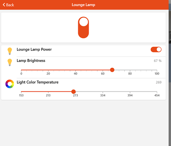
We all need a Widget to turn things On and Off. We also need them to display anything with two states (Open/Closed or Present/Absent etc.)
But we also may have Equipment that does more than just switch an Item (eg. Dimmers and Colour Lights) and sometimes we need to access these extra Items.
This is the widget which gives you all of the above and possibly more.
Its a self contained, standalone widget that can be used with any Item that has two states.
It can be used to just display an Item with two states or provide a toggle function when you click/touch anywhere on the widget.
If an Equipment group is configured it will display a menu Icon and when clicked will show all members of that group and allow you to interact with them.
The displayed Font, Color, Background and even the States themselves are configurable on the advanced properties. (defaults are set for normal ON/OFF switch)
You can also configure a footer Item to display a secondary Item (i.e. The brightness value of a dimmer)
I’m working on a Multistate Widget so keep an eye out for that.
Please feel free to give any sort of feedback.
Screenshots
Changelog
Version 0.1
- initial release
Resources
uid: widget_Toggle
tags: []
props:
  parameters:
    - description: Just display the Item state with no user interaction
      label: Display Only
      name: displayOnly
      required: false
      type: BOOLEAN
    - default: Title
      description: Title to display
      label: Title
      name: Title
      required: false
      type: TEXT
    - default: switch
      description: oh:iconName or iconName (<a class="external text-color-blue" target="_blank" href="https://www.openhab.org/link/icons">openHAB icon</a>), f7:iconName (<a class="external text-color-blue" target="_blank" href="https://framework7.io/icons/">Framework7 icon</a>), material:iconName (<a class="external text-color-blue" target="_blank" href="https://jossef.github.io/material-design-icons-iconfont/">Material icon</a>) or iconify:iconSet:iconName (<a class="external text-color-blue" target="_blank" href="https://icon-sets.iconify.design">Iconify icon</a>, requires being online if not in cache)
      label: Main Icon
      name: mainIcon
      required: false
    - context: item
      description: Enter Main Item to Display.
      label: Main Item
      name: itemMain
      required: true
      type: TEXT
    - context: item
      description: Equipment/group for Menu Action
      label: Equipment
      name: itemEq
      required: false
      type: TEXT
    - default: ON/OFF
      description: Enter ON/OFF State Alias. Useful when using different DisplayStates
      label: State Aliases
      name: stateAlias
      required: false
      type: TEXT
      groupName: advanced
      advanced: true
    - default: "Aquamarine/linear-gradient(40deg, #DAE2F8 0%, #D6A4A4 100%)"
      description: Enter ON/OFF Backgroup colour
      label: Background Colours
      name: bgColour
      required: false
      type: TEXT
      groupName: advanced
      advanced: true
    - default: red/green
      description: Enter ON/OFF Font colour
      label: Font Colours
      name: fntColour
      required: false
      type: TEXT
      groupName: advanced
      advanced: true
    - context: item
      description: Enter Footer Item to display.
      label: footer Item
      name: footerItem
      required: false
      type: TEXT
      groupName: footer
    - description: Enter Footer Icon to Display
      label: Footer Icon
      name: footerIcon
      required: false
      type: TEXT
      groupName: footer
  parameterGroups:
    - name: advanced
      description: State and Color settings
    - name: footer
      description: Icon and Item for Footer
timestamp: Sep 9, 2023, 6:04:33 PM
component: f7-card
config:
  style:
    background: =(@props.itemMain == props.stateAlias.split('/')[0]) ? props.bgColour.split('/')[0]:props.bgColour.split('/')[1]
    border: 3px
    border-radius: 15px
    border-style: =(@props.itemMain == props.stateAlias.split('/')[0])  ? 'inset':'outset'
slots:
  default:
    - component: oh-link
      config:
        action: '=(!props.displayOnly) ? "toggle" : ""'
        actionCommand: ON
        actionCommandAlt: OFF
        actionItem: =props.itemMain
        no-link-class: true
        style:
          border-radius: inherit
          display: flex
          flex-direction: column
          justify-content: flex-start
          width: 100%
      slots:
        default:
          - component: f7-row
            config:
              style:
                display: flex
                flex-direction: row
                justify-content: space-between
                width: 100%
            slots:
              default:
                - component: Label
                  config:
                    style:
                      color: black
                      font-size: .8rem
                      font-weight: bold
                      padding-left: .7rem
                      padding-top: .3rem
                    text: =props.Title
                - component: oh-button
                  config:
                    action: group
                    actionGroupPopupItem: =props.itemEq
                    icon-f7: menu
                    iconSize: 1rem
                    small: true
                    style:
                      color: black
                    visible: '=(props.itemEq) ? "true" : "false"'
          - component: f7-col
            config:
              style:
                display: flex
                flex-direction: column
                height: 4rem
                justify-content: space-evenly
            slots:
              default:
                - component: f7-row
                  config:
                    style:
                      display: flex
                      flex-direction: row
                      justify-content: center
                      width: 100%
                  slots:
                    default:
                      - component: oh-icon
                        config:
                          color: =(@props.itemMain == props.stateAlias.split('/')[0]) ? props.fntColour.split('/')[0]:props.fntColour.split('/')[1]
                          height: 36
                          icon: =props.mainIcon
                          state: =@props.itemMain
                      - component: Label
                        config:
                          style:
                            color: black
                            font-size: 190%
                            font-weight: bold
                          text: =@props.itemMain
                - component: f7-row
                  config:
                    style:
                      display: flex
                      flex-direction: row
                      justify-content: center
                      width: 100%
                    visible: "= (props.footerItem)? true : false"
                  slots:
                    default:
                      - component: oh-icon
                        config:
                          height: 16
                          icon: =(props.footerIcon)
                          state: =@props.footerItem
                          style:
                            padding-right: .2rem
                            padding-top: .1rem
                      - component: Label
                        config:
                          style:
                            color: black
                            font-size: .8rem
                            font-weight: bold
                          text: =@props.footerItem


