I created a couple of widgets and pages in v3.4.0 and decided to create a complete new installation from scratch with v5.1.0, recreated the whole config (which is mostly text based) and copied the yaml code of both widgets and pages. When I now look at the result, the layout is completely malformed, it seems that there is some hidden default to show certain components in the middle instead of being at the left side as intended. The widget itself show correctly, it’s only when used from a page that it goes wrong.
Screenshots
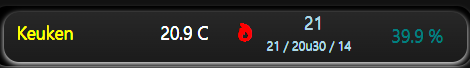
This is how the widget should look like:
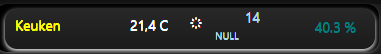
and this is how it looks like in the page (v5.1.0):

In v3.4.0 it showed correctly (don’t mind the values [null] as the old instance is no longer getting the updated values)
Resources
Here’s the widget code:
uid: Mx_Kamer
tags: []
props:
  parameters:
    - description: Select Mx room
      label: Give room name (prefix for items)
      name: MxRoom
      required: true
      type: TEXT
    - context: item
      default: "-"
      description: item
      label: Give humidity item
      name: Humid
      required: false
      type: TEXT
  parameterGroups: []
timestamp: Nov 4, 2025, 9:25:51 PM
component: f7-card
config:
  style:
    --f7-card-margin-horizontal: 0px
    background-color: rgb(0, 0, 0)
    border-radius: 12px
    box-shadow: 0px 1px 4px -2px
    height: 3rem
    text-shadow: 0px -1px
    width: 24rem
slots:
  default:
    - component: f7-badge
      config:
        bgColor: black
        style:
          $transform: skew(-45deg)
          background-image: "linear-gradient(360deg, #1C1C1C 10%, #494949 360%)"
          border-radius: 12px
          box-shadow: 0px 2px 5px
          height: 40px
          left: 10px
          position: absolute
          top: 5px
          width: 370px
    - component: oh-link
      config:
        action: command
        actionCommand: =props.MxRoom
        actionItem: strChart_Label
        style:
          color: yellow
          left: 20px
          position: absolute
          top: 11px
        text: =props.MxRoom
    - component: oh-link
      config:
        style:
          color: white
          left: 135px
          position: absolute
          top: 11px
        text: =items["Temp_Mx_" + props.MxRoom].displayState
    - component: oh-link
      config:
        iconF7: "=(items['Switch_Mx_' + props.MxRoom].state === 'OPEN') ? 'rays' :
          'flame_fill' "
        iconSize: "=(items['Switch_Mx_' + props.MxRoom].state === 'OPEN') ? '12px' :
          '15px' "
        style:
          color: "=(items['Switch_Mx_' + props.MxRoom].state === 'OPEN') ? 'white' : 'red'
            "
          left: 195px
          position: absolute
          top: 14px
    - component: oh-link
      config:
        style:
          color: lightblue
          left: 250px
          position: absolute
          top: 3px
        text: =items["Set_Mx_" + props.MxRoom].displayState | items["Set_Mx_" +
          props.MxRoom].state
    - component: Label
      config:
        style:
          color: lightblue
          font-size: 10px
          left: 220px
          line-height: 32px
          position: absolute
          top: 16px
        text: =items["Text_Mx_" + props.MxRoom].state
    - component: Label
      config:
        style:
          color: teal
          font-size: 14px
          left: 320px
          line-height: 32px
          position: absolute
          top: 8px
        text: =items["Vocht_" + props.MxRoom].state + " %"
        visible: "=items['Vocht_' + props.MxRoom].state === '-' ? false : true"
And here is the page defenition:
config:
  colNum: 8
  fixedType: grid
  hideNavbar: false
  label: Moloch-x
  layoutType: fixed
  scale: true
  screenHeight: 1840
  screenWidth: 540
  showFullscreenIcon: true
  sidebar: true
 blocks: []
masonry: []
grid:
  - component: oh-grid-item
    config:
      h: 1
      w: 8
      x: 0
      y: 3
      position: absolute
    slots:
      default:
        - component: widget:Mx_Kamer
          config:
            Humid: Vocht_Wemos2_Keuken
            MxRoom: Keuken
  - component: oh-grid-item
    config:
      h: 1
      w: 8
      x: 0
      y: 4
    slots:
      default:
        - component: widget:Mx_Kamer
          config:
            MxRoom: Salon
canvas: []
Any help for debugging the issue or other sugestions for improvements are welcome.
Just for info: I got my inspiration for this in the Harmony hub remote widget in the that is published in the market place.
