New Look for Sitemaps

Hi,

First of all, it’s nice to see that sitemaps aren’t entirely dead yet and that there’s still some development. However, I was quite shocked when I opened the Android App this morning. :astonished:

This quite compact, showing lots of information in a confined space :+1::

has turned into this rather unwieldy, not very space-saving … erm … “monstrosity” :sob::

I don’t mind the read bars for the frame titles and displaying value below the item label is pretty much OK too, but the Switch are using way too much space. Is it intentional to waste all that space on a device with limited size?
Is there an option to have the buttons in a decent size so they are displayed in one line on the right side again or is there a configuration option to have the old look?

Cheers
Peter

PS:
And it’s even worse in landscape mode. From this:
grafik

to this (yes, that is really only two roller shutters on the entire page. :frowning:):
grafik

1 Like

:thinking:
What version of the android app are you using? Did you doan update?
I just installed the release version of the app (2.23.0) and do not see your observed problems.

I’m using Version 3.0.1 (according to Play Store it’s been released on 19/01/23).

The update is currently available for ~20% of all users: Release version 3.0.1 · Issue #3133 · openhab/openhab-android · GitHub

The Material 3 rework is also available in the beta version on F-Droid.

There are plenty of issues with cut item label or values, so we decided to go for this approach.

Also see Confusing new layout · Issue #3159 · openhab/openhab-android · GitHub

… which is a screenshot of the iOS app. Got a screenshot of the previous Android app design, especially for the ‘Isabels Zimmer’ row?

Yes, of course, since we like annoying our users :roll_eyes:

No.

To expand on @mueller-ma’s correct answer about the item label vs. content (value + buttons) sizing, please consider

In the particular example of section switches, there maybe is optimization potential (e.g. a dedicated widget layout for large screen sizes - which obviously wouldn’t change the ‘phone screen’ case, but which didn’t fit label + buttons before either). Your tone is not exactly motivating though.
(BTW, the Rollershutter widget would display on one line, but without the ‘sun’ icon, whatever it’s doing)

(And taking the tone aside: what’s your solution suggestion? If you now say ‘as it was before’: what’s your suggestion to deal with a section switch that says ‘Up’, ‘Down’, ‘Stop’ and ‘Sun’ next to ‘Isabels Zimmer’, which would then be displayed as ‘I…’, if at all?)

3 Likes

Ups, I didn’t think we (germans) are so far off (digitally).

I also had a big suprise today when I opened the app with the new UI. I specifically designed my sitemaps such that everything fitted on a mobile screen without any scrolling. I understand the advantages (multi-line, value-support), but it also looks good to fit everything back on a single page.

Are there options available to especially make the frame titles smaller or decrease the spacing between items (or will there be in the future)?

My suggestion is to release a legacy version of the Android app on F-Droid, and anyone who doesn’t like the updates can switch to it. The fine print would be that the legacy version is no longer in development and no longer supported. For most current users, that’s probably fine.

I know that anyone can already compile from the repository, but this would make it easier for those who are less technically inclined, while enabling development of the existing Google/F-Droid versions to continue moving forward.

Personally, I’ll stick with the in-development version.

1 Like

I love the new layout.

Also got the thumbs up from the partners so thats and extra tick.

No, are least none are planned. The new design follows the Material Design 3 spec (or at least attempts to do so), and MD3 uses a bit more white space than older design guide versions. Look at the Android settings app of Android 12 or 13 and you know what I mean.

Of course we can reduce padding here and there by a few pixels, but the difference of doing that will be negligible when it comes to ‘compact layout’.

The (Google Play) APK is here … Please note though it won’t receive any fixes anymore. I don’t know about @mueller-ma’s plans, but I don’t believe having two maintained branches (‘current’ and ‘legacy’) is feasible.

1 Like

Just to clarify, I wasn’t suggesting maintaining a second branch. I’m saying to put it out there once as “openHAB Legacy App” with a description saying that it’s available for current users that prefer the old sitemap layout, but no longer supported. And then I’d mention that in the listing for the current app.

Honestly though, pointing to the APK (as you’ve done) is probably enough for most users.

Whatever the case, I’m looking forward to seeing the changes when the newest version shows up for me. :wink:

I like the new style. But where is the color accent setting? :wink:
Greets

Very nice much needed update.

Design wise took a leap from 2006 to the 2020’s.

1 Like

Hi,

Yes, your’re right. Sorry, the surprise and initial frustration got the better of me.

I don’t mind the overall look. That is just aesthetics, but I would wish for a more efficient usage of space. That is functionality, particularly given the limited area on a phone screen which is probably what most people use sitemaps for. I would expect people using tablets to rather go to Main UI (which I have to admit I can’t get to grips with). But I may be wrong.

Make it “as it was before” … oh wait…

Yeah, I never experienced the multi-line value issue. I had truncated labels, but then I know my items and “Living r…” is still quite clear and I would always prefer to see as much information as possible at a glance.
But I get the point with the multi line values.

So what would be my suggestion other than “as it was before” then :thinking:

I actually don’t mind most of the other widgets beside that I agree with @Piscator that the padding is too extensive. Also showing the values below the labels is pretty much ok. Particulary for switches I can choose not to display the values as icons can be dynamic to reflect their states.

I mainly dislike (and honestly that a major issue for me) the multi-item switches.

If it was possible to have them in one line as long as there is enough space (or even if there isn’t in some cases) I would be quite happy. Like this (similar to the rollershutter switch version):


There is a lot of space to be saved.

Yes that from iOS … well spotted :+1:
No, I do not have a screenshot of the old Android app. If I had known …

I installed an older beta and there my rollershutters are displayed with drop downs, which is worse. However there is one button with what you are aiming at:
grafik

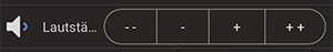
But then, as I said above, I know what “Lautstä…” means. I use it every day, I don’t mind it being truncated. I prefer to get there fast, without scrolling too much.
(I could still remove the spaces I put around the “-” and “+” to reduce the size of the buttons, but that was a good compromise between different devices.)
Maybe an extra option would be possible for multi-item switches to force them into one line like in my mock-up above?!?

It’s an additional setting to quickly close the shutters to a specific value if it’s hot and the sun is shining in summer.

I expect nothing less :wink:
No, honestly, you’re doing a great job with openHAB. Thanks a lot!

Peter

1 Like

Are there similar updates planned for BasicUI and the iOS-App?

If you know what it means, you could remove the label at all. Then the switch will use only one line.

I personally won’t publish an app that doesn’t receive any (security) updates. Anyone can still download older versions from GitHub or F-Droid and disable auto-updates.

It’s gone :wink:
Many first-party apps don’t have an accent color setting and it makes maintaining the app easier without such setting.

Therefore I won’t add it back.

Yes, I could… and if there are like 5, 7 or 10 similar items, I would still prefer at least some orientation even if it’s just a single letter or two.

Also, I use different devices and on - say - an iPad I would still want to have labels without having to maintain different sitemaps.

I doubt it, or if there are they would be driven by different style guides. These changes were driven by the Android style guide.

This setpoint one is still truncated