There are a lot of Energy Flow Widgets for Fronius (and other brands) around, which try to imitate the ones seen on the manufacturer’s apps. Though there are some very nice ones out there, none of them quite matches what I had in mind.
I also found many of them - while working fine - much too convoluted and complicated. They try and wring some functionality from standard components, which are clearly not intended for such use and are rather limited in their application, when trying to replicate a very specific look.
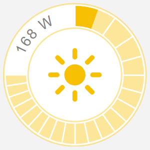
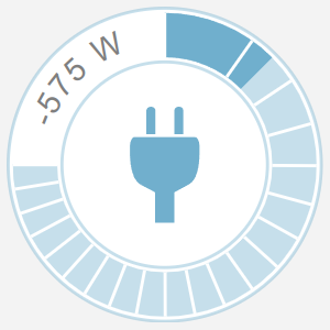
So this is my first attempt at one of the gauges. Eventually it is intended to be used with others (for battery, load, inverter and grid), but also works as standalone widget. It scales freely to the desired size (determined by the parent component) and is built almost completely using SVG, which makes for a much shallower document tree and provides a lot more freedom of design and fine grained control. The downside of this approach is of course a lot of exposed mathematics. I tried to tame some of it by using functions with hopefully self explaining names.
The widget uses an exponential scale (to the power of 0.68). The exponent is completely arbitrary and chosen for aesthetic reasons. Sensible values would range from 0.5 to 2.0). I chose this exponent to allow for a more fine grained display of lower values and more densely packed higher ones. If it is configured with 1, the scale will be linear. It has 20 segments (hence the rangeStep of 13.5).
Any other values should be fairly clear.
You can get to some of the configuration options by choosing “Show advanced”.
You may wonder why I did not include the battery, grid and inverter icons as well. While they all may look similar, under the hood they are completely different beasts. The battery widget has to deal with percentages of charge and all of them can have the power flowing in both directions. The battery also needs dynamic icons. So instead of incorporating all this functionality into one huge mess of code, I may be doing separate widgets for those. Don’t hold your breath though.
Additionally to the pv icon, you will need the consumption icon. Both of them have to be present in the /icons/classic directory.
I hope you like it. It also should be fairly easy to create the other parts of the fronius gauge, using this one as a template.
Changelog
Version 1.1
- added: customization options for the exponential scale, icon and base color. Grouped some of them.
- added: Comments.
- changed: The widget can now be used for pv power as well as load power visualization.
- changed: Numerical representation switches to kW when the value exceeds 1000 W.
- changed: Cleaned up some formulas.
Version 1.0
- initial release
Resources
uid: fronius_pv_gauge
tags:
  - energy
  - solar
  - fronius
props:
  parameters:
    - default: "8000"
      description: Maximum power in Watts.
      label: Maximum Power
      name: max_power
      required: false
      type: INTEGER
      min: 1
    - context: item
      description: Current power in Watts. Typically this would be the solar_yield,
        consumption, battery load etc.
      label: Power
      name: power
      required: false
      type: TEXT
    - default: "100"
      description: The size of the widget.
      label: Widget size
      name: size
      required: false
      type: INTEGER
      groupName: design
      advanced: true
    - default: "0.68"
      description: "Exponent for the scale (default: 0.68; 1=linear, reasonable values
        range from 0.5 to 2)"
      label: Exponent
      name: exponent
      required: false
      groupName: design
      advanced: true
    - default: pv
      description: Icon for the widget. The icon selection determines the base color
        for the widget as well.
      label: Icon
      name: icon
      required: false
      type: TEXT
      groupName: design
      advanced: true
      limitToOptions: true
      options:
        - label: PV
          value: pv
        - label: Load
          value: consumption
  parameterGroups:
    - name: design
      label: Design elements
      description: Group of parameters which determine the visual appearance of the widget.
timestamp: Aug 4, 2024, 1:53:32 PM
component: f7-block
config:
  comment: This component determines the size of the widget.
  style:
    width: =props.size + "px"
    height: =props.size + "px"
    padding: 0px
slots:
  default:
    - component: oh-context
      config:
        comment: "'arc_flag' determines which arc should be drawn (short or long).
          'scale_to_deg' makes sure the input value does not exceed to max_power
          and scales everything to 270°. 'switch_color' handles power less than
          1 and sets the color dependent on the icon selected, based on the
          dictionary in the function. 'to_cartesian' converts degree to
          cartesian coordinates to be used by arc."
        functions:
          arc_flag: "=(degree) => degree < 180 ? 0 : 1"
          scale_to_deg: =(value) => Math.pow(Math.min(Math.abs(value), props.max_power) *
            (270 / props.max_power), props.exponent) * (270 / Math.pow(270,
            props.exponent))
          switch_color: '=(value) => (Math.abs(value) >= 1) ? {"pv": "#f7c002",
            "consumption": "#70afcd"}[props.icon] : "grey"'
          to_cartesian: =(degree) => (50 + Math.sin(degree * Math.PI / 180) * 41) + " " +
            (50 - Math.cos(degree * Math.PI / 180) * 41)
      slots:
        default:
          - component: svg
            config:
              comment: The component scales freely to the size of its parent.
              width: 100%
              height: 100%
              viewBox: 0 0 100 100
            slots:
              default:
                - component: circle
                  config:
                    comment: Outer ring. The stroke color uses the base color with less opacity.
                    style:
                      stroke-width: 1px
                      stroke: =fn.switch_color(#props.power)
                      stroke-opacity: 0.4
                    r: 49.5px
                    cx: 50px
                    cy: 50px
                    fill: white
                - component: path
                  config:
                    comment: Background of the dial. The stroke color uses the base color with less
                      opacity.
                    style:
                      stroke-width: 14px
                      stroke: =fn.switch_color(#props.power)
                      stroke-opacity: 0.4
                    d: M50 9 A41 41 0 1 1 9 50
                    r: 41px
                    cx: 50px
                    cy: 50px
                    fill: rgba(0, 0, 0, 0)
                - component: circle
                  config:
                    comment: Inner ring. The stroke color uses the base color with less opacity.
                    style:
                      stroke-width: 1px
                      stroke: =fn.switch_color(#props.power)
                      stroke-opacity: 0.4
                    r: 32.5px
                    cx: 50px
                    cy: 50px
                    fill: rgba(0, 0, 0, 0)
                - component: path
                  config:
                    comment: Dial, using an exponential scale. If the value exceeds max_power, the
                      color dial turns red.
                    style:
                      stroke: '=(Math.abs(#props.power) < props.max_power) ?
                        fn.switch_color(#props.power) : "#f70202"'
                      stroke-width: 14px
                    d: =`M50 9 A41 41 0 ${fn.arc_flag(fn.scale_to_deg(Math.abs(#props.power)))} 1
                      ${fn.to_cartesian(fn.scale_to_deg(Math.abs(#props.power)))}`
                    fill: rgba(0, 0, 0, 0)
                - component: path
                  config:
                    comment: Path for numerical display of input value.
                    id: pv_text_path
                    d: M9,50 A41 41 0 0 1 50 9
                    fill: rgba(0, 0, 0, 0)
                - component: text
                  config:
                    style:
                      font-size: 10px
                      font-family: sans-serif
                      text-anchor: middle
                      fill: rgb(127, 127, 127)
                      letter-spacing: 1px
                      dominant-baseline: central
                  slots:
                    default:
                      - component: textPath
                        config:
                          xlink:href: "#pv_text_path"
                          startOffset: 50%
                          content: "=Math.abs(#props.power) > 999 ? `${(#props.power / 1000).toFixed(2)}
                            kW` : `${Math.round(#props.power) | 0} W`"
                - component: image
                  config:
                    comment: Icons pv.svg and consumption.svg have to be present in /icons/classic/.
                    width: 44px
                    height: 44px
                    xlink:href: =`/icon/${props.icon}?format=svg&anyFormat=true&iconset=classic`
                    x: 28px
                    y: 28px
                - component: oh-repeater
                  config:
                    comment: Draws the segments of the dial, using an exponential scale.
                    for: degree
                    sourceType: range
                    rangeStart: 0
                    rangeStop: 270
                    rangeStep: 13.5
                    fragment: true
                  slots:
                    default:
                      - component: line
                        config:
                          style:
                            stroke-width: 1px
                            stroke: white
                            transform: ="rotate(" + (Math.pow(loop.degree, props.exponent) * 270 /
                              Math.pow(270, props.exponent)) + "deg)"
                            transform-origin: center
                          x1: 50px
                          x2: 50px
                          y1: 2px
                          y2: 16px