I just found out that I’m having the same problem.
I guess I messed up the code when I copy/pasted the last version.
Need to take a closer look at it.
Fixed in the code in the full YAML in my earlier post above.
The problem was that the 3 last lines should have been on the same level as “style”.
Also make sure you put {period} inside the URL where you would want to have the timerange pasted.
http://192.168.0.13:3000/d-solo/4OdYJNbMk/energie-pv-haus?orgId=1&refresh=1m&from=now-{period}&to=now&panelId=2
Hi,
moving those three lines to line up with “style:” fixed it.
Thanks for your work on this widget - it’s really handy.
Thanks,
Richie
Hello, I would like to display a .svg image that was automatically redrawn every 3 minutes. I can display the picture in the image card as well as in the web frame card, but I cannot “refresh” it. The picture is engraved in the html folder on the Pi
Hello, I solved the problem myself
What did you do to get it working?
I made an f7 widgetsonnenlauf.txt (1.0 KB)
Putting the oh-image inside an f7-block makes the refresh of the image work?
Yes runs. this is only for the shadow run from oh2
matix-theme. so specially intended for it.
Hey @RGroll,
this is a bit OT, but is anyway related to the f7-segmented used in the widget above…
I’m on my way to define buttons to select the operating mode of my Daikin HVAC.
Button pressed selects the correct operating mode of the HVAC, but I’m struggeling to get the right button highlighted with the current seeting.
It seems as if the “fill:” always receives “true”, hence all buttons are highlighed.
item:
DaikinACUnit192168040_Mode
oh-button config / fill (e.g. string “COLD” activates cooling mode":
fill: "=(item.DaikinACUnit192168040_Mode.state === 'COLD') ? true : false"
YAML:
uid: f7-segmented Test
tags: []
props: []
parameterGroups: []
timestamp: Jan 24, 2021, 10:23:25 AM
component: f7-card-content
config:
  style:
    --f7-card-margin-horizontal: 0px
    --f7-card-margin-vertical: 3px
    --f7-card-content-padding-horizontal: 10px
    --f7-card-content-padding-vertical: 10px
slots:
  default:
    - component: f7-segmented
      config:
        round: false
        outline: false
        class:
          - segmented-strong
        style:
          --f7-segmented-strong-padding: 0px
          --f7-segmented-strong-between-buttons: 5px
          --f7-segmented-strong-button-font-weight: 300
          --f7-segmented-strong-bg-color: rgba(255, 255, 255, 0.05)
          --f7-segmented-strong-button-hover-bg-color: rgba(255, 255, 255, 0.07)
      slots:
        default:
          - component: oh-button
            config:
              iconF7: arrow_2_squarepath
              fill: "=(item.DaikinACUnit192168040_Mode.state === 'AUTO') ? true : false"
              round: false
              outline: false
              style:
                --f7-button-font-size: 14px
                --f7-button-border-width: 1px
                --f7-button-text-color: white
                --f7-button-border-color: rgba(255,255,255,.15)
                --f7-button-border-radius: 5px
              action: command
              actionItem: DaikinACUnit192168040_Mode
              actionCommand: ="AUTO"
          - component: oh-button
            config:
              iconF7: snow
              fill: "=(item.DaikinACUnit192168040_Mode.state === 'COLD') ? true : false"
              round: false
              outline: false
              style:
                --f7-button-font-size: 14px
                --f7-button-border-width: 1px
                --f7-button-text-color: white
                --f7-button-border-color: rgba(255,255,255,.15)
                --f7-button-border-radius: 5px
              action: command
              actionItem: DaikinACUnit192168040_Mode
              actionCommand: ="COLD"
          - component: oh-button
            config:
              iconF7: flame
              fill: "=(item.DaikinACUnit192168040_Mode.state === 'HEAT') ? true : false"
              round: false
              outline: false
              style:
                --f7-button-font-size: 14px
                --f7-button-border-width: 1px
                --f7-button-text-color: white
                --f7-button-border-color: rgba(255,255,255,.15)
                --f7-button-border-radius: 5px
              action: command
              actionItem: DaikinACUnit192168040_Mode
              actionCommand: ="HEAT"
          - component: oh-button
            config:
              iconF7: drop
              fill: "=(item.DaikinACUnit192168040_Mode.state === 'DEHUMIDIFIER') ? true : false"
              round: false
              outline: false
              style:
                --f7-button-font-size: 14px
                --f7-button-border-width: 1px
                --f7-button-text-color: white
                --f7-button-border-color: rgba(255,255,255,.15)
                --f7-button-border-radius: 5px
              action: command
              actionItem: DaikinACUnit192168040_Mode
              actionCommand: ="DEHUMIDIFIER"
          - component: oh-button
            config:
              iconF7: wind
              fill: "=(item.DaikinACUnit192168040_Mode.state === 'FAN') ? true : false"
              round: false
              outline: false
              style:
                --f7-button-font-size: 14px
                --f7-button-border-width: 1px
                --f7-button-text-color: white
                --f7-button-border-color: rgba(255,255,255,.15)
                --f7-button-border-radius: 5px
              action: command
              actionItem: DaikinACUnit192168040_Mode
              actionCommand: ="FAN"
What am I doing wrong?
Hey @maxmaximax
just a typo - it’s items.XY.state instead of item.XY.state 
Thanks a lot !
Great idea and post. Thus, wants me to make similar things.
So far, so good, but I have a design issue and no idea how to solve it.

I always have a white bar at the bottom and don’t know how to get rid of it. I do not need a header or footer. My very basic code so far:
uid: Chart-widget
tags: []
props:
timestamp: Jan 25, 2021, 2:32:56 PM
component: f7-card
config:
  style:
    border-radius: 20px
    background-color: rgba(17,28,31)
slots:
  default:
    - component: f7-card-content
      slots:
        default:
        - component: oh-webframe-card
          config:
            src: https://server:3000/d-solo/0ZnG09uZk/openhab?orgId=2&refresh=5m&from=now-8h&to=now&panelId=2
Anyone any idea?
Fixed it with adding/chaging the following in the webframe definition
- component: oh-webframe-card
        config:
          src: =props.urlContent
          class:
            - display-block
@ysc ,
is there a way change the orientation of the f7-segmented to vertical?
Couldn’t find anything on the f7 website…
Thank you.
No, you can stack regular buttons vertically with flexbox but that’s all.
Or you can try the transform: rotate(-90deg) along with transform-origin and some other adjustments. Probably not what you wanted though.
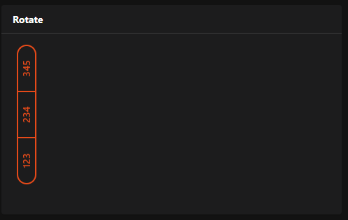
component: f7-card
config:
  title: Rotate
  footer: =props.prop1
  style:
    height: 300px
slots:
  default:
    - component: f7-card-content
      config:
        style:
          display: flex
          flex-direction: row
          height: 200px
      slots:
        default:
          - component: f7-segmented
            config:
              round: true
              style:
                width: 200px
                margin-left: -80px
                transform: rotate(-90deg)
                transform-origin: center center
            slots:
              default:
                - component: oh-button
                  config:
                    text: 123
                    round: true
                    outline: true
                - component: oh-button
                  config:
                    text: 234
                    round: true
                    outline: true
                - component: oh-button
                  config:
                    text: 345
                    round: true
                    outline: true
Thanks for this code. I used it and is working fine.
I want to extent this code with a second line of buttons where you can select the base url. In that way the same yaml code can be used to display multiple Grafana layouts.
Did already someone created such a layout?
Or is there another way to archive the same?
Well, haven’t tried myself but I’d try with the same approach as described here for {period}.
I would see 2 options that should work:
-
Replace “panelId=2” with “panelId={panelnumber}” to differentiate between the different graphs when the graphs are in the same grafana dashboard
-
Replace “4OdYJNbMk/energie-pv-haus” with “{dashboard}” when the graphs are in different dashboards
… or a combination of the 2 options.
Awesome widget. I would be really happy to use it. Maybe you can help me with my issue. I have set up InfluxDB and I am using Grafana 7.2.0.
The problem I am facing is that after adding the props to the widget and saving it doesn’t show the graph at all. Tried different browsers.
adding the props

graph not showing in page

I also wonder that the props seem to disappear. After chosing “set props” again the property values are empty. Even though I saved them before and had a preview as you can see in the picture above.
props empty again

Is this an issue about the grafana credentials or embedding itself?