OH3: UI editor quirks; items not showing; comments disappearing

  • openHABian 3.4 on rPi4 with 4GB

I am referring to this: Animated Energy Widget

This is the first time I am working with pages and widgets in the UI editor.
… and I have to say this UI editor is ridiculous! … or I don’t know how to use it.

I massaged this widget and did some testing by setting visibility to true and commented out the formula that determines visibility.
Guess what? It removed all comments, hence, I lost all formulas.

Also, when searching in an file open in the editor with Ctrl-F, it counts one more than there are results in the file. It looks like it counts the search term as well.

Where do people actually edit these yaml files, so that

  1. (ideally) the item names can be selected from a list
  2. comments remain in the file
    Solution for this is, introduce a new property, such as Comment, Note, etc., like so:
Note: line from pv to consumers
visible: true
Comment: "=(Number.parseFloat(items[props.spm_Solar_Total].state) - (Number.parseFloat(items[props.spm_Source_Power].state) + Math.abs(Number.parseFloat(items[props.spm_Battery_Power].state))) > 0) ? true : false"

Why are visibility statements in quotes and text: isn’t?

What is the difference between .displayState and .state?
Answer: Formatting of values in UI / state vs displaystate

Why did some say they had to cast to parseInt instead of parseFloat? This makes no sense. My power values are all integers, hence, I should be be able to cast these to Floats for the purpose of this widget?

However, none of my values show, even when selecting the correct item. What am I missing?


Only have a widget under Developer Tools; not elsewhere. Do I need to?
Does the item selection only work in ‘the other’ location? Wherever that is?!


When saving the icons, my browser picked .png as extension. Are these actually SVGs?


Any hints appreciated.

The yaml is stored by OH as json files. Data in yaml is 100% compatible with the json format (by design), but json does not have comments. So comments in yaml get ignored when going to json and thus, when OH goes back to yaml from the json the comments are gone. This is why this trick

works. You can comment out lines in the yaml editor temporarily while you are designing and testing, you just cannot save and reload the comments.

Due to the structure of vue UI there is actually quite a bit more on many pages than you actually see. The search function, however still finds these hidden things. The discrepancy between the number of search hits and the text is not simple one extra. Here I can get 8 search hits for a word that doesn’t exist in the widget text at all:

This is the best game in town for widget editing. You could use a different text editor and then paste your content into the widget editor pane, but you would loose all content hints, yaml checks, and live preview.

There are many places in the editor where you do indeed get a list item names as along as it is one of the item contexts that the widget editor recognizes (for example, after you type items. or @@). If the list of item names doesn’t come up in these situations you can press ctrl + space to bring up the hint window.

In fact this hint window works for much more than just item names, it will also give you many other hints about available opbjects in the widget expressions.

The yaml sytax requires [key name]:[space][key value], so yaml readers base their parsing on the location of :[space]. Because the widget expressions use a javascript like syntax, there are places where :[space] might appear a second time in a line. The most common example is the javascript ternary operator test ? if true : if false. If you put on of those as the raw value of one of the yaml keys like this:

color: =(items.some_switch.state == 'ON') ? 'green' : 'red'

you will get a yaml parsing error because it thinks you have put two key-value pairs on one line. One solution to this is to put the whole expression (leading = included) inside quotes so that it is clear the full expression string is one value. The other solution is simply to get rid of the space after the : in the expression. For readability, I prefer to use ( ) to set off each part:

color: =(items.some_switch.state == 'ON')?('green'):('red')

There is no requirement here other than whatever the logic of the expression demands. parseInt and parseFloat work exactly as you would expect them to.

Yes, but there’s also no reason to as long as the logic of the rest of the expression can handle integer values.

No one will ever be able to tell you unless you show the code that isn’t working.

All your custom widgets are listed in the widgets section of the developer tools. But that is just for the administration of the widgets. You have to add the widgets to one or more pages to see them in actions in the normal users space of the UI.

1 Like

Awesome; thank you :+1: Lots of great info…

I found the expression editor; it does not work with double quotes; like so:

"=(Number.parseInt(items[props.spm_Battery_SoC].state) > 20) ? true : false"

Removing the quotes always leads to false.

In fact, I can only get this to work, when removing all but:

=items.spm_Battery_SoC.state > 20 ? true : false

… which leads ot the question, do I need [probs] bit?

Yes, I get that :slight_smile: I was referring to the original post… this seems to work for most. I am puzzled, that none of the numbers (labels?) are shown?
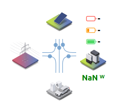
I strongly believe that post is correct, and after placing my items in there, none show… which is unexpected, the items exist, and are all numbers (no units; hence, why I removed the split() the author had in there); like so:

Example:
Author:

visible: '=(Number.parseFloat(items[props.netzeinspeisung].state.split(" ")[0]) > 0) ? true : false'

Me:

visible: '=(Number.parseFloat(items[props.spm_Source_Power].state) > 0) ? true : false'

Setting the formulas to true (commenting them out)… All symbols show, but no numbers.
image

I did not change the formula, but only the item name(s).

Note: line from pv to consumers
visible: "=(Number.parseFloat(items[props.spm_Solar_Total].state) - (Number.parseFloat(items[props.spm_Source_Power].state) + Math.abs(Number.parseFloat(items[props.spm_Battery_Power].state))) > 0) ? true : false"```

I didn’t think I can bugger this up as I seemingly did.

The short of it: setting visibility to true will work, using the formula doesn’t.


Alright: simple things… I have to redraw the widget when changing these formulas. It never occurred to me, because when changing symbol-related code, it did make the changes in the preview.

DANG! :frowning:

The top of the widget you are looking at (and, in deed, the top of 99.99999% of widgets) contains a list of the widget properties, or props.

uid: SMA_widget
tags: []
props:
  parameters:
    - context: item
      label: Netzeinspeisung
      name: netzeinspeisung
      required: true
      type: TEXT
    - context: item
      label: Netzbezug
      name: netzbezug
      required: true
      type: TEXT
+ many more

These can call be configured to whatever values you like. In the widget editor you do this by pressing the set props button at the bottom of the window. When you are adding the widget to a page you do it by putting the values in the widget’s config object.

The whole point of these props in widgets is that you shouldn’t have to change the code of the widget at all to to make it work with your system, you just configure the widget properties with the names of your own items.

You will set prop netzeinspeisung to the name of your item that represents the outgoing power of your system. You will set prop netzbezug to the name of your item that represent the incoming power of your system. etc.

If, for some reason, you really want to change the widget expressions, then you need to understand what the expression actually is:

visible: '=(Number.parseFloat(items[props.netzeinspeisung].state.split(" ")[0]) > 0) ? true : false'
  • props.netzeinspeisung evaluates to a string that conatins the name of the items set as that property
  • items[some_string].state retrieves the current state of the item with the name that is held in the string variable/expression some_string.

If you want to get the state of an item that you know the name of (and will never change as far as the expression is concerned) you can use the dot syntax instead items.exact_name_of_item_here.state.

In the epxressions you will see the [ ] syntax more often because the name of the item is being generated as a string by some other expression, such as getting the value of the netzeinspeisung property.

1 Like

Thank you again!

I am making progress…

I have now figured that I need to redraw the widget after making a change, but do not need to save it first. OK.

I also figured, removing the props[] part will produce numbers and working formulas.

I will make an effort to understand what your props[] explanation means.
→ Got it. Set Props link at bottom (as you indicated).

One thing missing…

When I “Set Props”, I get an item list, and make the relevant associations.

Ctrl-R will redraw the widget, and it looks as it should.

What do I need to do next?

I reloaded the widget and was ‘uninitialised’ as in the associations were gone.

Repeated the associations, and hit save; reloaded and the association was gone.

How do I make this permanent?

You do not use the widget editor to deploy this widget. This is just for development of the general widget template, which is why the props are not saved. If you want a permanent version of the widget you have to add it to a page (where you will have a chance to configure the properties you want to see for the widget on that particular page).

Each one of the custom widgets can be reused as many times as you like on as many different UI pages as you like with different configured properties each time. It would defeat the purpose of the widgets if you had to use the widget editor tosave only one set of properties.

1 Like

Again, I am very grateful for your support!

Thanks again; I got it now.

For all others, this is (I am) an example of someone who has never before touched yaml, f7, widgets and the UI editor in openHAB. It has nothing to do with the ‘traditional’ (pre OH3) way of knowledge. Completely different kettle of fish.

Enjoy.

image

The Developer Sidebar (alt-shift-d) can also search for, pin, and let you copy Item names, Thing IDs, etc… This works in cases where the inline hint window doesn’t work or is otherwise unavailable.

I want to caution on the use of “cast” here. This is not a correct usage of this term. In programming languages that support Object Oriented Programming there is a concept called “polymorphism”. This concept means that you can have a hierarchy of “is a” relationships that any single Object can have. For example:

Object -> Number -> BigDecimal
    |        |----> Integer
    |        |----> Double
    |---> String

Given the above, Double, Integer and BigDecimal are all dependents of Number. This means all three actually are Numbers and therefore you can “cast” each of them to become Number.

However, this casting only goes up or down, not side to side. You cannot cast a BigDecimal to a Double, for example. Given that, you cannot simply cast a String to a Number because Number is not in the hierarchy for String.

In order to convert types in cases where casting is not possible requires a transformation. In this case, you’d parse the String to create a new Number. This transformation is not a cast.

I don’t want to be pedantic here but avoid confusion because casting is a fundamentally different type of operation from a type transformation and if they are mentally treated the same you will run into trouble and confusion down the line.

This point cannot be stressed enough for both end users and for those coding widgets and rule templates. Every effort should be made to make it so that end users do not have to edit the widgets so as many things that can be configured through a property should be configured that way.

I’ll also add they can be used in “default X widget” Item metadata. That’s actually how I uses custom widgets the most.

One thing I like to do with widgets like this is to set it as the “default stand-alone widget” of the Equipment Group. Then I can just put that Group Item on the page and it will use that stand alone widget instead of putting the widget on the page directly.

If you want to change how it appears on the Overview page’s tabs, set the “default list item widget”.

1 Like

Hello!

Can you maybe post your whole yaml config?
I am using this animation currently but without battery icon. I managed it somehow to get it working 1,5 years ago! Now I´m getting a battery installed and I´m struggeling with the config of the yaml file. I´m almost there but now the animated symbols are missing?!

Thank you!

Sure can…

However, I modified the original by adding comments, and using English props.

uid: energy_widget
tags: []
description: 2024-04-07 MaxG derived from the SMA widget; anglified; and added descriptions
props:
  parameters:
    - context: item
      label: Grid export
      name: grid_export
      required: true
      type: TEXT
    - context: item
      label: Grid import
      name: grid_import
      required: true
      type: TEXT
    - context: item
      label: Current load
      name: current_load
      required: true
      type: TEXT
    - context: item
      label: Solar PV production
      name: pv_generation
      required: true
      type: TEXT
    - context: item
      label: Battery power
      name: battery_power
      required: true
      type: TEXT
    - context: item
      label: Battery SoC
      name: battery_soc
      required: true
      type: TEXT
  parameterGroups: []
timestamp: Apr 4, 2024, 11:27:56 PM
component: f7-card
config:
  class:
    - display-flex
    - flex-direction-column
    - align-items-center
  style:
    height: 383px
slots:
  content:
    - component: f7-block
      config:
        style:
          --f7-theme-color: var(--f7-text-color)
          display: flex
          justify-content: space-between
          padding: 0
      slots:
        default:
          - component: f7-col
            description: first column
            config:
              style:
                align-items: center
                display: flex
                flex-direction: row
            slots:
              default:
                - component: f7-block
                  config:
                    style:
                      align-items: center
                      display: flex
                      flex-direction: column
                      height: 110px
                      justify-content: center
                      margin-top: 0
                      width: 110px
                  slots:
                    default:
                      - description: grid related stuff
                      - component: oh-icon
                        config:
                          height: 110px
                          icon: w_grid
                      - component: Label
                        config:
                          style:
                            color: red
                            font-size: 25px
                            font-weight: bold
                            margin-top: -10px
                            text-align: center
                            width: 100px
                          text: =items[props.grid_import].displayState
                          visible: '=(Number.parseFloat(items[props.grid_export].state.split(" ")[0]) == 0) ? true : false'
                      - component: Label
                        config:
                          style:
                            color: green
                            font-size: 25px
                            font-weight: bold
                            margin-top: -10px
                            text-align: center
                            width: 100px
                          text: =items[props.grid_export].displayState
                          visible: '=(Number.parseFloat(items[props.grid_export].state.split(" ")[0]) > 0) ? true : false'
          - component: f7-col
            description: second column, pv panel, energy flow paths, and consumers
            config:
              style:
                align-items: center
                display: flex
                flex-direction: column
                flex-grow: 1
            slots:
              default:
                - component: f7-block
                  description: pv panel number and icon
                  config:
                    style:
                      align-items: center
                      display: flex
                      flex-direction: column
                      height: 110px
                      justify-content: center
                      margin-top: 0
                      width: 110px
                  slots:
                    default:
                      - component: Label
                        config:
                          style:
                            font-size: 25px
                            font-weight: bold
                            text-align: center
                            width: 100px
                          text: =items[props.pv_generation].displayState
                          visible: '=(Number.parseFloat(items[props.pv_generation].state.split(" ")[0]) > 0) ? true : false'
                      - component: oh-icon
                        config:
                          height: 110px
                          icon: w_pv_panel
                          style:
                            margin-top: -20px
                - component: f7-block
                  description: all energy flow paths
                  config:
                    style:
                      display: flex
                      justify-content: center
                      margin: 0
                      padding: 0
                      width: 100%
                  slots:
                    default:
                      - component: f7-row
                        config:
                          preserveAspectRatio: xMidYMid slice
                          style:
                            height: auto
                            width: auto
                          tag: svg
                          viewBox: 0 0 100 100
                          xmlns: http://www.w3.org/2000/svg
                        slots:
                          default:
                            - component: f7-row
                              config:
                                d: M60 -5 v10 c0 30 10 35 30 35 h20
                                fill: none
                                id: path1
                                stroke: rgba(100, 150, 200, 0.8)
                                stroke-width: 2
                                tag: path
                                vector-effect: non-scaling-stroke
                                description: line from pv to battery
                                visible: '=(Number.parseFloat(items[props.battery_power].state.split(" ")[0]) < 0) ? true : false'
                            - component: f7-row
                              config:
                                fill: rgba(100, 150, 200, 0.8)
                                r: 6
                                style:
                                  stroke-width: 4
                                tag: circle
                                vector-effect: non-scaling-stroke
                                description: dot from pv to battery
                                visible: '=(Number.parseFloat(items[props.battery_power].state.split(" ")[0]) < 0) ? true : false'
                              slots:
                                default:
                                  - component: f7-row
                                    config:
                                      calcMode: linear
                                      dur: 4s
                                      repeatCount: indefinite
                                      tag: animateMotion
                                    slots:
                                      default:
                                        - component: f7-row
                                          config:
                                            tag: mpath
                                            xlink:href: "#path1"
                            - component: f7-row
                              config:
                                d: M40 -5 v10 c0 40 -10 35 -30 35 h-20
                                fill: none
                                id: path2
                                stroke: rgba(100, 150, 200, 0.8)
                                stroke-width: 2
                                tag: path
                                vector-effect: non-scaling-stroke
                                description: line from pv to grid; grid_import = AC_Source, which is positive; see if negative on import after dark. import < 0 works during day (was ==)
                                note: 2024-04-10 removed &&, works correct during day, but draws line/dot after dark
                                visible: '=(Number.parseFloat(items[props.grid_export].state.split(" ")[0]) > 0 && Number.parseFloat(items[props.grid_import].state.split(" ")[0]) < 0) ? true : false'
                            - component: f7-row
                              config:
                                fill: rgba(100, 150, 200, 0.8)
                                r: 6
                                strokeWidth: 10
                                tag: circle
                                vectorEffect: non-scaling-stroke
                                description: dot from pv to grid
                                visible: '=(Number.parseFloat(items[props.grid_export].state.split(" ")[0]) > 0 && Number.parseFloat(items[props.grid_import].state.split(" ")[0]) < 0) ? true : false'
                              slots:
                                default:
                                  - component: f7-row
                                    config:
                                      calcMode: linear
                                      dur: 4s
                                      repeatCount: indefinite
                                      tag: animateMotion
                                    slots:
                                      default:
                                        - component: f7-row
                                          config:
                                            tag: mpath
                                            xlink:href: "#path2"
                            - component: f7-row
                              config:
                                d: M50, 0 v100
                                fill: none
                                id: path3
                                stroke: rgba(100, 150, 200, 0.8)
                                stroke-width: 2
                                tag: path
                                vector-effect: non-scaling-stroke
                                description: line from pv to consumers; removed grid export to make it work during the day
                                visible: '=(Number.parseFloat(items[props.pv_generation].state.split(" ")[0]) - (Number.parseFloat(items[props.grid_export].state.split(" ")[0]) + Math.abs(Number.parseFloat(items[props.battery_power].state.split(" ")[0]))) > 0) ? true : false'
                            - component: f7-row
                              config:
                                fill: rgba(100, 150, 200, 0.8)
                                r: 6
                                strokeWidth: 10
                                tag: circle
                                vectorEffect: non-scaling-stroke
                                visible: '=(Number.parseFloat(items[props.pv_generation].state.split(" ")[0]) - (Number.parseFloat(items[props.grid_export].state.split(" ")[0]) + Math.abs(Number.parseFloat(items[props.battery_power].state.split(" ")[0]))) > 0) ? true : false'
                              slots:
                                default:
                                  - component: f7-row
                                    config:
                                      calcMode: linear
                                      dur: 4s
                                      repeatCount: indefinite
                                      tag: animateMotion
                                    slots:
                                      default:
                                        - component: f7-row
                                          config:
                                            tag: mpath
                                            xlink:href: "#path3"
                            - component: f7-row
                              config:
                                d: M-5 50 l10 0 c40 0 35 10 35 50 l 0 20
                                fill: none
                                id: path4
                                stroke: rgba(100, 150, 200, 0.8)
                                stroke-width: 2
                                tag: path
                                vector-effect: non-scaling-stroke
                                description: line from grid to consumers; should be < 0 (was >); tested works during day pv gen; check after dark
                                visible: '=(Number.parseFloat(items[props.grid_import].state.split(" ")[0]) < 0) ? true : false'
                            - component: f7-row
                              config:
                                fill: rgba(100, 150, 200, 0.8)
                                r: 6
                                strokeWidth: 10
                                tag: circle
                                vectorEffect: non-scaling-stroke
                                description: dot from grid to consumers
                                visible: '=(Number.parseFloat(items[props.grid_import].state.split(" ")[0]) < 0) ? true : false'
                              slots:
                                default:
                                  - component: f7-row
                                    config:
                                      calcMode: linear
                                      dur: 4s
                                      repeatCount: indefinite
                                      tag: animateMotion
                                    slots:
                                      default:
                                        - component: f7-row
                                          config:
                                            tag: mpath
                                            xlink:href: "#path4"
                            - component: f7-row
                              config:
                                d: M 105 50 l -10 0 c -40 0 -35 10 -35 50 l 0 20
                                fill: none
                                id: path5
                                stroke: rgba(100, 150, 200, 0.8)
                                stroke-width: 2
                                tag: path
                                vector-effect: non-scaling-stroke
                                description: line from battery to consumers; changing spm_Battery_Power_Inverted to spm_Battery_Power makes this work, as it is negative when draining
                                visible: '=(Number.parseFloat(items[props.battery_power].state.split(" ")[0]) > 0) ? true : false'
                            - component: f7-row
                              config:
                                fill: rgba(100, 150, 200, 0.8)
                                r: 6
                                strokeWidth: 10
                                tag: circle
                                vectorEffect: non-scaling-stroke
                                description: dot from battery to consumers
                                visible: '=(Number.parseFloat(items[props.battery_power].state.split(" ")[0]) > 0) ? true : false'
                              slots:
                                default:
                                  - component: f7-row
                                    config:
                                      calcMode: linear
                                      dur: 4s
                                      repeatCount: indefinite
                                      tag: animateMotion
                                    slots:
                                      default:
                                        - component: f7-row
                                          config:
                                            tag: mpath
                                            xlink:href: "#path5"
                - component: f7-block
                  description: comsumers
                  config:
                    style:
                      align-items: center
                      display: flex
                      flex-direction: column
                      height: 110px
                      justify-content: center
                      margin-top: -10px
                      width: 110px
                  slots:
                    default:
                      - component: oh-icon
                        config:
                          color: orange
                          height: 110px
                          icon: w_consumers
                      - component: Label
                        config:
                          style:
                            font-size: 25px
                            font-weight: bold
                            margin-top: -10px
                            text-align: center
                            width: 100px
                          text: =items[props.current_load].displayState
          - component: f7-col
            description: third column
            config:
              style:
                align-items: center
                display: flex
                flex-direction: row
            slots:
              default:
                - component: f7-block
                  config:
                    style:
                      align-items: center
                      display: flex
                      flex-direction: column
                      height: 110px
                      justify-content: center
                      margin-top: -40px
                      width: 110px
                  slots:
                    default:
                      - component: oh-link
                        config:
                          description: red battery symbol over battery symbol
                          iconColor: red
                          iconF7: battery_0
                          iconSize: 33px
                          style:
                            font-size: 25px
                            font-weight: bold
                            white-space: nowrap
                          text: =items[props.battery_soc].state
                          visible: '=(Number.parseFloat(items[props.battery_soc].state.split(" ")[0]) < 20) ? true : false'
                      - component: oh-link
                        config:
                          description: orange battery symbol over battery symbol
                          iconColor: orange
                          iconF7: battery_25
                          iconSize: 33px
                          style:
                            font-size: 25px
                            font-weight: bold
                            white-space: nowrap
                          text: =items[props.battery_soc].state
                          visible: '=(Number.parseFloat(items[props.battery_soc].state.split(" ")[0]) >= 20 && Number.parseFloat(items[props.battery_soc].state.split(" ")[0]) < 80) ? true : false'
                      - component: oh-link
                        config:
                          description: red battery symbol over battery symbol
                          iconColor: green
                          iconF7: battery_100
                          iconSize: 33px
                          style:
                            font-size: 25px
                            font-weight: bold
                            white-space: nowrap
                          text: =items[props.battery_soc].state
                          visible: '=(Number.parseFloat(items[props.battery_soc].state.split(" ")[0]) >= 80) ? true : false'
                      - component: oh-icon
                        config:
                          height: 110px
                          icon: w_battery
                          style:
                            margin-top: -20px
                      - component: Label
                        config:
                          description: text under battery symbol, negative = red, positive = green
                          style:
                            color: '=(Number.parseFloat(items[props.battery_power].state.split(" ")[0]) > 0) ? "red" : "green"'
                            font-size: 25px
                            font-weight: bold
                            margin-top: -10px
                            text-align: center
                            white-space: nowrap
                            width: 100px
                          text: =Math.abs(Number.parseFloat(items[props.battery_power].state.split(" ")[0])) + ' ᵂ'
                          visible: '=(Number.parseFloat(items[props.battery_power].state.split(" ")[0]) !== 0) ? true : false'

If the icons are missing, maybe you are not referencing the proper path you had before??

1 Like