Hi all,
I working on a widget for OH3 that use my broadlink rm3 (see also habpanel)
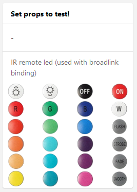
Here are the first result concerning the widget layout.
updated code (2020 11 22)
uid: ir_widget_9ba8e79e82
tags:
- rm3
props:
parameters:
- description: A text prop
label: Prop 1
name: prop1
required: false
type: TEXT
- context: item
description: An item to control
label: Item
name: item
required: false
type: TEXT
parameterGroups: []
timestamp: Nov 22, 2020, 12:23:25 PM
component: f7-card
config:
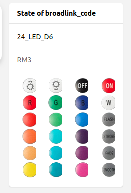
title: '=(props.item) ? "State of " + props.item : "Set props to test!"'
footer: =props.prop1
content: =items[props.item].displayState || items[props.item].state
slots:
default:
- component: f7-card-content
slots:
default:
- component: f7-row
slots:
default:
- component: f7-col
config:
class:
- button
- button-large
- align-items-center
slots:
default:
- component: oh-button
config:
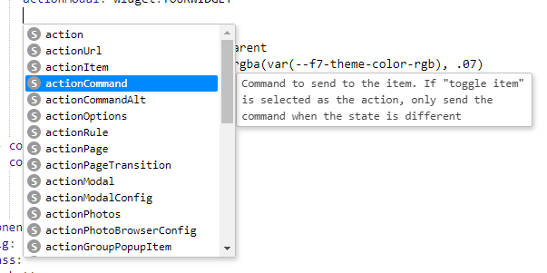
action: command
actionItem: broadlink_code
actionCommand: 24_LED_A1
style:
--f7-button-bg-color: transparent
--f7-button-hover-bg-color: rgba(var(--f7-theme-color-rgb), .07)
--f7-button-pressed-bg-color: rgba(0,0,0,.15)
position: absolute
top: 0
left: 0
height: 100%
width: 100%
- component: oh-icon
config:
icon: a1
style:
height: 95%
- component: f7-col
config:
class:
- button
- button-large
- align-items-center
slots:
default:
- component: oh-button
config:
action: command
actionItem: broadlink_code
actionCommand: 24_LED_B1
style:
--f7-button-bg-color: transparent
--f7-button-hover-bg-color: rgba(var(--f7-theme-color-rgb), .07)
--f7-button-pressed-bg-color: rgba(0,0,0,.15)
position: absolute
top: 0
left: 0
height: 100%
width: 100%
- component: oh-icon
config:
icon: a2
style:
height: 95%
- component: f7-col
config:
class:
- button
- button-large
- align-items-center
slots:
default:
- component: oh-button
config:
action: command
actionItem: broadlink_code
actionCommand: 24_LED_C1
style:
--f7-button-bg-color: transparent
--f7-button-hover-bg-color: rgba(var(--f7-theme-color-rgb), .07)
--f7-button-pressed-bg-color: rgba(0,0,0,.15)
position: absolute
top: 0
left: 0
height: 100%
width: 100%
- component: oh-icon
config:
icon: a3
style:
height: 95%
- component: f7-col
config:
class:
- button
- button-large
- align-items-center
slots:
default:
- component: oh-button
config:
action: command
actionItem: broadlink_code
actionCommand: 24_LED_D1
style:
--f7-button-bg-color: transparent
--f7-button-hover-bg-color: rgba(var(--f7-theme-color-rgb), .07)
--f7-button-pressed-bg-color: rgba(0,0,0,.15)
position: absolute
top: 0
left: 0
height: 100%
width: 100%
- component: oh-icon
config:
icon: a4
style:
height: 95%
- component: f7-row
slots:
default:
- component: f7-col
config:
class:
- button
- button-large
- align-items-center
slots:
default:
- component: oh-button
config:
action: command
actionItem: broadlink_code
actionCommand: 24_LED_A2
style:
--f7-button-bg-color: transparent
--f7-button-hover-bg-color: rgba(var(--f7-theme-color-rgb), .07)
--f7-button-pressed-bg-color: rgba(0,0,0,.15)
position: absolute
top: 0
left: 0
height: 100%
width: 100%
- component: oh-icon
config:
icon: b1
style:
height: 95%
- component: f7-col
config:
class:
- button
- button-large
- align-items-center
slots:
default:
- component: oh-button
config:
action: command
actionItem: broadlink_code
actionCommand: 24_LED_B2
style:
--f7-button-bg-color: transparent
--f7-button-hover-bg-color: rgba(var(--f7-theme-color-rgb), .07)
--f7-button-pressed-bg-color: rgba(0,0,0,.15)
position: absolute
top: 0
left: 0
height: 100%
width: 100%
- component: oh-icon
config:
icon: b2
style:
height: 95%
- component: f7-col
config:
class:
- button
- button-large
- align-items-center
slots:
default:
- component: oh-button
config:
action: command
actionItem: broadlink_code
actionCommand: 24_LED_C2
style:
--f7-button-bg-color: transparent
--f7-button-hover-bg-color: rgba(var(--f7-theme-color-rgb), .07)
--f7-button-pressed-bg-color: rgba(0,0,0,.15)
position: absolute
top: 0
left: 0
height: 100%
width: 100%
- component: oh-icon
config:
icon: b3
style:
height: 95%
- component: f7-col
config:
class:
- button
- button-large
- align-items-center
slots:
default:
- component: oh-button
config:
action: command
actionItem: broadlink_code
actionCommand: 24_LED_D2
style:
--f7-button-bg-color: transparent
--f7-button-hover-bg-color: rgba(var(--f7-theme-color-rgb), .07)
--f7-button-pressed-bg-color: rgba(0,0,0,.15)
position: absolute
top: 0
left: 0
height: 100%
width: 100%
- component: oh-icon
config:
icon: b4
style:
height: 95%
- component: f7-row
slots:
default:
- component: f7-col
config:
class:
- button
- button-large
- align-items-center
slots:
default:
- component: oh-button
config:
action: command
actionItem: broadlink_code
actionCommand: 24_LED_A3
style:
--f7-button-bg-color: transparent
--f7-button-hover-bg-color: rgba(var(--f7-theme-color-rgb), .07)
--f7-button-pressed-bg-color: rgba(0,0,0,.15)
position: absolute
top: 0
left: 0
height: 100%
width: 100%
- component: oh-icon
config:
icon: c1
style:
height: 95%
- component: f7-col
config:
class:
- button
- button-large
- align-items-center
slots:
default:
- component: oh-button
config:
action: command
actionItem: broadlink_code
actionCommand: 24_LED_B3
style:
--f7-button-bg-color: transparent
--f7-button-hover-bg-color: rgba(var(--f7-theme-color-rgb), .07)
--f7-button-pressed-bg-color: rgba(0,0,0,.15)
position: absolute
top: 0
left: 0
height: 100%
width: 100%
- component: oh-icon
config:
icon: c2
style:
height: 95%
- component: f7-col
config:
class:
- button
- button-large
- align-items-center
slots:
default:
- component: oh-button
config:
action: command
actionItem: broadlink_code
actionCommand: 24_LED_C3
style:
--f7-button-bg-color: transparent
--f7-button-hover-bg-color: rgba(var(--f7-theme-color-rgb), .07)
--f7-button-pressed-bg-color: rgba(0,0,0,.15)
position: absolute
top: 0
left: 0
height: 100%
width: 100%
- component: oh-icon
config:
icon: c3
style:
height: 95%
- component: f7-col
config:
class:
- button
- button-large
- align-items-center
slots:
default:
- component: oh-button
config:
action: command
actionItem: broadlink_code
actionCommand: 24_LED_D3
style:
--f7-button-bg-color: transparent
--f7-button-hover-bg-color: rgba(var(--f7-theme-color-rgb), .07)
--f7-button-pressed-bg-color: rgba(0,0,0,.15)
position: absolute
top: 0
left: 0
height: 100%
width: 100%
- component: oh-icon
config:
icon: c4
style:
height: 95%
- component: f7-row
slots:
default:
- component: f7-col
config:
class:
- button
- button-large
- align-items-center
slots:
default:
- component: oh-button
config:
action: command
actionItem: broadlink_code
actionCommand: 24_LED_A4
style:
--f7-button-bg-color: transparent
--f7-button-hover-bg-color: rgba(var(--f7-theme-color-rgb), .07)
--f7-button-pressed-bg-color: rgba(0,0,0,.15)
position: absolute
top: 0
left: 0
height: 100%
width: 100%
- component: oh-icon
config:
icon: d1
style:
height: 95%
- component: f7-col
config:
class:
- button
- button-large
- align-items-center
slots:
default:
- component: oh-button
config:
action: command
actionItem: broadlink_code
actionCommand: 24_LED_B4
style:
--f7-button-bg-color: transparent
--f7-button-hover-bg-color: rgba(var(--f7-theme-color-rgb), .07)
--f7-button-pressed-bg-color: rgba(0,0,0,.15)
position: absolute
top: 0
left: 0
height: 100%
width: 100%
- component: oh-icon
config:
icon: d2
style:
height: 95%
- component: f7-col
config:
class:
- button
- button-large
- align-items-center
slots:
default:
- component: oh-button
config:
action: command
actionItem: broadlink_code
actionCommand: 24_LED_C4
style:
--f7-button-bg-color: transparent
--f7-button-hover-bg-color: rgba(var(--f7-theme-color-rgb), .07)
--f7-button-pressed-bg-color: rgba(0,0,0,.15)
position: absolute
top: 0
left: 0
height: 100%
width: 100%
- component: oh-icon
config:
icon: d3
style:
height: 95%
- component: f7-col
config:
class:
- button
- button-large
- align-items-center
slots:
default:
- component: oh-button
config:
action: command
actionItem: broadlink_code
actionCommand: 24_LED_D4
style:
--f7-button-bg-color: transparent
--f7-button-hover-bg-color: rgba(var(--f7-theme-color-rgb), .07)
--f7-button-pressed-bg-color: rgba(0,0,0,.15)
position: absolute
top: 0
left: 0
height: 100%
width: 100%
- component: oh-icon
config:
icon: d4
style:
height: 95%
- component: f7-row
slots:
default:
- component: f7-col
config:
class:
- button
- button-large
- align-items-center
slots:
default:
- component: oh-button
config:
action: command
actionItem: broadlink_code
actionCommand: 24_LED_A5
style:
--f7-button-bg-color: transparent
--f7-button-hover-bg-color: rgba(var(--f7-theme-color-rgb), .07)
--f7-button-pressed-bg-color: rgba(0,0,0,.15)
position: absolute
top: 0
left: 0
height: 100%
width: 100%
- component: oh-icon
config:
icon: e1
style:
height: 95%
- component: f7-col
config:
class:
- button
- button-large
- align-items-center
slots:
default:
- component: oh-button
config:
action: command
actionItem: broadlink_code
actionCommand: 24_LED_B5
style:
--f7-button-bg-color: transparent
--f7-button-hover-bg-color: rgba(var(--f7-theme-color-rgb), .07)
--f7-button-pressed-bg-color: rgba(0,0,0,.15)
position: absolute
top: 0
left: 0
height: 100%
width: 100%
- component: oh-icon
config:
icon: e2
style:
height: 95%
- component: f7-col
config:
class:
- button
- button-large
- align-items-center
slots:
default:
- component: oh-button
config:
action: command
actionItem: broadlink_code
actionCommand: 24_LED_C5
style:
--f7-button-bg-color: transparent
--f7-button-hover-bg-color: rgba(var(--f7-theme-color-rgb), .07)
--f7-button-pressed-bg-color: rgba(0,0,0,.15)
position: absolute
top: 0
left: 0
height: 100%
width: 100%
- component: oh-icon
config:
icon: e3
style:
height: 95%
- component: f7-col
config:
class:
- button
- button-large
- align-items-center
slots:
default:
- component: oh-button
config:
action: command
actionItem: broadlink_code
actionCommand: 24_LED_D5
style:
--f7-button-bg-color: transparent
--f7-button-hover-bg-color: rgba(var(--f7-theme-color-rgb), .07)
--f7-button-pressed-bg-color: rgba(0,0,0,.15)
position: absolute
top: 0
left: 0
height: 100%
width: 100%
- component: oh-icon
config:
icon: e4
style:
height: 95%
- component: f7-row
slots:
default:
- component: f7-col
config:
class:
- button
- button-large
- align-items-center
slots:
default:
- component: oh-button
config:
action: command
actionItem: broadlink_code
actionCommand: 24_LED_A6
style:
--f7-button-bg-color: transparent
--f7-button-hover-bg-color: rgba(var(--f7-theme-color-rgb), .07)
--f7-button-pressed-bg-color: rgba(0,0,0,.15)
position: absolute
top: 0
left: 0
height: 100%
width: 100%
- component: oh-icon
config:
icon: f1
style:
height: 95%
- component: f7-col
config:
class:
- button
- button-large
- align-items-center
slots:
default:
- component: oh-button
config:
action: command
actionItem: broadlink_code
actionCommand: 24_LED_B6
style:
--f7-button-bg-color: transparent
--f7-button-hover-bg-color: rgba(var(--f7-theme-color-rgb), .07)
--f7-button-pressed-bg-color: rgba(0,0,0,.15)
position: absolute
top: 0
left: 0
height: 100%
width: 100%
- component: oh-icon
config:
icon: f2
style:
height: 95%
- component: f7-col
config:
class:
- button
- button-large
- align-items-center
slots:
default:
- component: oh-button
config:
action: command
actionItem: broadlink_code
actionCommand: 24_LED_C6
style:
--f7-button-bg-color: transparent
--f7-button-hover-bg-color: rgba(var(--f7-theme-color-rgb), .07)
--f7-button-pressed-bg-color: rgba(0,0,0,.15)
position: absolute
top: 0
left: 0
height: 100%
width: 100%
- component: oh-icon
config:
icon: f3
style:
height: 95%
- component: f7-col
config:
class:
- button
- button-large
- align-items-center
slots:
default:
- component: oh-button
config:
action: command
actionItem: broadlink_code
actionCommand: 24_LED_D6
style:
--f7-button-bg-color: transparent
--f7-button-hover-bg-color: rgba(var(--f7-theme-color-rgb), .07)
--f7-button-pressed-bg-color: rgba(0,0,0,.15)
position: absolute
top: 0
left: 0
height: 100%
width: 100%
- component: oh-icon
config:
icon: f4
style:
height: 95%
Now i try to figure out how to use broadlink with oh3, any suggestions are welkom
I copied the latest *.jar file to the addons folder and it is not visible under the bindings in oh3 (i think it is not ready for oh3)
In habpanel i use:
<button class="btn_IR" type="button" class="btn btn-default" style="height: 2em; border: 0; color: white; background: transparent; font-size: 16px"   ng-click="sendCmd(config.Command, '24_LED_A2')">
  <widget-icon iconset="'eclipse-smarthome-classic'" icon="'b1'" size="30" inline="true"></widget-icon>
</button>
how to use the ng-click code into the new oh3-widget?
I updated the widget when used the layout still is not ok
On a smartphone it takes the hale of the screen ? how can i solve this.
I made a item : broadlink code, and have a mapping file in the transformations folder
Question,
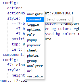
the correct syntax on how to use “pros.item” in actionItem: …???
actionItem: props.item is not working
Regards,
Ronny
 ). Then you have to only define an item and a command you want to send.