Roomba

Hello all,

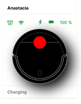
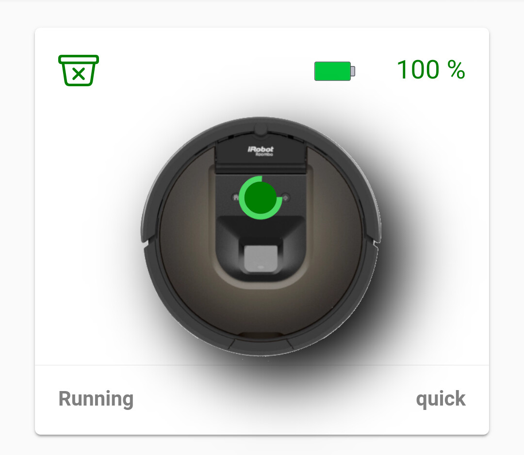
I’ve put together an openHAB 3 widget to control my Roomba via the excellent iRobot binding. I used the Dishwasher Status widget as a starting point for this, and had some design inspiration from this Vacuum Card project. Some highlights:

  • Ability to issue any commands the iRobot binding provides via a popup
  • Displays the full text of any error messages (76 in total!)
  • Displays its current state
  • Animation when the vacuum is running
  • Color coding of charging icon; lower battery indicator

Some TODOs here yet, but figured I’d release this early here for now!

  • Some animation alignment issues on mobile to address yet
  • General code cleanup
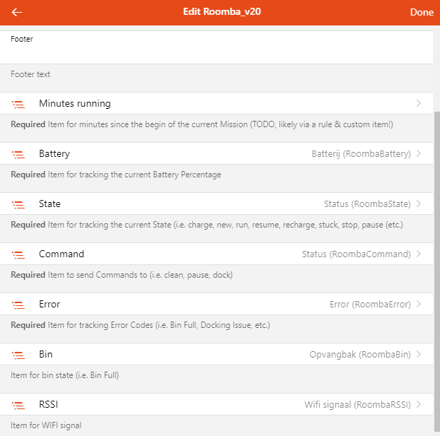
  • Wire in support for Runtime Minutes - to show how long the Roomba has been working on the current Mission

Here’s a screenshot:

image

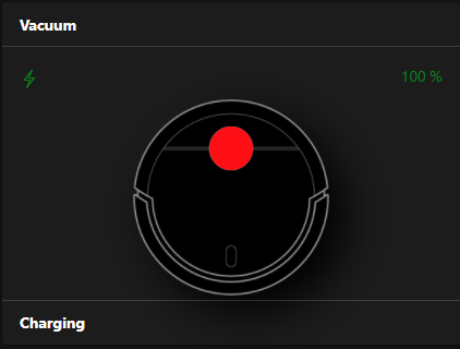
For a better overall appearance, I took the approach of using a PNG background instead of pure CSS. Download this image and place this in your openHAB html directory (probably /etc/openhab/html/vacuum.png)

Resources

And here is the widgets YAML code:

uid: Roomba_v20
tags: []
props:
  parameters:
    - description: Title of the card
      label: Title
      name: title
      required: false
      type: TEXT
    - description: Header text
      label: Header
      name: header
      required: false
      type: TEXT
    - description: Footer text
      label: Footer
      name: footer
      required: false
      type: TEXT
    - context: item
      description: Item for minutes since the begin of the current Mission (TODO, likely via a rule & custom item!)
      label: Minutes running
      name: runtime
      required: true
      type: TEXT
    - context: item
      description: Item for tracking the current Battery Percentage
      label: Battery
      name: battery
      required: true
      type: TEXT
    - context: item
      description: Item for tracking the current State (i.e. charge, new, run, resume, recharge, stuck, stop, pause (etc.)
      label: State
      name: state
      required: true
      type: TEXT
    - context: item
      description: Item to send Commands to (i.e. clean, pause, dock)
      label: Command
      name: command
      required: true
      type: TEXT
    - context: item
      description: Item for tracking Error Codes (i.e. Bin Full, Docking Issue, etc.)
      label: Error
      name: error
      required: true
      type: TEXT
  parameterGroups: []
timestamp: Mar 14, 2021, 6:43:07 PM
component: f7-card
config:
  title: =(props.title)
slots:
  default:
    - component: f7-card-content
      config:
        style:
          height: 200px
      slots:
        default:
          - component: f7-icon
            config:
              f7: bolt
              style:
                #right: 0
                #border: 2px solid red
                color: '=items[props.state].state == "charge" ? "green" : "gray"'
          - component: Label
            config:
              text: "=items[props.battery].state + ' %'"
              style:
                color: '=items[props.battery].state >= 80 ? "green" : "red"'
                height: 10px
                float: right
          - component: f7-row
            config:
              class:
                - display-flex
                - justify-content-center
              style:
                width: 100%
            slots:
              default:
                - component: f7-col
                  config:
                    style:
                      height: 100%
                      width: 180px
                  slots:
                    default:
                      - component: f7-block-header
                        slots:
                          default:
                            - component: Label
                              config:
                                text: =props.header
                                style:
                                  color: white
                      - component: oh-image
                        config:
                          url: static/vacuum.png
                          style:
                            position: absolute
                            transform: translate(-50%)
                            left: 50%
                            width: 180px
                            filter: invert(100%) drop-shadow(16px 16px 20px black)
                      - component: f7-block
                        config:
                          style:
                            height: auto
                            width: auto
                        slots:
                          default:
                            - component: f7-block
                              config:
                                style:
                                  top: 19px
                                  left: 38px
                                  z-index: 10
                              slots:
                                default:
                                  - component: oh-link
                                    config:
                                      f7: circle_fill
                                      size: 35
                                      color: green
                                      style:
                                        background: '=items[props.state].state == "run" ? "green" : "red"'
                                        border-radius: 50%
                                        height: 40px
                                        width: 40px
                                      action: options
                                      actionItem: =[props.command]
                                      actionOptions: clean=Clean,spot=Spot,pause=Pause,stop=Stop,dock=Dock
                            - component: f7-block
                              slots:
                                default:
                                  - component: f7-preloader
                                    config:
                                      size: 50
                                      colorTheme: green
                                      visible: =items[props.state].state == "run"
                                      style:
                                        position: absolute
                                        top: -30px
                                        left: 48px
                                        z-index: 10
    - component: f7-block
      slots:
        default:
          - component: Label
            config:
              size: 20
              text: "=items[((!props.error) ? '' : props.error)].displayState"
              visible: =items[props.error].state != 0
              style:
                color: red
                white-space: nowrap
    - component: f7-card-footer
      config:
        visible: =[props.footer]
      slots:
        default:
          - component: Label
            config:
              size: 40
              visible: =[props.footer]
              text: "=items[((!props.state) ? '' : props.state)].displayState"
              style: 
                font-weight: bold
                color: white

I’d appreciate any and all feedback here on how to improve!

Best regards,
.

4 Likes

Hi,

Thanks a lot for this widget it works like a charm.

maybe something to improve : a little bin that shows red or green depending if the bin is full or not ?

2 Likes

OK, made my first steps into the code of the widgets. :wink:
I’ve update a bit the original widget, and came up with following changes:

  • Added some extra items (bin, wifi…)
  • Bin icon (should change color and icon on status)
  • Wifi status (shoud change color on strength, and icon on signal lost)
  • Charge icon (flash should appears when charging)
  • battery icon (should change color and icon on 80% level)
  • footer text to grey (so it’s visible in light and dark theme).

End result:
1

This is the code so far:

uid: Roomba_v21
props:
  parameters:
    - description: Title of the card
      label: Title
      name: title
      required: false
      type: TEXT
    - description: Header text
      label: Header
      name: header
      required: false
      type: TEXT
    - description: Footer text
      label: Footer
      name: footer
      required: false
      type: TEXT
    - context: item
      description: Item for minutes since the begin of the current Mission (TODO, likely via a rule & custom item!)
      label: Minutes running
      name: runtime
      required: true
      type: TEXT
    - context: item
      description: Item for tracking the current Battery Percentage
      label: Battery
      name: battery
      required: true
      type: TEXT
    - context: item
      description: Item for tracking the current State (i.e. charge, new, run, resume, recharge, stuck, stop, pause (etc.)
      label: State
      name: state
      required: true
      type: TEXT
    - context: item
      description: Item to send Commands to (i.e. clean, pause, dock)
      label: Command
      name: command
      required: true
      type: TEXT
    - context: item
      description: Item for tracking Error Codes (i.e. Bin Full, Docking Issue, etc.)
      label: Error
      name: error
      required: true
      type: TEXT
    - context: item
      description: Item for bin state (i.e. Bin Full)
      label: Bin
      name: bin
      required: false
      type: TEXT
    - context: item
      description: Item for WIFI signal
      label: RSSI
      name: RSSI
      required: false
      type: TEXT
timestamp: Dec 24, 2021, 3:26:55 PM
component: f7-card
config:
  title: =(props.title)
slots:
  default:
    - component: f7-card-content
      config:
        style:
          height: 200px
      slots:
        default:
          - component: f7-icon
            config:
              f7: '=items[props.bin].state == "ok" ? "bin_xmark" : "arrow_up_bin_fill"'
              style:
                color: '=items[props.bin].state == "ok" ? "green" : "red"'
          - component: f7-icon
            config:
              f7: '.'
              style:
                opacity: 0.0 
          - component: f7-icon
            config:
              f7: '=items[props.RSSI].state <= 0 ? "wifi" : "wifi_slash"'
              style:
                color: '=items[props.RSSI].state <= -40 ? "green" : "red"'
          - component: Label
            config:
              text: = items[props.battery].state + ' %'
              style:
                color: '=items[props.battery].state >= 80 ? "green" : "red"'
                height: 10px
                float: right
          - component: f7-icon
            config:
              f7: '.'
              style:
                 opacity: 0.0
                 float: right
          - component: f7-icon
            config:
              f7: '=items[props.battery].state >= 80 ? "battery_100" : "battery_25"'
              style:
                color: '=items[props.battery].state >= 80 ? "green" : "red"'
                float: right
          - component: f7-icon
            config:
              f7: '.'
              style:
                 opacity: 0.0
                 float: right                
          - component: f7-icon
            config:
              f7: '=items[props.state].state !== "charge" ? "" : "bolt"'
              style:
                color: '=items[props.state].state == "charge" ? "green" : "red"'
                float: right
          - component: f7-row
            config:
              class:
                - display-flex
                - justify-content-center
              style:
                width: 100%
            slots:
              default:
                - component: f7-col
                  config:
                    style:
                      height: 100%
                      width: 180px
                  slots:
                    default:
                      - component: f7-block-header
                        slots:
                          default:
                            - component: Label
                              config:
                                text: =props.header
                                style:
                                  color: white
                      - component: oh-image
                        config:
                          url: /static/vacuum.png
                          style:
                            position: absolute
                            transform: translate(-50%)
                            left: 50%
                            width: 180px
                            filter: invert(100%) drop-shadow(16px 16px 20px black)
                      - component: f7-block
                        config:
                          style:
                            height: auto
                            width: auto
                        slots:
                          default:
                            - component: f7-block
                              config:
                                style:
                                  top: 19px
                                  left: 38px
                                  z-index: 10
                              slots:
                                default:
                                  - component: oh-link
                                    config:
                                      f7: circle_fill
                                      size: 35
                                      color: green
                                      style:
                                        background: '=items[props.state].state == "run" ? "green" : "red"'
                                        border-radius: 50%
                                        height: 40px
                                        width: 40px
                                      action: options
                                      actionItem: =[props.command]
                                      actionOptions: clean=Clean,spot=Spot,pause=Pause,stop=Stop,dock=Dock
                            - component: f7-block
                              slots:
                                default:
                                  - component: f7-preloader
                                    config:
                                      size: 50
                                      colorTheme: green
                                      visible: =items[props.state].state == "run"
                                      style:
                                        position: absolute
                                        top: -30px
                                        left: 48px
                                        z-index: 10
    - component: f7-block
      slots:
        default:
          - component: Label
            config:
              size: 20
              text: "=items[((!props.error) ? '' : props.error)].displayState"
              visible: =items[props.error].state != 0
              style:
                color: red
                white-space: nowrap
    - component: f7-card-footer
      config:
        visible: =[props.footer]
      slots:
        default:
          - component: Label
            config:
              size: 40
              visible: =[props.footer]
              text: "=items[((!props.state) ? '' : props.state)].displayState"
              style:
                font-weight: bold
                color: grey

Let me know if I can/should change anything else…

ps not in the marketplace yet. Not sure if eveything is ‘fine’ and how the marketplace works. :blush:

1 Like

Great looking widget and I would like to use it BUT I’m still using habpanel the old way by importing widgets.

I got your widget into OH 3.x admin widget section but I can’t see/use the widget on the habpanel 2.x way.

Any ideas how I can do this?

Best, Jay

Hi ,

Got it working with 980 on pi3 .

You can add resume=Resume,reset=Reset in actionOptions .

Resume is probably same as Clean after Pause .

Reset turns it off while on job (and can’t be started excpt manually using Clean button)-

Reset while on home base does reset (reboot) the device .

Oh and another thing …icon resizing for mobile phone is not working or implemented ,as roomba.png icon is larger than widget and vitrual button is off centre .

Overall great widget !

Edit . My bad for icon /img resizing for mobile . I used “add block” (rows and cells) instead of “add mansonry” in UI overview page (beginner issue) . If you use masonry everything looks good at least on my android 5.0 even dynamically repositioning with other widgets works ok .

1 Like

Just deployed! Thanks!
Have you integrated cleaning passes or edge clean in any updates? I might try if you haven’t.

Just went into HabPanel and then into Widget Gallery and I’m not seeing any Roomba or iRobot widgets as of yet.

Do you have a URL against GitHub I could use?

Best, Jay

I’m not the developer, but I’m not sure it will work in habapp. I grabbed the code above and created the widget in MainUI.

No it will not. HABPanel and the main UI were released half a decade apart, and are completely different and incompatible with each other. The #marketplace:ui-widgets category is for the openHAB 3.0 main UI widgets only. The HABPanel widget gallery features widgets in the #apps-services:habpanel category with a widgetgallery tag.

@brononius - Thanks a bunch for all of these improvements to the Roomba widget! I’m now using your v21 along with the additional actionOptions @Goran had suggested. Looks great all around!

I’ve “gimp’d” a roomba 980 photo .
Looks like this now . Also implemented colour change for battery icon and added slot for “mission” . It looks like this now.

Code and PNG at https://github.com/yuguar/roomba_OH3_UI_widget

1 Like

What does the command “Macak” stand for? I figure it’s croatian for a male cat, but…

Time based rule to clean around cats litter box .
I missed it , my bad I’ll remove it.

Not THAT makes sense :wink:
Thank you!

Hi there, this is the first time I’m using a windget. Still its not clear to me all the steps I have to do to get it working.

First I’ve clicked developer toops -_> windget and create a new one pasting your code and changin UID with the one of my iRobot.

Then if I click on Set Props many items are required for the setup. How do I have to create them?
I’ve got only the robot thing, generated from the binding.

Also can you tell me where to save the picture to show it correctly in the widget?

thanks and sorry for the dumb questions

You should create items for all sensors you wish to use. I do this mostly by text-files (I’m an old linux guy).
You can also do this trough the GUI. I’m not an expert with GUI’s, but you should go to the channel of you thing, and “add link to item”.

Once they are created (and loaded, take some seconds), you should be able to select them in the widget properties (button “configure widget”.


The icon should be saved in the html-folder. By default /etc/openhab/html/

1 Like