NOTE: I will keep this post around for reference but all of these widgets will be migrated to the new Marketplace.
I’ve been creating a bunch of custom list widgets to use as default list widgets on my similar Items. This lets me define the widget only once and keep a consistent look and feel over how the Items are depected and work across the automatically generated cards. I figured I’d share some here as they might be useful.
Once you’ve imported them as a custom widget under Developer Tools, you can select them from the list of widget types in the “default list widget” metadata.
Because I kind of like a consistent look and feel and I like the ability to control the icons and color of the icons based on the state of Items (not necessarily the Item being displayed) I’m using all f7 icons. I kind of wish they had more IoT type icons available.
NOTE: If using one of the widgets that displays the state in a badge, you need to suppress the showing of the Item’s state. Do this by adding State Description metadata to the Item and set the Pattern to a space, or flip to the code view and set it to the empty string.
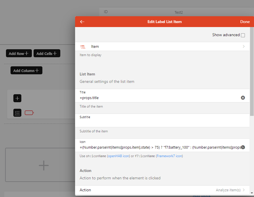
Battery Status
NOTE: Migrated to the marketplace.
The action will open up a chart. It uses red and battery_0 when the level is < 25, battery_25 and yellow when between 25 and 75 (as shown) and green and battery_100 when > 75.
uid: battery_list
tags:
  - list
  - battery
props:
  parameters:
    - description: Battery name
      label: Name
      name: title
      required: false
      type: TEXT
    - context: item
      description: Battery Item to display
      label: Item
      name: item
      required: false
      type: TEXT
  parameterGroups: []
timestamp: Feb 3, 2021, 1:37:09 PM
component: oh-label-item
config:
  icon: '=(Number.parseInt(items[props.item].state) > 75) ? "f7:battery_100" : (Number.parseInt(items[props.item].state) > 25) ? "f7:battery_25" : "f7:battery_0"'
  iconColor: '=(Number.parseInt(items[props.item].state) > 75) ? "green" : (Number.parseInt(items[props.item].state) > 25) ? "yellow" : "red"'
  title: =props.title
  item: =props.item
  action: analyzer
  actionAnalyzerCoordSystem: time
  actionAnalyzerItems: =[props.item]
Electric
NOTE: Migrated to the marketplace.

This is a very simple widget that just sets an orange bolt icon and will open a chart for the Item as the action. I use it for the sensor readings of my whole house energy meter.
uid: electric
tags:
  - list
  - electric
props:
  parameters:
    - description: Widget title
      label: Title
      name: title
      required: false
      type: TEXT
    - context: item
      description: Item to display
      label: Item
      name: item
      required: false
      type: TEXT
  parameterGroups: []
timestamp: Feb 2, 2021, 3:42:47 PM
component: oh-label-item
config:
  icon: f7:bolt
  iconColor: '"yellow"'
  title: =props.title
  item: =props.item
  action: analyzer
  actionAnalyzerCoordSystem: time
  actionAnalyzerItems: =[props.item]
Garage door
NOTE: Migrated to the marketplace.
I have two garage door openers, each with a single sensor Item and a controller Item. I’ve assigned this widget to the sensor Item and excluded the control Item from the model since this widget handles both status and triggering the Item. But by using the sensor Item I can keep the badge on the card when a door is opened.

uid: garagedoor_list
tags:
  - list
  - garagedoor
props:
  parameters:
    - description: Door name
      label: Name
      name: name
      required: false
      type: TEXT
    - context: item
      description: Control Item
      label: Control Item
      name: control_item
      required: false
      type: TEXT
    - context: item
      description: Sensor Item
      label: Sensor Item
      name: sensor_item
      required: false
      type: TEXT
  parameterGroups: []
timestamp: Feb 3, 2021, 1:12:37 PM
component: oh-list-item
config:
  icon: '=(items[props.sensor_item].state == "CLOSED") ? "f7:house" : "f7:house_fill"'
  iconColor: '=(items[props.sensor_item].state == "CLOSED") ? "green" : "red"'
  title: =props.name
  action: command
  actionItem: =props.control_item
  actionCommand: ON
  badgeColor: '=(items[props.sensor_item].state == "CLOSED") ? "green" : "red"'
  badge: '=(items[props.sensor_item].state == "CLOSED") ? "closed" : "open"'
Humidity
NOTE: Migrated to the marketplace.
A simple widget that uses the F7 drop icon. The icon will be purple when humidity is > 45, blue when between 30 and 45, and orange when under 30. I mostly use these for indoor sensors so the color coding is based on comfort level.
uid: humidity_list
tags:
  - list
  - humidity
props:
  parameters:
    - description: Widget title
      label: Title
      name: title
      required: false
      type: TEXT
    - context: item
      description: Item to display
      label: Item
      name: item
      required: false
      type: TEXT
  parameterGroups: []
timestamp: Feb 3, 2021, 11:51:38 AM
component: oh-label-item
config:
  icon: f7:drop
  iconColor: '=(Number.parseInt(items[props.item].state) > 45) ? "purple" : (Number.parseInt(items[props.item].state) > 30) ? "blue" : "orange"'
  title: =props.title
  item: =props.item
  action: analyzer
  actionAnalyzerCoordSystem: time
  actionAnalyzerItems: =[props.item]
Light Switches
NOTE: Migrated to the marketplace.


A simple toggle widget using the lightbulb icon. Color is grey when it’s off and yellow when it’s on.
uid: light_list_widget
tags:
  - list
  - light
props:
  parameters:
    - description: The label for the widget
      label: Title
      name: title
      required: false
      type: TEXT
    - context: item
      description: The light switch Item
      label: Item
      name: item
      required: false
      type: TEXT
  parameterGroups: []
timestamp: Jan 28, 2021, 4:45:06 PM
component: oh-toggle-item
config:
  icon: f7:lightbulb
  iconColor: '=(items[props.item].state == "ON") ? "yellow" : "gray"'
  color: '=(items[props.item].state == "ON") ? "yellow" : "gray"'
  title: =props.title
  item: =props.item
Money
NOTE: Migrated to the marketplace.
Based on the whole house energy meter I estimate my monthly electrical bill. These widgets show that estimate.

It will change color, green when it’s under 50, orange when between 50 and 200, and red when greater than 200.
uid: money_list
tags:
  - list
  - money
props:
  parameters:
    - description: Widget title
      label: Title
      name: title
      required: false
      type: TEXT
    - context: item
      description: Item to display
      label: Item
      name: item
      required: false
      type: TEXT
  parameterGroups: []
timestamp: Feb 2, 2021, 3:43:47 PM
component: oh-label-item
config:
  item: =props.item
  title: =props.title
  iconColor: '=(items[props.item].state < 50) ? "green" : (items.[props.item].state < 200) ? "orange" : "red"'
  icon: f7:money_dollar_circle
  actionAnalyzerItems: =[props.item]
  action: analyzer
Presence
NOTE: Migrated to the marketplace.

Will turn red and the badge changes to “away” when not present.
uid: presence_list
tags:
  - list
  - presence
props:
  parameters:
    - description: The label for the widget
      label: Person
      name: title
      required: false
      type: TEXT
    - context: item
      description: The presence switch Item
      label: Item
      name: item
      required: false
      type: TEXT
  parameterGroups: []
timestamp: Feb 2, 2021, 4:00:22 PM
component: oh-label-item
config:
  icon: f7:person_circle
  iconColor: '=(items[props.item].state == "ON") ? "green" : "red"'
  color: '=(items[props.item].state == "ON") ? "yellow" : "gray"'
  title: =props.title
  item: =props.item
  badgeColor: '=(items[props.item].state === "ON") ? "green" : "red"'
  badge: '=(items[props.item].state === "ON") ? "PRESENT" : "AWAY"'
Temperature
NOTE: Migrated to the marketplace.
Changes the color of the icon based on the current temp. > 75 is red, between 75 and 50 is orange, between 50 and 32 is blue, and anything under 32 is purple. You can see it’s a pretty nice day here today.
uid: temperature_list
tags:
  - list
  - temperature
props:
  parameters:
    - description: Widget title
      label: Title
      name: title
      required: false
      type: TEXT
    - context: item
      description: Item to display
      label: Item
      name: item
      required: false
      type: TEXT
  parameterGroups: []
timestamp: Feb 3, 2021, 11:51:12 AM
component: oh-label-item
config:
  icon: f7:thermometer
  iconColor: '=(Number.parseFloat(items[props.item].state) > 75) ? "red" : (Number.parseFloat(items[props.item].state) > 55) ? "orange" : (Number.parseFloat(items[props.item].state]) > 32) ? "blue" : "purple"'
  title: =props.title
  item: =props.item
  action: analyzer
  actionAnalyzerCoordSystem: time
  actionAnalyzerItems: =[props.item]
Door with Lock
NOTE: Migrated to the marketplace.
This is another dual Item widget similar to the garage door openers. However, unlike the garage door, the lock and the door are independent from each other. The badge at the right indicates the door’s open status and the icon on the left indicates the door’s deadbolt status. Clicking on the widget causes the lock to toggle.
Now that I look at it I should use orange for open and green for closed in the badge and I can put some more text information in the subtitle. I’ll leave those as an exercise for the student. I don’t want to have to recreate the screen grabs.
uid: lock_list
tags:
  - list
  - lock
props:
  parameters:
    - description: Door name
      label: Name
      name: name
      required: false
      type: TEXT
    - context: item
      description: Control Item
      label: Control Item
      name: control_item
      required: false
      type: TEXT
    - context: item
      description: Sensor Item
      label: Sensor Item
      name: sensor_item
      required: false
      type: TEXT
  parameterGroups: []
timestamp: Feb 3, 2021, 2:35:39 PM
component: oh-list-item
config:
  icon: '=(items[props.control_item].state == "ON") ? "f7:lock" : "f7:lock_open"'
  iconColor: '=(items[props.control_item].state == "ON") ? "green" : "orange"'
  title: =props.name
  action: toggle
  actionCommand: ON
  actionCommandAlt: OFF
  actionItem: =props.control_item
  badgeColor: '=(items[props.sensor_item].state == "OPEN") ? "green" : "orange"'
  badge: '=(items[props.sensor_item].state == "OPEN") ? "open" : "closed"'
Ok ok, here’s the updated version.

uid: lock_list
tags:
  - list
  - lock
props:
  parameters:
    - description: Door name
      label: Name
      name: name
      required: false
      type: TEXT
    - context: item
      description: Control Item
      label: Control Item
      name: control_item
      required: false
      type: TEXT
    - context: item
      description: Sensor Item
      label: Sensor Item
      name: sensor_item
      required: false
      type: TEXT
  parameterGroups: []
timestamp: Feb 3, 2021, 2:35:39 PM
component: oh-list-item
config:
  icon: '=(items[props.control_item].state == "ON") ? "f7:lock" : "f7:lock_open"'
  iconColor: '=(items[props.control_item].state == "ON") ? "green" : "orange"'
  title: =props.name
  subtitle: '=(items[props.sensor_item].state == "OPEN") ? "open" : (items[props.control_item].state == "ON") ? "closed and locked" : "closed and unlocked"'
  action: toggle
  actionCommand: ON
  actionCommandAlt: OFF
  actionItem: =props.control_item
  badgeColor: '=(items[props.sensor_item].state == "OPEN") ? "orange" : "green"'
  badge: '=(items[props.sensor_item].state == "OPEN") ? "open" : "closed"'
Humidifier Switch
NOTE: Migrated to the marketplace.
uid: humidifier_switch_list
tags:
  - list
  - humidifier
props:
  parameters:
    - description: Name of the humidifier
      label: Name
      name: title
      required: false
      type: TEXT
    - context: item
      description: The humidifier switch Item
      label: Item
      name: item
      required: false
      type: TEXT
  parameterGroups: []
timestamp: Feb 3, 2021, 4:21:38 PM
component: oh-toggle-item
config:
  icon: f7:drop
  iconColor: '=(items[props.item].state == "ON") ? "blue" : "gray"'
  color: '=(items[props.item].state == "ON") ? "blue" : "gray"'
  title: =props.title
  item: =props.item
Humidifier Setpoint
NOTE: Migrated to the marketplace.

uid: humidifier_setpoint_list
tags:
  - list
  - humidifier
props:
  parameters:
    - description: Humidifier name
      label: Name
      name: name
      required: false
      type: TEXT
    - context: item
      description: Control Item
      label: Control Item
      name: control_item
      required: false
      type: TEXT
    - context: item
      description: Sensor Item
      label: Sensor Item
      name: sensor_item
      required: false
      type: TEXT
  parameterGroups: []
timestamp: Feb 3, 2021, 4:42:49 PM
component: oh-slider-item
config:
  icon: f7:drop
  iconColor: '=(Number.parseInt(items[props.sendor_item].state) > 45) ? "purple" : (Number.parseInt(items[props.sensor_item].state) > 30) ? "blue" : "orange"'
  title: '=props.name + ": " + items[props.control_item].state + "%"'
  unit: "%"
  min: 0
  max: 100
  step: 1
  item: =props.control_item
  scaleSteps: 10
  scaleSubSteps: 5
  color: blue
  label: true
The above probably isn’t the best example. I should use the State Description metadata to add the “%” in the title.
scaleSteps and scaleSubSteps are not really being used.
What I couldn’t capture easily was that when you drag the slider it shows the current value in a little popup above the handle.
Light Level
NOTE: Migrated to the marketplace.
Note, I’m just using light sensitive resistors so the actual number reported isn’t really all that meaningful beyond small number == dark and large number == light.
uid: light_level_list
tags:
  - list
  - light
props:
  parameters:
    - description: Sensor name
      label: Name
      name: title
      required: false
      type: TEXT
    - context: item
      description: Item to display
      label: Item
      name: item
      required: false
      type: TEXT
  parameterGroups: []
timestamp: Feb 5, 2021, 3:59:02 PM
component: oh-label-item
config:
  icon: '=(Number.parseFloat(items[props.item].state) < 250) ? "f7:light_min" : "f7:light_max"'
  iconColor: '=(Number.parseFloat(items[props.item].state) < 50) ? "black" : (Number.parseFloat(items[props.item].state) < 150) ? "gray" : (Number.parsFloat(items[props.item.state]) < 350) ? "orange" : "yellow"'
  title: =props.title
  item: =props.item
  action: analyzer
  actionAnalyzerCoordSystem: time
  actionAnalyzerItems: =[props.item]
Chromecast
NOTE: Migrated to the marketplace.

Ideally I’d like to convert this one into a single widget or perhaps two widgets but my experiments so far to put a button side by side to a player control or slider have been unsuccessful. So I’ve created four widgets, all of which will only be shown if the Idling Item is OFF.
uid: media_control_list
tags:
  - list
  - media
props:
  parameters:
    - description: Player name
      label: Name
      name: name
      required: false
      type: TEXT
    - description: Item prefix
      label: Prefix
      name: prefix
      required: true
      type: TEXT
  parameterGroups: []
timestamp: Feb 4, 2021, 2:14:55 PM
component: oh-player-item
config:
  icon: f7:hifispeaker
  iconColor: black
  title: =props.name
  subtitle: =items[props.prefix + "_MediaTitle"].state + " by " + items[props.prefix + "_MediaArtist"].state
  visible: =(items[props.prefix + "_Idling"].state == "OFF")
  trackItem: =props.prefix + "_MediaTitle"
  after: =items[props.prefix + "_App"].state
  artistItem: =props.prefix + "_MediaArtist"
  showRewindFFward: false
  item: =props.prefix + "_MediaControl"
uid: media_toggle_list_button
tags:
  - list
  - media
props:
  parameters:
    - description: Text to display when Item is ON
      label: On text
      name: on_label
      required: false
      type: TEXT
    - description: Text to display when Item is OFF
      label: Off text
      name: off_label
      required: true
      type: TEXT
    - context: item
      description: An item to control
      label: Item
      name: item
      required: true
      type: TEXT
    - context: item
      description: When ON the button will not be shown
      label: Idle Item
      name: idle_item
      required: true
      type: TEXT
  parameterGroups: []
timestamp: Feb 5, 2021, 3:46:21 PM
component: oh-list-item
config:
  title: '=(items[props.item].state == "ON") ? props.on_label : props.off_label'
  actionCommand: ON
  actionCommandAlt: OFF
  listButtonColor: black
  actionItem: =props.item
  action: toggle
  listButton: true
  visible: =items[props.idle_item].state != "ON"
uid: media_stop_list_button
tags:
  - list
  - media
props:
  parameters:
    - description: Text to display
      label: Label
      name: label
      required: false
      type: TEXT
    - context: item
      description: An item to control
      label: Item
      name: item
      required: true
      type: TEXT
    - context: item
      description: When ON the button will not be shown
      label: Idle Item
      name: idle_item
      required: true
      type: TEXT
  parameterGroups: []
timestamp: Feb 5, 2021, 3:46:41 PM
component: oh-list-item
config:
  title: =props.label
  actionCommand: ON
  listButtonColor: black
  actionItem: =props.item
  action: command
  listButton: true
  visible: =items[props.idle_item].state != "ON"
uid: volume_setpoint_list
tags:
  - list
  - media
props:
  parameters:
    - description: Player name
      label: Name
      name: name
      required: false
      type: TEXT
    - context: item
      description: Item
      label: Volume Item
      name: item
      required: true
      type: TEXT
  parameterGroups: []
timestamp: Feb 4, 2021, 4:16:07 PM
component: oh-slider-item
config:
  icon: '=(Number.parseInt(items[props.item].state) == 0) ? "f7:speaker_slash" : (Number.parseInt(items[props.item].state) < 25) ? "f7:speaker" : (Number.parseInt(items[props.item].state) < 50) ? "f7:speaker_1" : (Number.parseInt(items[props.item].state) < 75) ? "f7:speaker_2" : "f7:speaker_3"'
  iconColor: black
  title: =props.name
  min: 0
  max: 100
  step: 10
  item: =props.item
  scaleSteps: 10
  scaleSubSteps: 5
  color: black
  label: true
  visible: =(items[props.item.replace("Volume", "Idling")].state == "OFF")
Service Status
NOTE: Migrated to the marketplace.
I’ve configured it to show ONLINE but I’ve also configured it to be invisible when the service is online.
uid: service_status_list
tags:
  - list
  - status
props:
  parameters:
    - description: Human friendly service name
      label: Service Name
      name: service
      required: false
      type: TEXT
    - context: item
      description: An item to control
      label: Item
      name: item
      required: false
      type: TEXT
  parameterGroups: []
timestamp: Feb 5, 2021, 2:20:29 PM
component: oh-label-item
config:
  title: =props.service
  icon: '=(items[props.item].state == "ON") ? "f7:wifi" : "f7:wifi_slash"'
  badgeColor: '=(items[props.item].state === "ON") ? "green" : "red"'
  badge: '=(items[props.item].state === "ON") ? "ONLINE" : "OFFLINE"'
  iconColor: '=(items[props.item].state == "ON") ? "green" : "red"'
  visible: =items[props.item].state != "ON"
I’ve also a few list widgets defined that are not created as custom widgets that I’ll paste here in case they are useful.
Cloudiness
NOTE: Migrated to the marketplace.
value: " "
config:
  icon: '=(Number.parseInt(items.vCloudiness.state) > 75) ? "f7:cloud_fill" :
    (Number.parseInt(items.vCloudiness.state) > 25) ? "f7:cloud_sun" :
    "f7:sun_min"'
  iconColor: '=(Number.parseInt(items.vCloudiness.state) > 75) ? "gray" :
    (Number.parseInt(items.vCloudiness.state) > 25) ? "blue" : "yellow"'
  actionAnalyzerCoordSystem: time
Door
NOTE: I’m not going to migrate this one to the marketplace.
A simple door without anything fancy.
value: oh-list-item
config:
  badgeColor: '=(items.Garagedoor_Sensor.state == "OPEN") ? "orange" : "green"'
  badge: '=(items.Garagedoor_Sensor.state == "OPEN") ? "OPEN" : "CLOSED"'
  icon: '=(items.Garagedoor_Sensor.state == "OPEN") ? "f7:house_alt_fill" :
    "f7:house_alt"'
  iconColor: '=(items.Garagedoor_Sensor.state == "OPEN") ? "orange" : "green"'
  iconUseState: ""
  title: Garage Door
I’ll add more as I create more.