OH3 Livio Energy Summary Animated

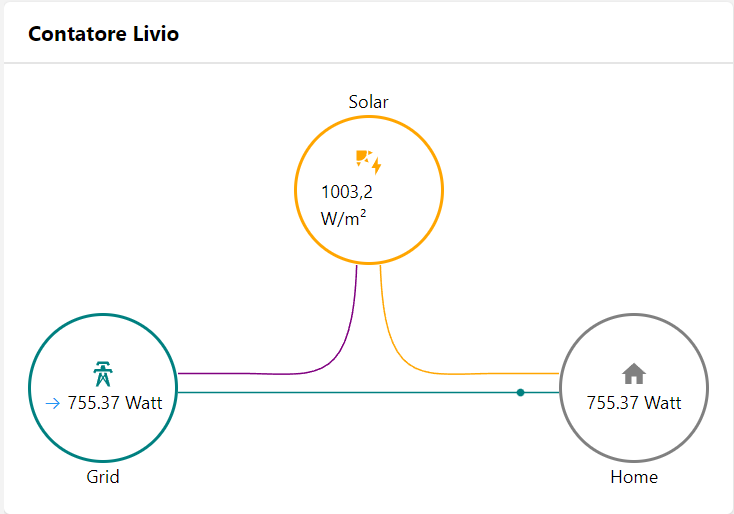
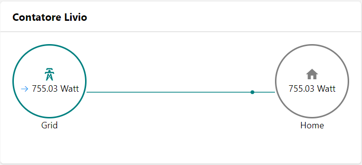
Based on this forum discussion I have created the configurable energy animated widget.
Required ITEMS are:

  • Consumption From Grid

  • Home Consumption

Other ITEMS are not mandatory and widget will display/hide the section accordingly.
Title it’s not mandatory, if missing the title section will not be displayed.

Changelog

Version 0.1

  • initial release

Resources

uid: OH3_Livio_Energy_Summary
tags: []
props:
  parameters:
    - description: Title
      label: Title
      name: title
      required: false
      type: TEXT
    - context: item
      description: Consumption From Grid
      label: Consumption From Grid Item
      name: itemConsumptionFromGrid
      required: true
      type: TEXT
    - context: item
      description: Production to Grid
      label: Production to Grid Item
      name: itemProductionToGrid
      required: false
      type: TEXT
    - context: item
      description: Item Solar Production
      label: Solar Production Item
      name: itemSolar
      required: false
      type: TEXT
    - context: item
      description: Home Consumption
      label: Home Consumption Item
      name: itemHomeConsumption
      required: true
      type: TEXT
    - context: item
      description: Gas Consumption Item
      label: Item Gas Consumption
      name: itemGas
      required: false
      type: TEXT
    - context: item
      description: Non Fossil Value Item
      label: Non Fossile Item
      name: itemNonFossil
      required: false
      type: TEXT
    - description: Icon Dimension in px, insert only the numeric value (default 100px, stay within 80px and 120px for best results)
      label: Icon Dimension
      name: iconDimension
      required: false
    - description: Border Radius, enter a numeric value from 0 to 100 (significant changes are visible from value between 40 and 70)
      label: Border Radius
      name: borderRadius
      required: false
  parameterGroups: []
timestamp: Jun 4, 2022, 12:54:59 PM
component: f7-card
config:
  title: = props.title
slots:
  content:
    - component: f7-block
      config:
        style:
          margin: 0
          padding: 0
      slots:
        default:
          - component: f7-block
            config:
              style:
                margin: 0
                padding: 0
                display: flex
                justify-content: space-between
                --f7-theme-color: var(--f7-text-color)
                --f7-block-font-size: 12px
            slots:
              default:
                - component: f7-col
                  config:
                    style:
                      display: flex
                      flex-direction: column
                      align-items: center
                  slots:
                    default:
                      - component: Label
                        config:
                          text: "=(props.itemNonFossil) ? 'Non-Fossil' : ''"
                      - component: f7-block
                        config:
                          style:
                            height: "=props.iconDimension ? Number(props.iconDimension)+'px' : '100px'"
                            width: "=props.iconDimension ? Number(props.iconDimension)+'px' : '100px'"
                            border: 2px solid darkgreen
                            border-radius: "=(props.borderRadius) ? props.borderRadius +'px' : '0px'"
                            display: flex
                            justify-content: center
                            align-items: center
                            flex-direction: column
                          visible: "=(props.itemNonFossil) ? true : false"
                        slots:
                          default:
                            - component: oh-icon
                              config:
                                icon: "=(props.itemNonFossil) ? 'if:mdi:leaf' : ''"
                                height: 20px
                                color: darkgreen
                            - component: Label
                              config:
                                text: = items[props.itemNonFossil].displayState
                                style:
                                  font-size: 12px
                      - component: f7-block
                        config:
                          style:
                            height: 30px
                            width: 2px
                            padding: 0
                            margin: 0
                            border: 1px solid darkgreen
                            display: flex
                            justify-content: center
                            align-items: center
                            flex-direction: column
                          visible: "=(props.itemNonFossil) ? true : false"
                      - component: f7-block
                        config:
                          style:
                            margin-top: "=(props.itemNonFossil) ? '0px' : (props.itemSolar) ? '150px' : (props.itemGas) ? '150px' : '0px'"
                            height: "=props.iconDimension ? Number(props.iconDimension)+'px' : '100px'"
                            width: "=props.iconDimension ? Number(props.iconDimension)+'px' : '100px'"
                            border: 2px solid teal
                            border-radius: "=(props.borderRadius) ? props.borderRadius +'px' : '0px'"
                            display: flex
                            justify-content: center
                            align-items: center
                            flex-direction: column
                        slots:
                          default:
                            - component: oh-icon
                              config:
                                icon: if:mdi:transmission-tower
                                height: 20px
                                color: teal
                            - component: oh-link
                              config:
                                text: = items[props.itemProductionToGrid].displayState
                                iconF7: "=(props.itemProductionToGrid) ? 'arrow_left' : ''"
                                iconSize: 12px
                                iconColor: purple
                                style:
                                  font-size: 12px
                                  white-space: nowrap
                                visible: = props.itemProductionToGrid
                            - component: oh-link
                              config:
                                text: = items[props.itemConsumptionFromGrid].displayState
                                iconF7: "=(props.itemConsumptionFromGrid) ? 'arrow_right' : ''"
                                iconSize: 12px
                                iconColor: blue
                                style:
                                  font-size: 12px
                                  white-space: nowrap
                      - component: Label
                        config:
                          text: Grid
                - component: f7-col
                  config:
                    style:
                      flex-grow: 1
                      display: flex
                      flex-direction: column
                      align-items: center
                  slots:
                    default:
                      - component: Label
                        config:
                          text: "=(props.itemSolar) ? 'Solar' : ''"
                      - component: f7-block
                        config:
                          style:
                            height: "=props.iconDimension ? Number(props.iconDimension)+'px' : '100px'"
                            width: "=props.iconDimension ? Number(props.iconDimension)+'px' : '100px'"
                            border: 2px solid orange
                            border-radius: "=(props.borderRadius) ? props.borderRadius +'px' : '0px'"
                            display: flex
                            justify-content: center
                            align-items: center
                            flex-direction: column
                          visible: "=(props.itemSolar) ? true : false"
                        slots:
                          default:
                            - component: oh-icon
                              config:
                                icon: if:mdi:solar-power
                                height: 20px
                                color: orange
                            - component: Label
                              config:
                                text: =items[props.itemSolar].displayState
                                style:
                                  font-size: 12px
                      - component: f7-block
                        config:
                          style:
                            margin: 0
                            padding: 0
                            width: 100%
                            display: flex
                            height: "=((props.itemNonFossil) && (props.itemSolar) && (props.itemGas)) ? '145px' : ((props.itemNonFossil) && (props.itemSolar)) ? '145px' : ((props.itemNonFossil) && (props.itemGas)) ? '320px' : ((props.itemSolar) && (props.itemGas)) ? '145px' : (props.itemNonFossil) ? '320px' : (props.itemGas) ? '320px' : '145px'"
                            justify-content: center
                        slots:
                          default:
                            - component: f7-row
                              config:
                                tag: svg
                                xmlns: http://www.w3.org/2000/svg
                                viewBox: "=((props.itemNonFossil) || (props.itemSolar) || (props.itemGas))?  '0 0 100 100' : '0 8 100 100'"
                                preserveAspectRatio: xMidYMid slice
                                style:
                                  height: auto
                              slots:
                                default:
                                  - component: f7-row
                                    config:
                                      tag: path
                                      id: path1
                                      d: M53,0 v15 c0,40 10,35 30,35 h20
                                      stroke: orange
                                      stroke-width: 1
                                      vector-effect: non-scaling-stroke
                                      fill: none
                                      visible: "=(props.itemSolar) ? true : false"
                                  - component: f7-row
                                    config:
                                      tag: circle
                                      r: 1
                                      vector-effect: non-scaling-stroke
                                      fill: orange
                                      style:
                                        stroke-width: 4
                                    slots:
                                      default:
                                        - component: f7-row
                                          config:
                                            tag: animateMotion
                                            repeatCount: indefinite
                                            calcMode: linear
                                            dur: 5s
                                          slots:
                                            default:
                                              - component: f7-row
                                                config:
                                                  tag: mpath
                                                  xlink:href: "#path1"
                                  - component: f7-row
                                    config:
                                      tag: path
                                      id: path2
                                      d: M47,0 v15 c0,40 -10,35 -30,35 h-20
                                      stroke: purple
                                      stroke-width: 1
                                      vector-effect: non-scaling-stroke
                                      fill: none
                                      visible: "=(props.itemSolar) ? true : false"
                                  - component: f7-row
                                    config:
                                      tag: circle
                                      r: 1
                                      vectorEffect: non-scaling-stroke
                                      strokeWidth: 10
                                      fill: purple
                                    slots:
                                      default:
                                        - component: f7-row
                                          config:
                                            tag: animateMotion
                                            repeatCount: indefinite
                                            calcMode: linear
                                            dur: 3s
                                          slots:
                                            default:
                                              - component: f7-row
                                                config:
                                                  tag: mpath
                                                  xlink:href: "#path2"
                                  - component: f7-row
                                    config:
                                      tag: path
                                      id: path3
                                      d: M0,55 H100
                                      stroke: teal
                                      stroke-width: 1
                                      vector-effect: non-scaling-stroke
                                      fill: none
                                  - component: f7-row
                                    config:
                                      tag: circle
                                      r: 1
                                      vectorEffect: non-scaling-stroke
                                      strokeWidth: 10
                                      fill: teal
                                    slots:
                                      default:
                                        - component: f7-row
                                          config:
                                            tag: animateMotion
                                            repeatCount: indefinite
                                            calcMode: linear
                                            dur: 3s
                                          slots:
                                            default:
                                              - component: f7-row
                                                config:
                                                  tag: mpath
                                                  xlink:href: "#path3"
                - component: f7-col
                  config:
                    style:
                      display: flex
                      flex-direction: column
                      align-items: center
                  slots:
                    default:
                      - component: Label
                        config:
                          text: "=(props.itemGas) ? 'Gas' : ''"
                      - component: f7-block
                        config:
                          style:
                            height: "=props.iconDimension ? Number(props.iconDimension)+'px' : '100px'"
                            width: "=props.iconDimension ? Number(props.iconDimension)+'px' : '100px'"
                            border: 2px solid darkred
                            border-radius: "=(props.borderRadius) ? props.borderRadius +'px' : '0px'"
                            display: flex
                            justify-content: center
                            align-items: center
                            flex-direction: column
                          visible: "=(props.itemGas) ? true : false"
                        slots:
                          default:
                            - component: oh-icon
                              config:
                                icon: if:mdi:gas
                                height: 20px
                                color: darkred
                            - component: Label
                              config:
                                text: = items[props.itemGas].displayState
                                style:
                                  font-size: 12px
                      - component: f7-block
                        config:
                          style:
                            height: 30px
                            width: 2px
                            padding: 0
                            margin: 0
                            border: 1px solid darkred
                            display: flex
                            justify-content: center
                            align-items: center
                            flex-direction: column
                          visible: "=(props.itemGas) ? true : false"
                      - component: f7-block
                        config:
                          style:
                            margin-top: "=((props.itemNonFossil) && (props.itemGas)) ? '0px' : ((props.itemSolar) && (props.itemGas)) ? '0px' : ((props.itemSolar) || (props.itemNonFossil)) ? '150px' : '0px'"
                            height: "=props.iconDimension ? Number(props.iconDimension)+'px' : '100px'"
                            width: "=props.iconDimension ? Number(props.iconDimension)+'px' : '100px'"
                            border: 2px solid gray
                            border-radius: "=(props.borderRadius) ? props.borderRadius +'px' : '0px'"
                            display: flex
                            justify-content: center
                            align-items: center
                            flex-direction: column
                        slots:
                          default:
                            - component: oh-icon
                              config:
                                icon: if:mdi:home
                                height: 20px
                                color: gray
                            - component: Label
                              config:
                                text: = items[props.itemHomeConsumption].displayState
                                style:
                                  font-size: 12px
                                  white-space: nowrap
                      - component: Label
                        config:
                          text: Home

following complete code

uid: OH3_Livio_Energy_Summary
tags: []
props:
  parameters:
    - description: Title
      label: Title
      name: title
      required: false
      type: TEXT
    - context: item
      description: Consumption From Grid
      label: Consumption From Grid Item
      name: itemConsumptionFromGrid
      required: true
      type: TEXT
    - context: item
      description: Production to Grid
      label: Production to Grid Item
      name: itemProductionToGrid
      required: false
      type: TEXT
    - context: item
      description: Item Solar Production
      label: Solar Production Item
      name: itemSolar
      required: false
      type: TEXT
    - context: item
      description: Home Consumption
      label: Home Consumption Item
      name: itemHomeConsumption
      required: true
      type: TEXT
    - context: item
      description: Gas Consumption Item
      label: Item Gas Consumption
      name: itemGas
      required: false
      type: TEXT
    - context: item
      description: Non Fossil Value Item
      label: Non Fossile Item
      name: itemNonFossil
      required: false
      type: TEXT
    - description: Icon Dimension in px, insert only the numeric value (default 100px, stay within 80px and 120px for best results)
      label: Icon Dimension
      name: iconDimension
      required: false
    - description: Border Radius, enter a numeric value from 0 to 100 (significant changes are visible from value between 40 and 70)
      label: Border Radius
      name: borderRadius
      required: false
  parameterGroups: []
timestamp: Jun 4, 2022, 12:54:59 PM
component: f7-card
config:
  title: = props.title
slots:
  content:
    - component: f7-block
      config:
        style:
          margin: 0
          padding: 0
      slots:
        default:
          - component: f7-block
            config:
              style:
                margin: 0
                padding: 0
                display: flex
                justify-content: space-between
                --f7-theme-color: var(--f7-text-color)
                --f7-block-font-size: 12px
            slots:
              default:
                - component: f7-col
                  config:
                    style:
                      display: flex
                      flex-direction: column
                      align-items: center
                  slots:
                    default:
                      - component: Label
                        config:
                          text: "=(props.itemNonFossil) ? 'Non-Fossil' : ''"
                      - component: f7-block
                        config:
                          style:
                            height: "=props.iconDimension ? Number(props.iconDimension)+'px' : '100px'"
                            width: "=props.iconDimension ? Number(props.iconDimension)+'px' : '100px'"
                            border: 2px solid darkgreen
                            border-radius: "=(props.borderRadius) ? props.borderRadius +'px' : '0px'"
                            display: flex
                            justify-content: center
                            align-items: center
                            flex-direction: column
                          visible: "=(props.itemNonFossil) ? true : false"
                        slots:
                          default:
                            - component: oh-icon
                              config:
                                icon: "=(props.itemNonFossil) ? 'if:mdi:leaf' : ''"
                                height: 20px
                                color: darkgreen
                            - component: Label
                              config:
                                text: = items[props.itemNonFossil].displayState
                                style:
                                  font-size: 12px
                      - component: f7-block
                        config:
                          style:
                            height: 30px
                            width: 2px
                            padding: 0
                            margin: 0
                            border: 1px solid darkgreen
                            display: flex
                            justify-content: center
                            align-items: center
                            flex-direction: column
                          visible: "=(props.itemNonFossil) ? true : false"
                      - component: f7-block
                        config:
                          style:
                            margin-top: "=(props.itemNonFossil) ? '0px' : (props.itemSolar) ? '150px' : (props.itemGas) ? '150px' : '0px'"
                            height: "=props.iconDimension ? Number(props.iconDimension)+'px' : '100px'"
                            width: "=props.iconDimension ? Number(props.iconDimension)+'px' : '100px'"
                            border: 2px solid teal
                            border-radius: "=(props.borderRadius) ? props.borderRadius +'px' : '0px'"
                            display: flex
                            justify-content: center
                            align-items: center
                            flex-direction: column
                        slots:
                          default:
                            - component: oh-icon
                              config:
                                icon: if:mdi:transmission-tower
                                height: 20px
                                color: teal
                            - component: oh-link
                              config:
                                text: = items[props.itemProductionToGrid].displayState
                                iconF7: "=(props.itemProductionToGrid) ? 'arrow_left' : ''"
                                iconSize: 12px
                                iconColor: purple
                                style:
                                  font-size: 12px
                                  white-space: nowrap
                                visible: = props.itemProductionToGrid
                            - component: oh-link
                              config:
                                text: = items[props.itemConsumptionFromGrid].displayState
                                iconF7: "=(props.itemConsumptionFromGrid) ? 'arrow_right' : ''"
                                iconSize: 12px
                                iconColor: blue
                                style:
                                  font-size: 12px
                                  white-space: nowrap
                      - component: Label
                        config:
                          text: Grid
                - component: f7-col
                  config:
                    style:
                      flex-grow: 1
                      display: flex
                      flex-direction: column
                      align-items: center
                  slots:
                    default:
                      - component: Label
                        config:
                          text: "=(props.itemSolar) ? 'Solar' : ''"
                      - component: f7-block
                        config:
                          style:
                            height: "=props.iconDimension ? Number(props.iconDimension)+'px' : '100px'"
                            width: "=props.iconDimension ? Number(props.iconDimension)+'px' : '100px'"
                            border: 2px solid orange
                            border-radius: "=(props.borderRadius) ? props.borderRadius +'px' : '0px'"
                            display: flex
                            justify-content: center
                            align-items: center
                            flex-direction: column
                          visible: "=(props.itemSolar) ? true : false"
                        slots:
                          default:
                            - component: oh-icon
                              config:
                                icon: if:mdi:solar-power
                                height: 20px
                                color: orange
                            - component: Label
                              config:
                                text: =items[props.itemSolar].displayState
                                style:
                                  font-size: 12px
                      - component: f7-block
                        config:
                          style:
                            margin: 0
                            padding: 0
                            width: 100%
                            display: flex
                            height: "=((props.itemNonFossil) && (props.itemSolar) && (props.itemGas)) ? '145px' : ((props.itemNonFossil) && (props.itemSolar)) ? '145px' : ((props.itemNonFossil) && (props.itemGas)) ? '320px' : ((props.itemSolar) && (props.itemGas)) ? '145px' : (props.itemNonFossil) ? '320px' : (props.itemGas) ? '320px' : '145px'"
                            justify-content: center
                        slots:
                          default:
                            - component: f7-row
                              config:
                                tag: svg
                                xmlns: http://www.w3.org/2000/svg
                                viewBox: "=((props.itemNonFossil) || (props.itemSolar) || (props.itemGas))?  '0 0 100 100' : '0 8 100 100'"
                                preserveAspectRatio: xMidYMid slice
                                style:
                                  height: auto
                              slots:
                                default:
                                  - component: f7-row
                                    config:
                                      tag: path
                                      id: path1
                                      d: M53,0 v15 c0,40 10,35 30,35 h20
                                      stroke: orange
                                      stroke-width: 1
                                      vector-effect: non-scaling-stroke
                                      fill: none
                                      visible: "=(props.itemSolar) ? true : false"
                                  - component: f7-row
                                    config:
                                      tag: circle
                                      r: 1
                                      vector-effect: non-scaling-stroke
                                      fill: orange
                                      style:
                                        stroke-width: 4
                                    slots:
                                      default:
                                        - component: f7-row
                                          config:
                                            tag: animateMotion
                                            repeatCount: indefinite
                                            calcMode: linear
                                            dur: 5s
                                          slots:
                                            default:
                                              - component: f7-row
                                                config:
                                                  tag: mpath
                                                  xlink:href: "#path1"
                                  - component: f7-row
                                    config:
                                      tag: path
                                      id: path2
                                      d: M47,0 v15 c0,40 -10,35 -30,35 h-20
                                      stroke: purple
                                      stroke-width: 1
                                      vector-effect: non-scaling-stroke
                                      fill: none
                                      visible: "=(props.itemSolar) ? true : false"
                                  - component: f7-row
                                    config:
                                      tag: circle
                                      r: 1
                                      vectorEffect: non-scaling-stroke
                                      strokeWidth: 10
                                      fill: purple
                                    slots:
                                      default:
                                        - component: f7-row
                                          config:
                                            tag: animateMotion
                                            repeatCount: indefinite
                                            calcMode: linear
                                            dur: 3s
                                          slots:
                                            default:
                                              - component: f7-row
                                                config:
                                                  tag: mpath
                                                  xlink:href: "#path2"
                                  - component: f7-row
                                    config:
                                      tag: path
                                      id: path3
                                      d: M0,55 H100
                                      stroke: teal
                                      stroke-width: 1
                                      vector-effect: non-scaling-stroke
                                      fill: none
                                  - component: f7-row
                                    config:
                                      tag: circle
                                      r: 1
                                      vectorEffect: non-scaling-stroke
                                      strokeWidth: 10
                                      fill: teal
                                    slots:
                                      default:
                                        - component: f7-row
                                          config:
                                            tag: animateMotion
                                            repeatCount: indefinite
                                            calcMode: linear
                                            dur: 3s
                                          slots:
                                            default:
                                              - component: f7-row
                                                config:
                                                  tag: mpath
                                                  xlink:href: "#path3"
                - component: f7-col
                  config:
                    style:
                      display: flex
                      flex-direction: column
                      align-items: center
                  slots:
                    default:
                      - component: Label
                        config:
                          text: "=(props.itemGas) ? 'Gas' : ''"
                      - component: f7-block
                        config:
                          style:
                            height: "=props.iconDimension ? Number(props.iconDimension)+'px' : '100px'"
                            width: "=props.iconDimension ? Number(props.iconDimension)+'px' : '100px'"
                            border: 2px solid darkred
                            border-radius: "=(props.borderRadius) ? props.borderRadius +'px' : '0px'"
                            display: flex
                            justify-content: center
                            align-items: center
                            flex-direction: column
                          visible: "=(props.itemGas) ? true : false"
                        slots:
                          default:
                            - component: oh-icon
                              config:
                                icon: if:mdi:gas
                                height: 20px
                                color: darkred
                            - component: Label
                              config:
                                text: = items[props.itemGas].displayState
                                style:
                                  font-size: 12px
                      - component: f7-block
                        config:
                          style:
                            height: 30px
                            width: 2px
                            padding: 0
                            margin: 0
                            border: 1px solid darkred
                            display: flex
                            justify-content: center
                            align-items: center
                            flex-direction: column
                          visible: "=(props.itemGas) ? true : false"
                      - component: f7-block
                        config:
                          style:
                            margin-top: "=((props.itemNonFossil) && (props.itemGas)) ? '0px' : ((props.itemSolar) && (props.itemGas)) ? '0px' : ((props.itemSolar) || (props.itemNonFossil)) ? '150px' : '0px'"
                            height: "=props.iconDimension ? Number(props.iconDimension)+'px' : '100px'"
                            width: "=props.iconDimension ? Number(props.iconDimension)+'px' : '100px'"
                            border: 2px solid gray
                            border-radius: "=(props.borderRadius) ? props.borderRadius +'px' : '0px'"
                            display: flex
                            justify-content: center
                            align-items: center
                            flex-direction: column
                        slots:
                          default:
                            - component: oh-icon
                              config:
                                icon: if:mdi:home
                                height: 20px
                                color: gray
                            - component: Label
                              config:
                                text: = items[props.itemHomeConsumption].displayState
                                style:
                                  font-size: 12px
                                  white-space: nowrap
                      - component: Label
                        config:
                          text: Home

Please let me know if you find some bugs or if you would suggest some improvements
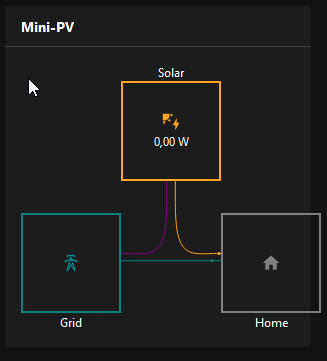
6 Likes

Hi, very good. I want ask, if also information about battery is in the plan to add into animation ?
Thanks

2 Likes

Even though my consumption from grid is 0 W, I see an animation from the grid to home. Is this expected behavior?

2 Likes

I have the same with the other animations as well. Solar Production is 0 W but there is an Animation to the grid and to the home.

I filled in all items (except the non fossile one) and get a realy strange animation… I see some flows but no values.

The three dots are all coming from ‘Solar’, but no sun anymore atm.
All these items are in kW.

I had this problem - my values are formatted as W whole number, and they would not show up unless they had a decimal

For each entry that looks like this, in the widget:

text: = items[props.itemProductionToGrid].displayStat

change it to

text: = items[props.itemProductionToGrid].displayState || items[props.itemProductionToGrid].state

Nice, much better!

Hopefully this will fix the problem with the animation, if no energy flow is present.
I’ve done a test today. If solar generation is > 0, the circles will “flow” in the right direction. After sunset, there is no circle moving. I hope i’ve also matched the grid to home and solar to grid circles.

uid: OH3_Livio_Energy_Summary
tags:
  - Energy
props:
  parameters:
    - description: Title
      label: Title
      name: title
      required: false
      type: TEXT
    - context: item
      description: Consumption From Grid
      label: Consumption From Grid Item
      name: itemConsumptionFromGrid
      required: true
      type: TEXT
    - context: item
      description: Production to Grid
      label: Production to Grid Item
      name: itemProductionToGrid
      required: false
      type: TEXT
    - context: item
      description: Item Solar Production
      label: Solar Production Item
      name: itemSolar
      required: false
      type: TEXT
    - context: item
      description: Home Consumption
      label: Home Consumption Item
      name: itemHomeConsumption
      required: true
      type: TEXT
    - context: item
      description: Gas Consumption Item
      label: Item Gas Consumption
      name: itemGas
      required: false
      type: TEXT
    - context: item
      description: Non Fossil Value Item
      label: Non Fossile Item
      name: itemNonFossil
      required: false
      type: TEXT
    - description: Icon Dimension in px, insert only the numeric value (default 100px, stay within 80px and 120px for best results)
      label: Icon Dimension
      name: iconDimension
      required: false
    - description: Border Radius, enter a numeric value from 0 to 100 (significant changes are visible from value between 40 and 70)
      label: Border Radius
      name: borderRadius
      required: false
  parameterGroups: []
timestamp: Jun 4, 2022, 12:54:59 PM
component: f7-card
config:
  title: = props.title
slots:
  content:
    - component: f7-block
      config:
        style:
          margin: 0
          padding: 0
      slots:
        default:
          - component: f7-block
            config:
              style:
                margin: 0
                padding: 0
                display: flex
                justify-content: space-between
                --f7-theme-color: var(--f7-text-color)
                --f7-block-font-size: 12px
            slots:
              default:
                - component: f7-col
                  config:
                    style:
                      display: flex
                      flex-direction: column
                      align-items: center
                  slots:
                    default:
                      - component: Label
                        config:
                          text: "=(props.itemNonFossil) ? 'Non-Fossil' : ''"
                      - component: f7-block
                        config:
                          style:
                            height: "=props.iconDimension ? Number(props.iconDimension)+'px' : '100px'"
                            width: "=props.iconDimension ? Number(props.iconDimension)+'px' : '100px'"
                            border: 2px solid darkgreen
                            border-radius: "=(props.borderRadius) ? props.borderRadius +'px' : '0px'"
                            display: flex
                            justify-content: center
                            align-items: center
                            flex-direction: column
                          visible: "=(props.itemNonFossil) ? true : false"
                        slots:
                          default:
                            - component: oh-icon
                              config:
                                icon: "=(props.itemNonFossil) ? 'if:mdi:leaf' : ''"
                                height: 20px
                                color: darkgreen
                            - component: Label
                              config:
                                text: = items[props.itemNonFossil].displayState
                                style:
                                  font-size: 12px
                      - component: f7-block
                        config:
                          style:
                            height: 30px
                            width: 2px
                            padding: 0
                            margin: 0
                            border: 1px solid darkgreen
                            display: flex
                            justify-content: center
                            align-items: center
                            flex-direction: column
                          visible: "=(props.itemNonFossil) ? true : false"
                      - component: f7-block
                        config:
                          style:
                            margin-top: "=(props.itemNonFossil) ? '0px' : (props.itemSolar) ? '150px' : (props.itemGas) ? '150px' : '0px'"
                            height: "=props.iconDimension ? Number(props.iconDimension)+'px' : '100px'"
                            width: "=props.iconDimension ? Number(props.iconDimension)+'px' : '100px'"
                            border: 2px solid teal
                            border-radius: "=(props.borderRadius) ? props.borderRadius +'px' : '0px'"
                            display: flex
                            justify-content: center
                            align-items: center
                            flex-direction: column
                        slots:
                          default:
                            - component: oh-icon
                              config:
                                icon: if:mdi:transmission-tower
                                height: 20px
                                color: teal
                            - component: oh-link
                              config:
                                text: = items[props.itemProductionToGrid].displayState
                                iconF7: "=(props.itemProductionToGrid) ? 'arrow_left' : ''"
                                iconSize: 12px
                                iconColor: purple
                                style:
                                  font-size: 12px
                                  white-space: nowrap
                                visible: = props.itemProductionToGrid
                            - component: oh-link
                              config:
                                text: = items[props.itemConsumptionFromGrid].displayState
                                iconF7: "=(props.itemConsumptionFromGrid) ? 'arrow_right' : ''"
                                iconSize: 12px
                                iconColor: blue
                                style:
                                  font-size: 12px
                                  white-space: nowrap
                      - component: Label
                        config:
                          text: Grid
                - component: f7-col
                  config:
                    style:
                      flex-grow: 1
                      display: flex
                      flex-direction: column
                      align-items: center
                  slots:
                    default:
                      - component: Label
                        config:
                          text: "=(props.itemSolar) ? 'Solar' : ''"
                      - component: f7-block
                        config:
                          style:
                            height: "=props.iconDimension ? Number(props.iconDimension)+'px' : '100px'"
                            width: "=props.iconDimension ? Number(props.iconDimension)+'px' : '100px'"
                            border: 2px solid orange
                            border-radius: "=(props.borderRadius) ? props.borderRadius +'px' : '0px'"
                            display: flex
                            justify-content: center
                            align-items: center
                            flex-direction: column
                          visible: "=(props.itemSolar) ? true : false"
                        slots:
                          default:
                            - component: oh-icon
                              config:
                                icon: if:mdi:solar-power
                                height: 20px
                                color: orange
                            - component: Label
                              config:
                                text: =items[props.itemSolar].displayState
                                style:
                                  font-size: 12px
                      - component: f7-block
                        config:
                          style:
                            margin: 0
                            padding: 0
                            width: 100%
                            display: flex
                            height: "=((props.itemNonFossil) && (props.itemSolar) && (props.itemGas)) ? '145px' : ((props.itemNonFossil) && (props.itemSolar)) ? '145px' : ((props.itemNonFossil) && (props.itemGas)) ? '320px' : ((props.itemSolar) && (props.itemGas)) ? '145px' : (props.itemNonFossil) ? '320px' : (props.itemGas) ? '320px' : '145px'"
                            justify-content: center
                        slots:
                          default:
                            - component: f7-row
                              config:
                                tag: svg
                                xmlns: http://www.w3.org/2000/svg
                                viewBox: "=((props.itemNonFossil) || (props.itemSolar) || (props.itemGas))?  '0 0 100 100' : '0 8 100 100'"
                                preserveAspectRatio: xMidYMid slice
                                style:
                                  height: auto
                              slots:
                                default:
                                  - component: f7-row
                                    config:
                                      tag: path
                                      id: path1
                                      d: M53,0 v15 c0,40 10,35 30,35 h20
                                      stroke: orange
                                      stroke-width: 1
                                      vector-effect: non-scaling-stroke
                                      fill: none
                                      visible: "=(props.itemSolar) ? true : false"
                                  - component: f7-row
                                    # draw circle for solar to home
                                    config:
                                      tag: circle
                                      r: 1
                                      vector-effect: non-scaling-stroke
                                      fill: orange
                                      style:
                                        stroke-width: 4
                                      visible: =items[props.itemSolar].state > 0
                                    slots:
                                      default:
                                        - component: f7-row
                                          config:
                                            tag: animateMotion
                                            repeatCount: indefinite
                                            calcMode: linear
                                            dur: 5s
                                          slots:
                                            default:
                                              - component: f7-row
                                                config:
                                                  tag: mpath
                                                  xlink:href: "#path1"
                                  - component: f7-row
                                    config:
                                      tag: path
                                      id: path2
                                      d: M47,0 v15 c0,40 -10,35 -30,35 h-20
                                      stroke: purple
                                      stroke-width: 1
                                      vector-effect: non-scaling-stroke
                                      fill: none
                                      visible: "=(props.itemSolar) ? true : false"
                                  - component: f7-row
                                    # draw circle for solar to grid
                                    config:
                                      tag: circle
                                      r: 1
                                      vectorEffect: non-scaling-stroke
                                      strokeWidth: 10
                                      fill: purple
                                      visible: =items[props.itemProductionToGrid].state > 0
                                    slots:
                                      default:
                                        - component: f7-row
                                          config:
                                            tag: animateMotion
                                            repeatCount: indefinite
                                            calcMode: linear
                                            dur: 3s
                                          slots:
                                            default:
                                              - component: f7-row
                                                config:
                                                  tag: mpath
                                                  xlink:href: "#path2"
                                  - component: f7-row
                                    config:
                                      tag: path
                                      id: path3
                                      d: M0,55 H100
                                      stroke: teal
                                      stroke-width: 1
                                      vector-effect: non-scaling-stroke
                                      fill: none
                                  - component: f7-row
                                    # draw circle for grid to home
                                    config:
                                      tag: circle
                                      r: 1
                                      vectorEffect: non-scaling-stroke
                                      strokeWidth: 10
                                      fill: teal
                                      visible: =items[props.itemConsumptionFromGrid].state > 0
                                    slots:
                                      default:
                                        - component: f7-row
                                          config:
                                            tag: animateMotion
                                            repeatCount: indefinite
                                            calcMode: linear
                                            dur: 3s
                                          slots:
                                            default:
                                              - component: f7-row
                                                config:
                                                  tag: mpath
                                                  xlink:href: "#path3"
                - component: f7-col
                  config:
                    style:
                      display: flex
                      flex-direction: column
                      align-items: center
                  slots:
                    default:
                      - component: Label
                        config:
                          text: "=(props.itemGas) ? 'Gas' : ''"
                      - component: f7-block
                        config:
                          style:
                            height: "=props.iconDimension ? Number(props.iconDimension)+'px' : '100px'"
                            width: "=props.iconDimension ? Number(props.iconDimension)+'px' : '100px'"
                            border: 2px solid darkred
                            border-radius: "=(props.borderRadius) ? props.borderRadius +'px' : '0px'"
                            display: flex
                            justify-content: center
                            align-items: center
                            flex-direction: column
                          visible: "=(props.itemGas) ? true : false"
                        slots:
                          default:
                            - component: oh-icon
                              config:
                                icon: if:mdi:gas
                                height: 20px
                                color: darkred
                            - component: Label
                              config:
                                text: = items[props.itemGas].displayState
                                style:
                                  font-size: 12px
                      - component: f7-block
                        config:
                          style:
                            height: 30px
                            width: 2px
                            padding: 0
                            margin: 0
                            border: 1px solid darkred
                            display: flex
                            justify-content: center
                            align-items: center
                            flex-direction: column
                          visible: "=(props.itemGas) ? true : false"
                      - component: f7-block
                        config:
                          style:
                            margin-top: "=((props.itemNonFossil) && (props.itemGas)) ? '0px' : ((props.itemSolar) && (props.itemGas)) ? '0px' : ((props.itemSolar) || (props.itemNonFossil)) ? '150px' : '0px'"
                            height: "=props.iconDimension ? Number(props.iconDimension)+'px' : '100px'"
                            width: "=props.iconDimension ? Number(props.iconDimension)+'px' : '100px'"
                            border: 2px solid gray
                            border-radius: "=(props.borderRadius) ? props.borderRadius +'px' : '0px'"
                            display: flex
                            justify-content: center
                            align-items: center
                            flex-direction: column
                        slots:
                          default:
                            - component: oh-icon
                              config:
                                icon: if:mdi:home
                                height: 20px
                                color: gray
                            - component: Label
                              config:
                                text: = items[props.itemHomeConsumption].displayState
                                style:
                                  font-size: 12px
                                  white-space: nowrap
                      - component: Label
                        config:
                          text: Home```

Hello,
using the code in the first post I get lines not connected, do you know why?